Practical: Distorted Portraiture
Wes Naman:
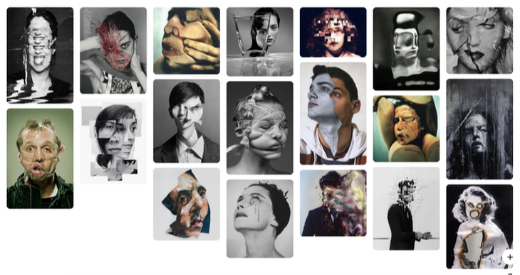
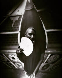
Wes Naman is a portrait photographer born in New Mexico in 1965. In his series 'Scotch Tape' he asked people to wrap their own faces in tape. By doing this their faces had become distorted, with all the key features of the face changed, which in turn made them loose their identity because people are usually recognisable by the key features of their face.
Wes Naman is a portrait photographer born in New Mexico in 1965. In his series 'Scotch Tape' he asked people to wrap their own faces in tape. By doing this their faces had become distorted, with all the key features of the face changed, which in turn made them loose their identity because people are usually recognisable by the key features of their face.
|
In each of Wes Naman's portraits, the models are creating a different expression with their face, combine this with the different ways in which their faces are wrapped and you receive completely different images. I like the diversity of his work yet each picture manages to have so much in common at the same time. The consistent use of the same green background creates a contrast between the fleshy, bloated faces of the models and their surroundings, the green background brings forward the model creating a greater sense of intamacy.
|
|
Photoshoot Plan:
1. Concept- I am going to wrap my sisters face in cling film to distort the her face.
2. Location- In a room with good lighting located somewhere in my house.
3. Models- My sister.
4. Clothing and accessories- Everyday clothes however with cling film wrapped around her face.
5. Styling- None.
6. Props-None.
8. Lighting- Bright, bold lighting so it can reflect off the cling film to give my sister really strong highlights all over her face.
9. Equipment and tools- Camera and Cling film.
10. List of Items I Need to Bring to my Shoot- Camera, Cling Film, Towel, Sister.
FIRST RESPONSE:
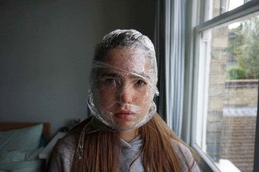
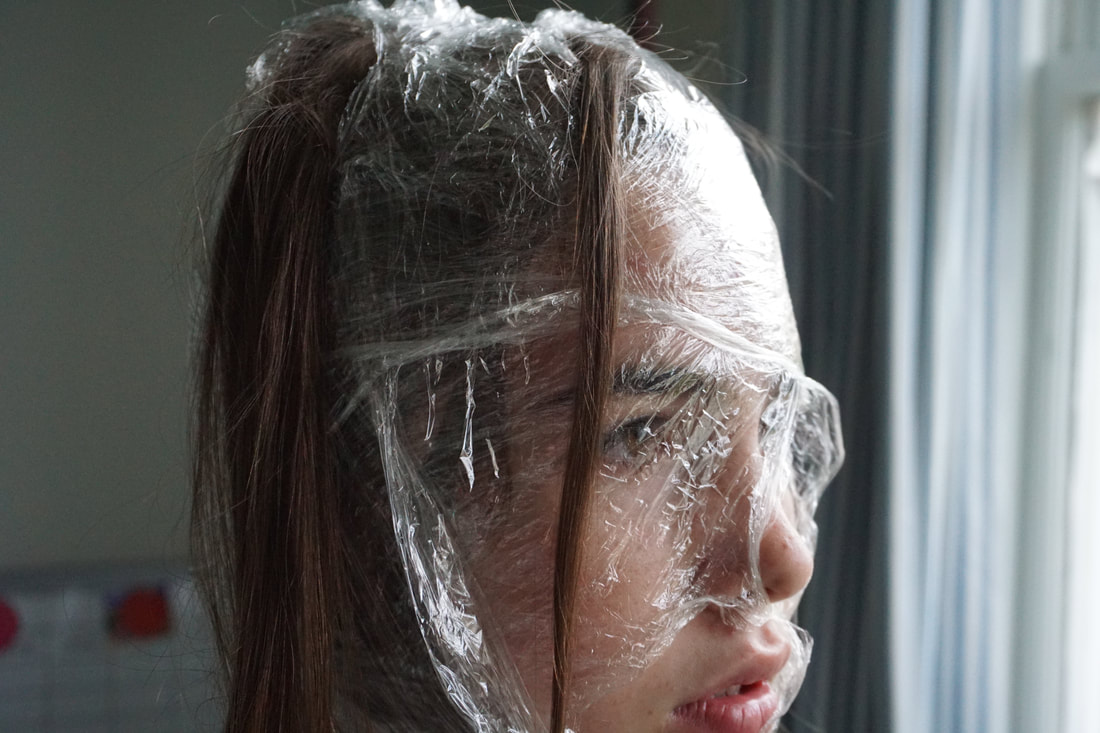
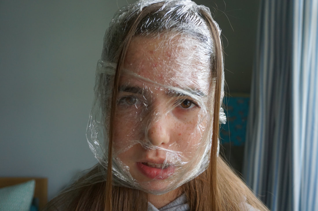
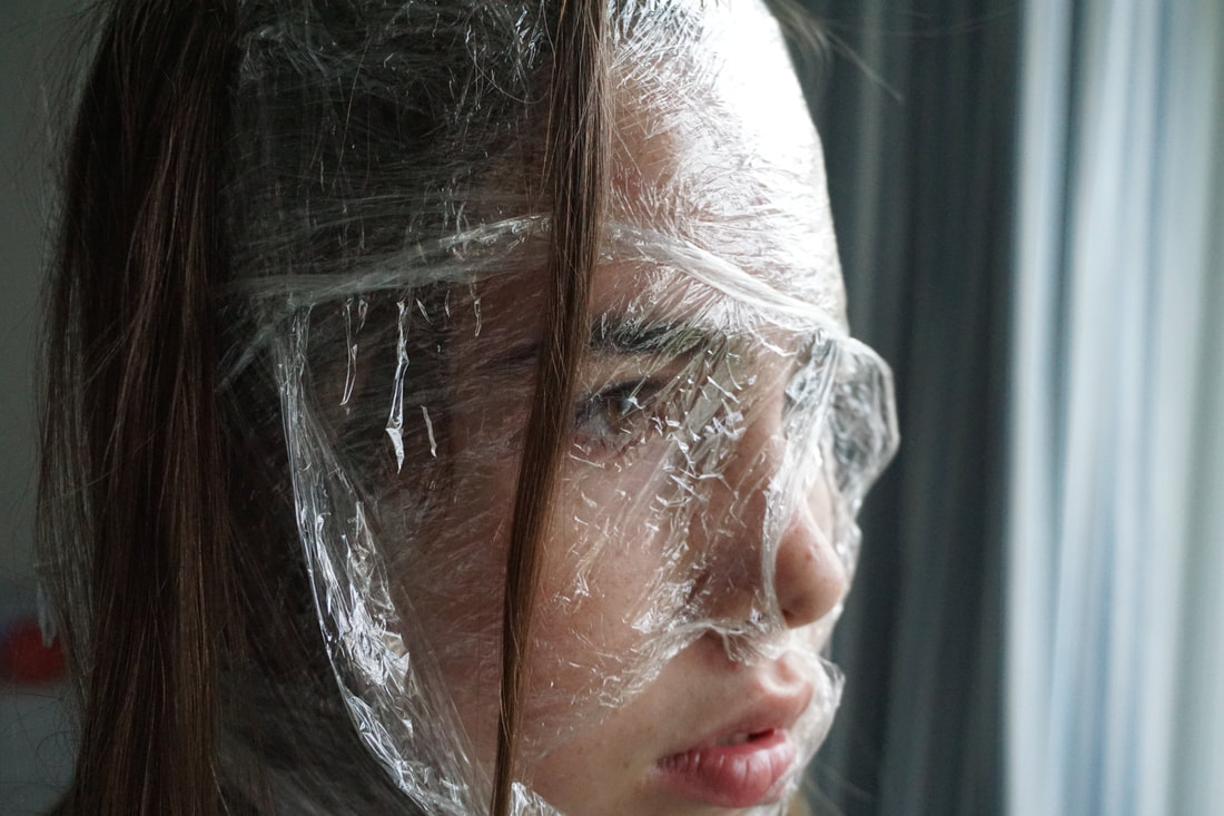
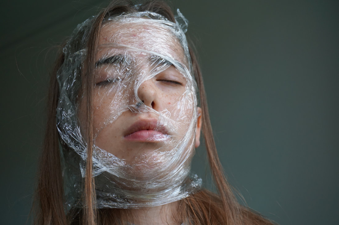
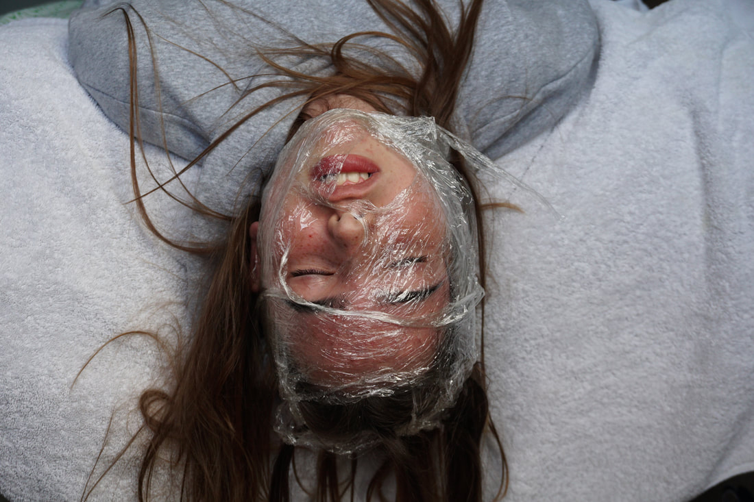
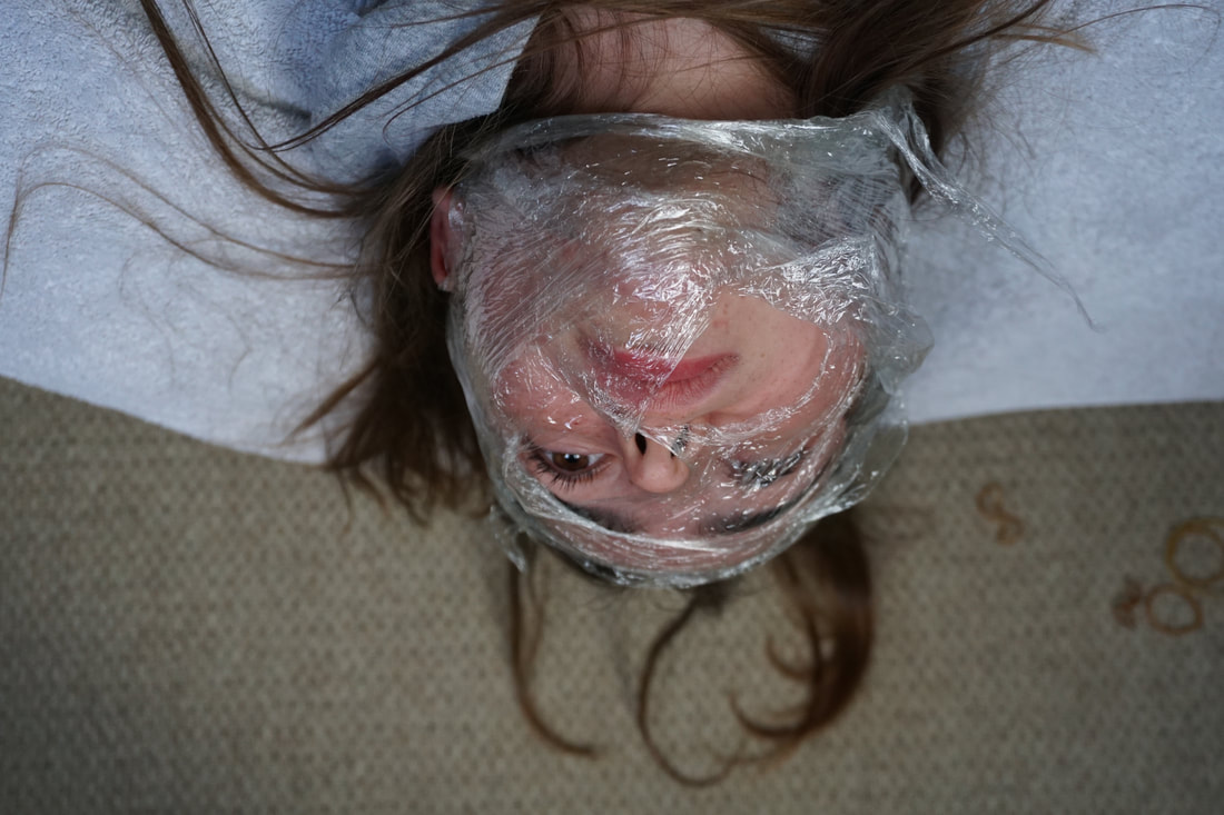
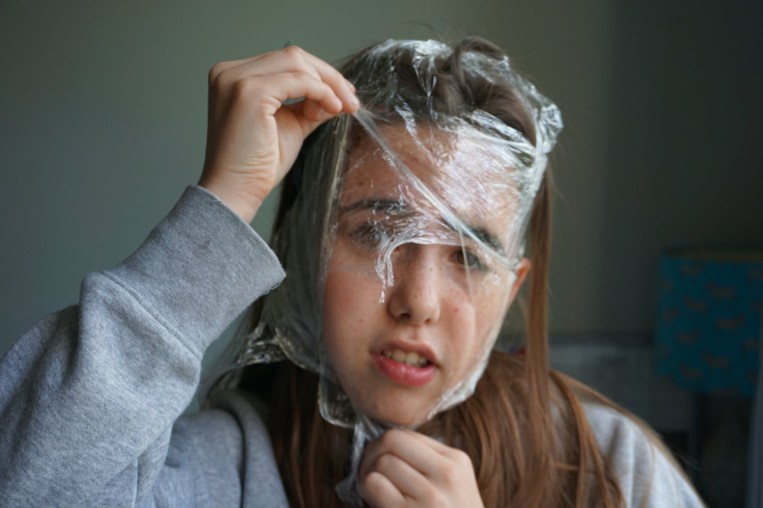
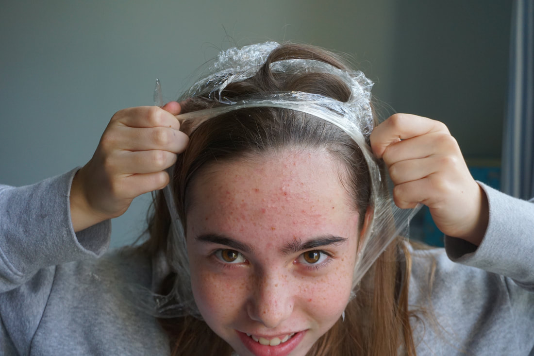
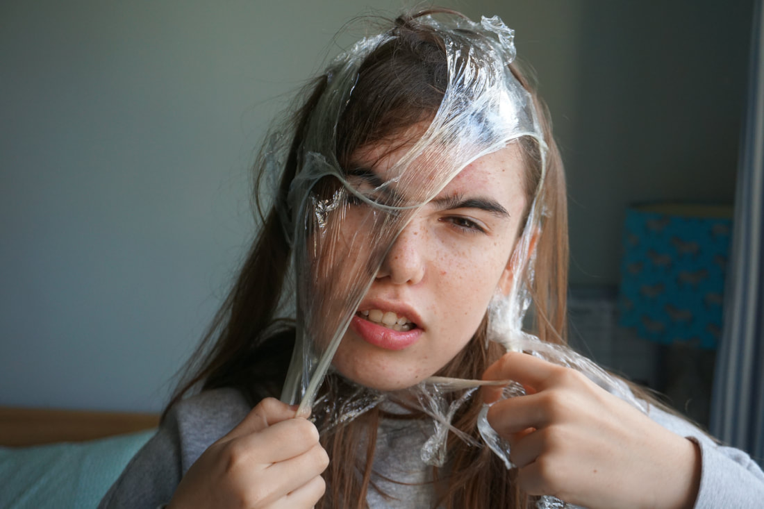
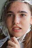
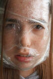
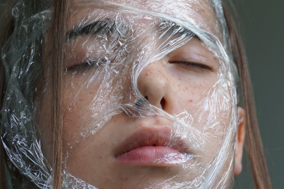
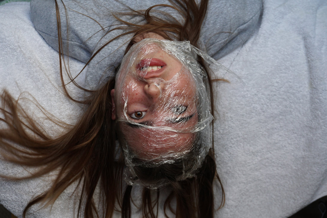
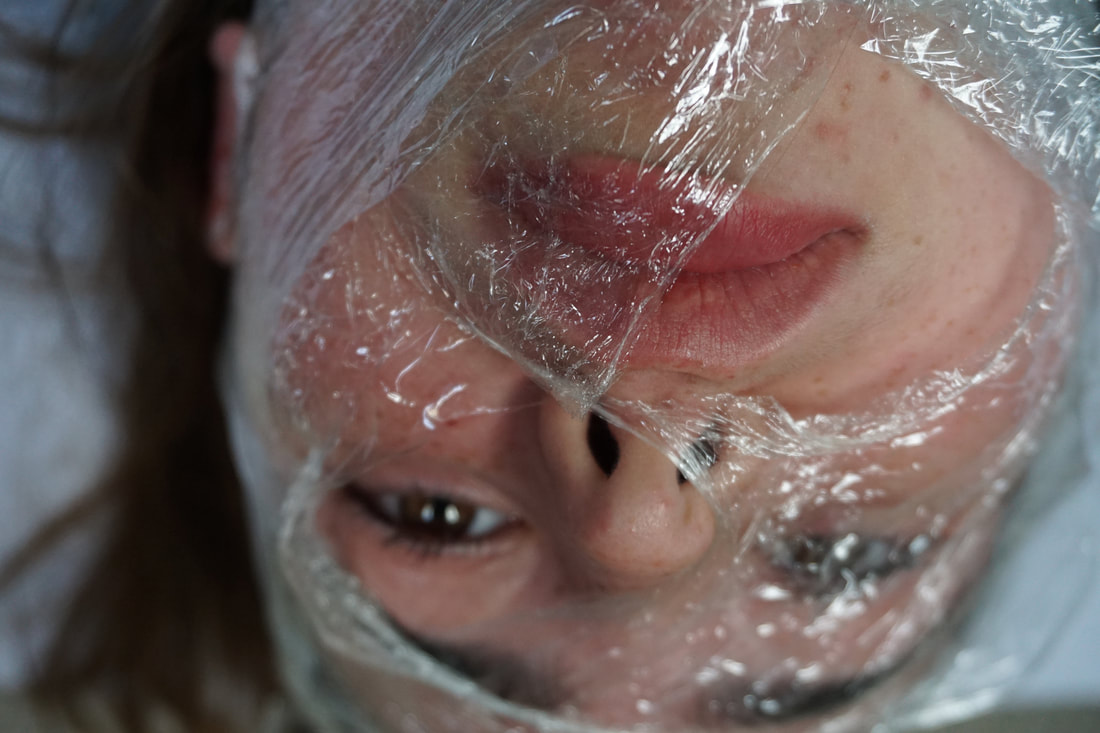
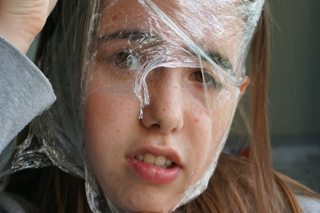
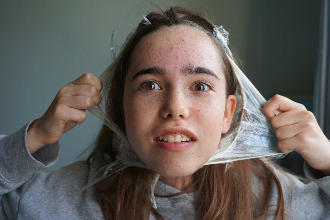
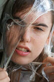
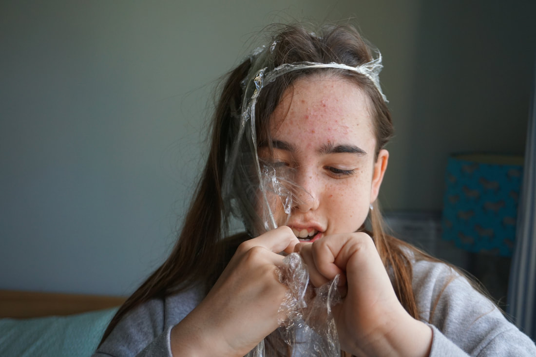
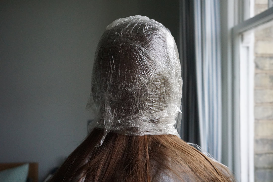
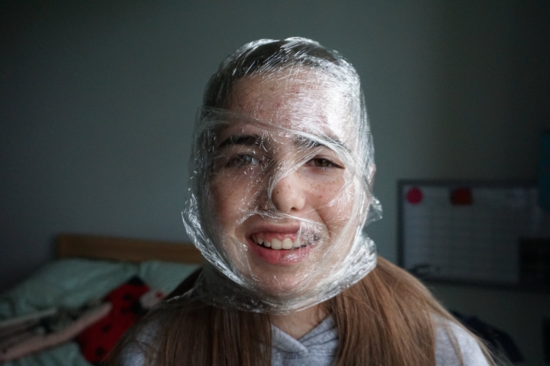
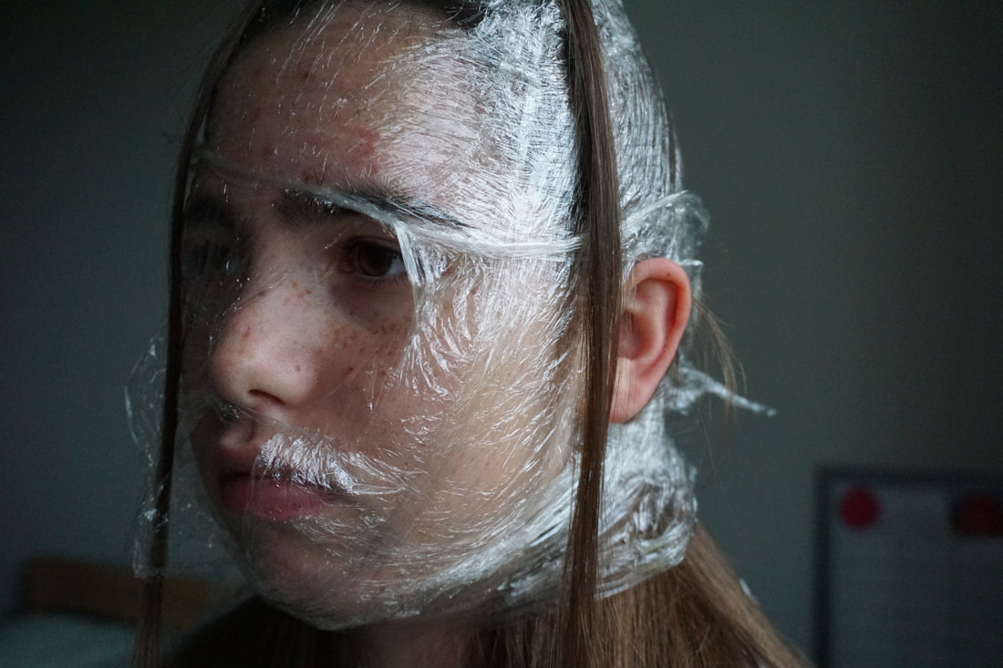
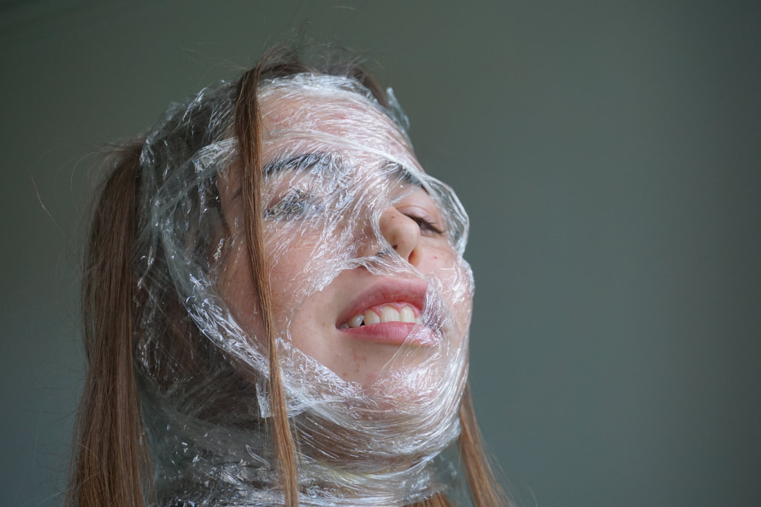
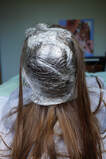
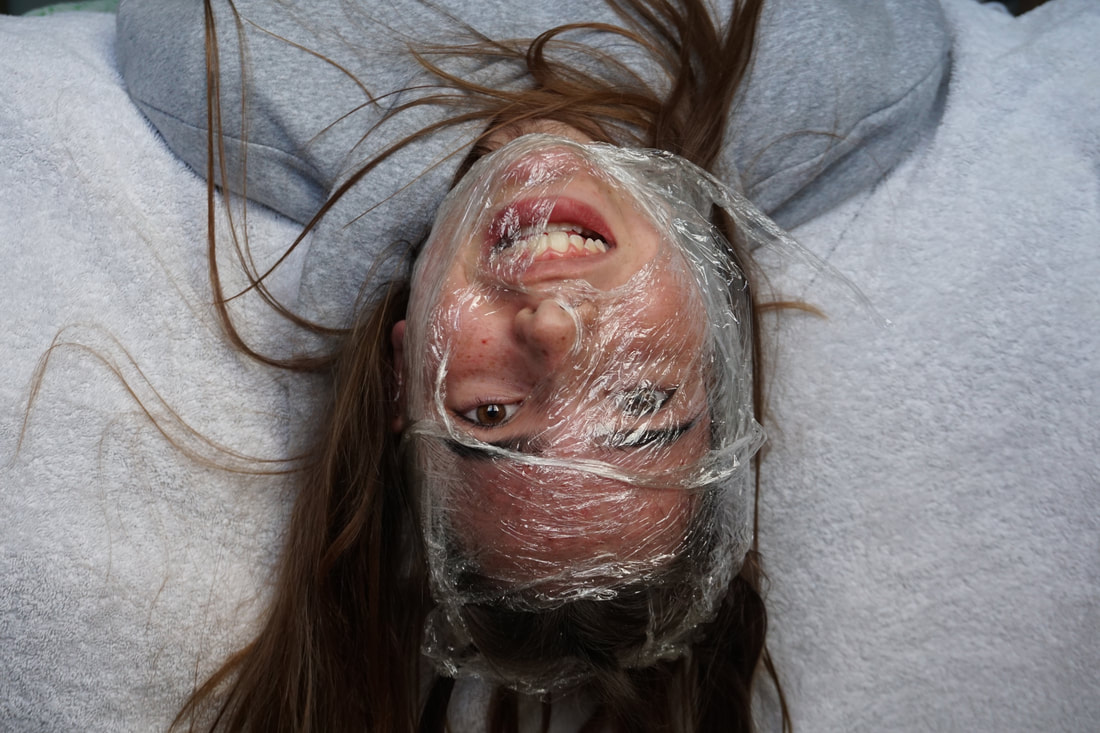
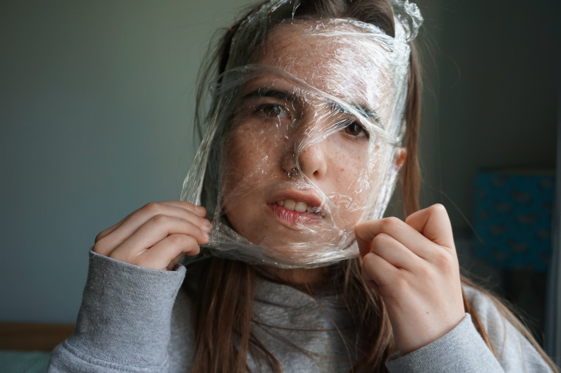
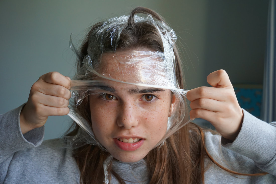
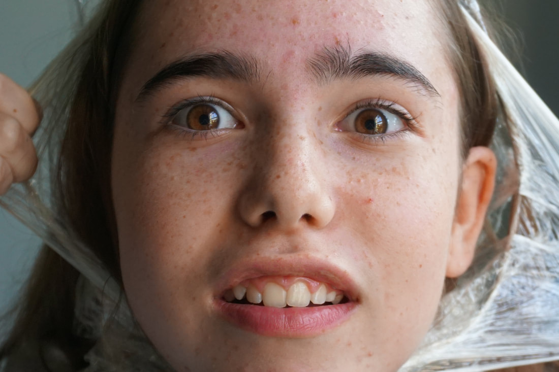
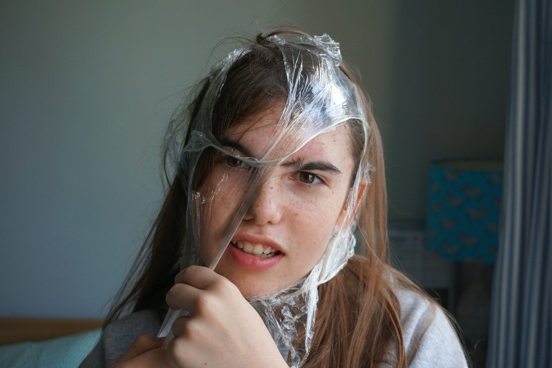
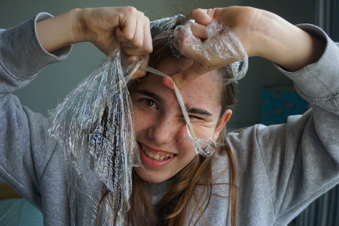
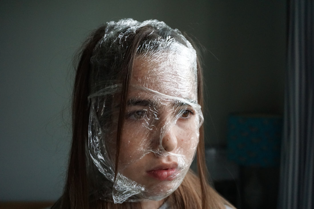
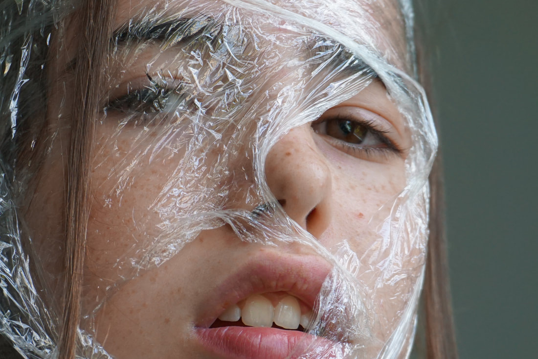
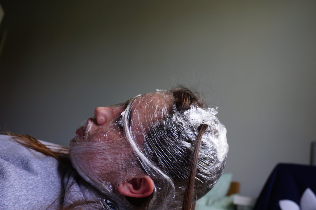
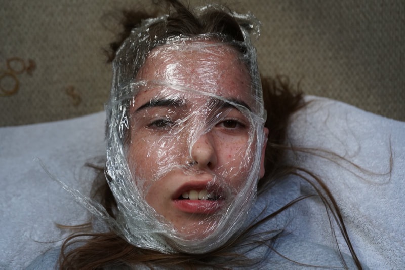
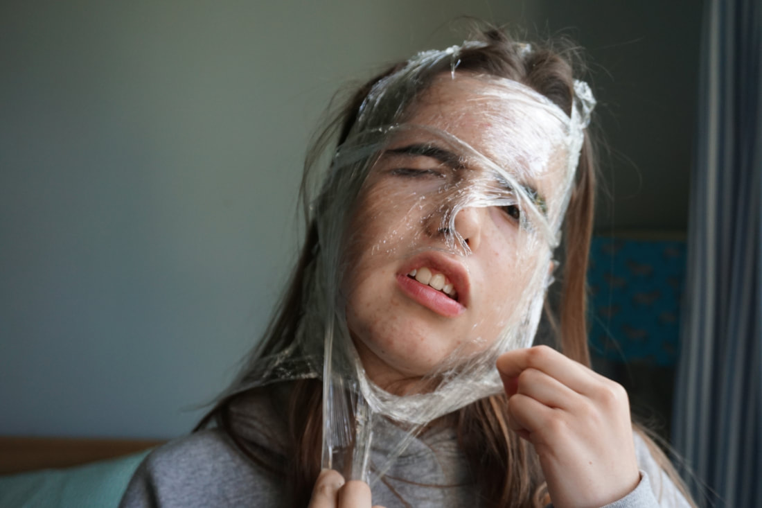
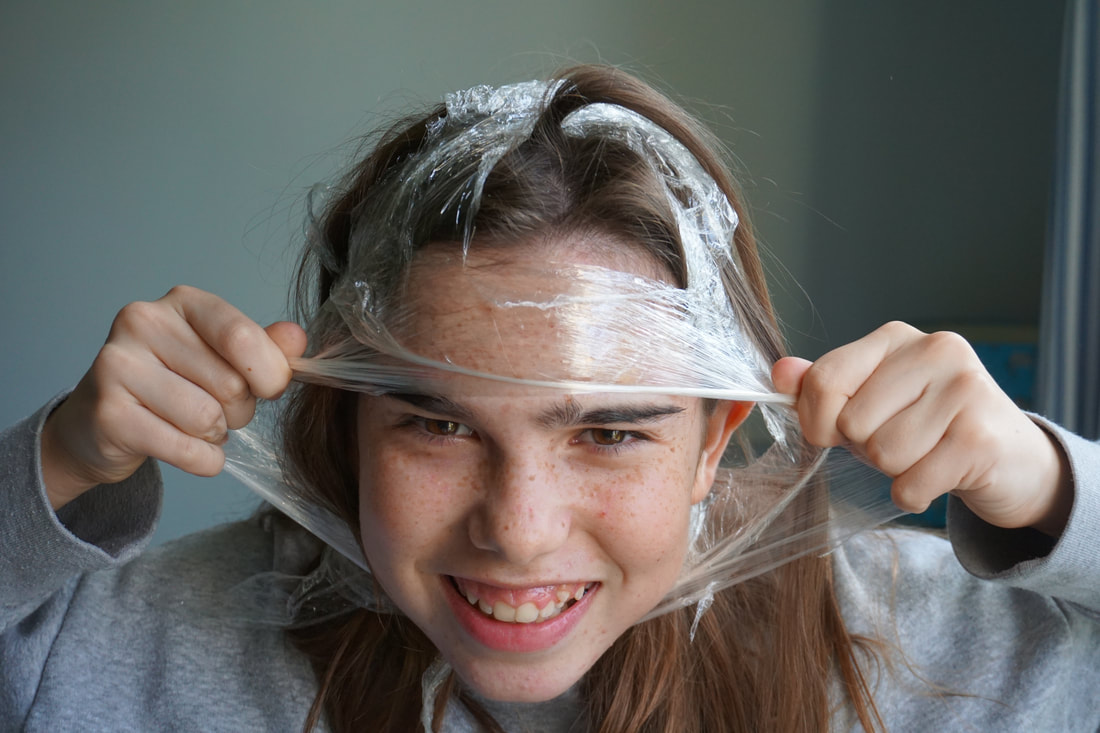
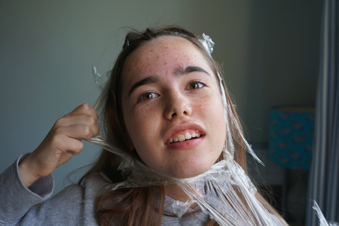
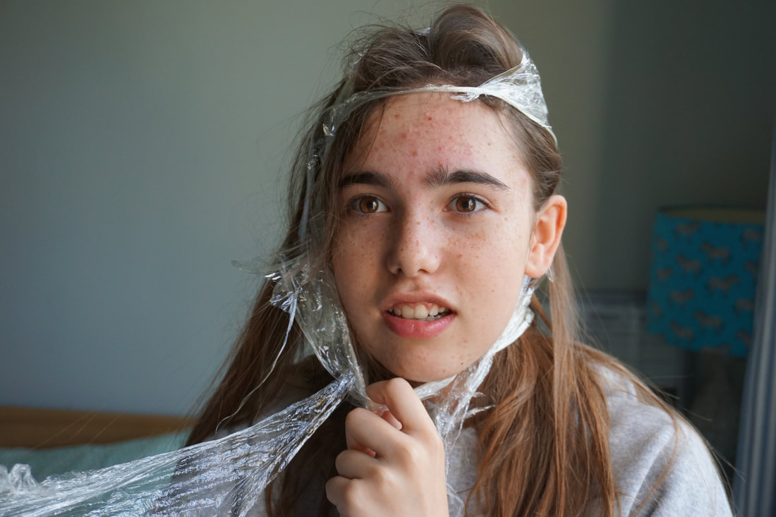
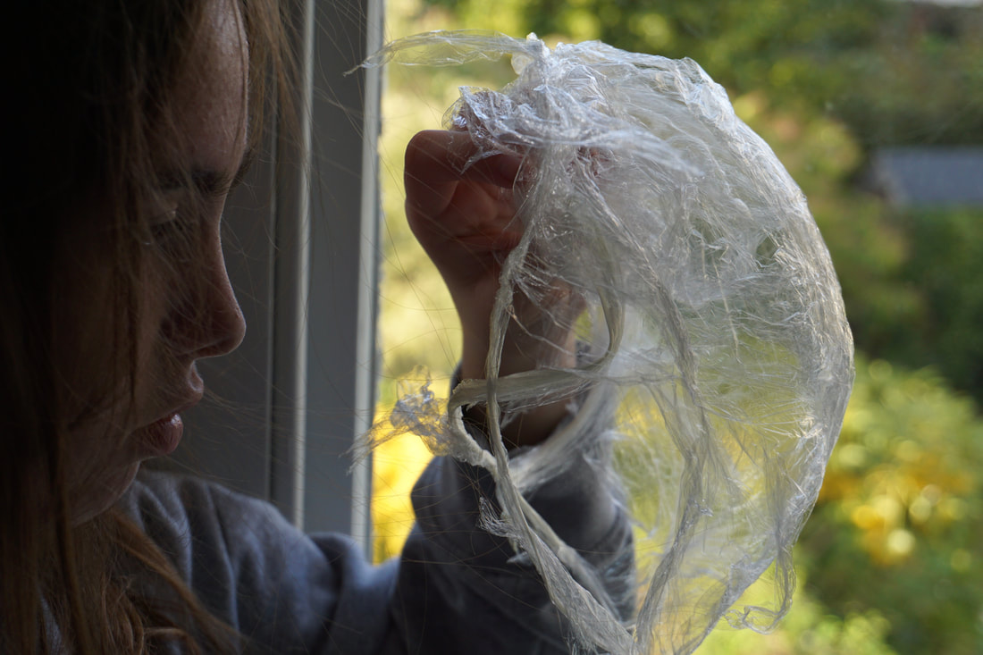
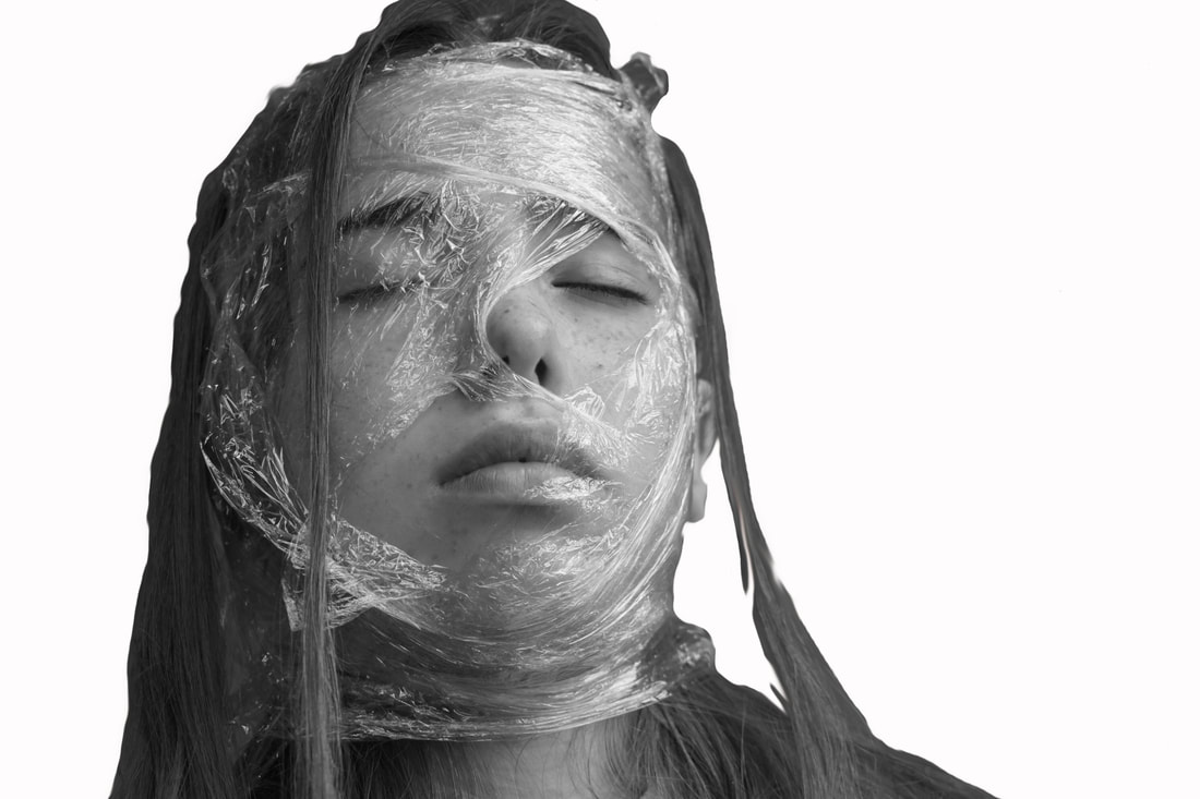
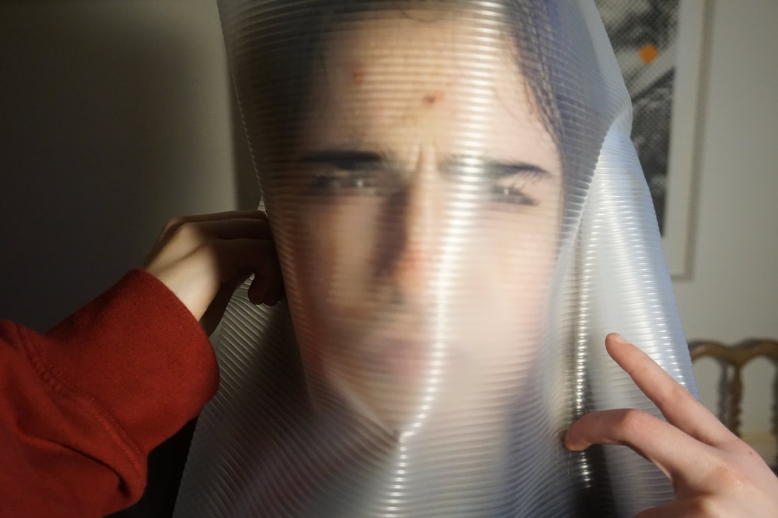
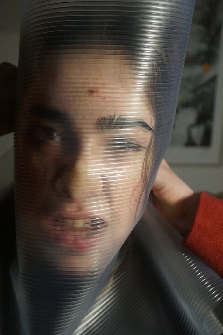
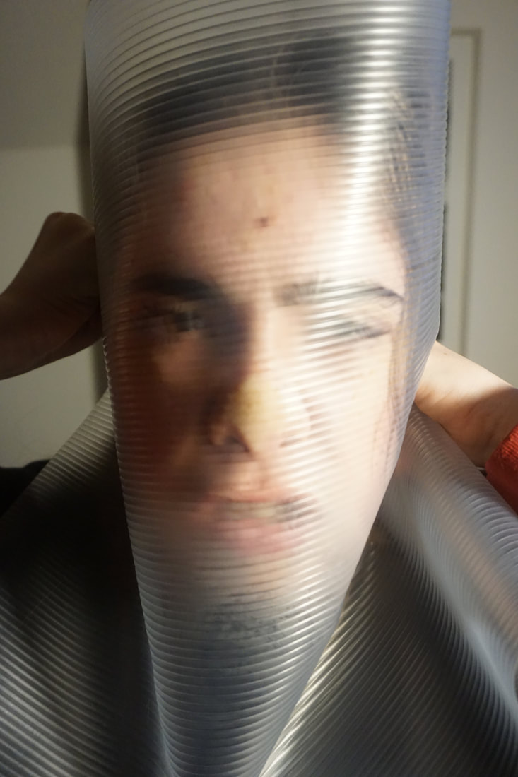
Looking at Wes Naman's 'Scotch Tape' series and how he wraps tape around his models faces to distort their face i decided to use cling film to try and create the same effect. I used my sister as a model and wrapped layers of cling film over her face, i then ripped open holes over her mouth, nose and one eye so she was able to breathe. Once her entire head had been wrapped up the effect of using cling film had made her head look as if it had been frozen in ice. After taking a series of photographs of my sister from multiple angles i then asked her to slowly take it off however she wanted to. As she removed the cling film i watched her struggle and rip the cling film, tearing and stretching it as if it was her own skin. Once she had completely removed the cling film it still held the form of her head, almost like a mould of her head.
Looking at Wes Naman's 'Scotch Tape' series and how he wraps tape around his models faces to distort their face i decided to use cling film to try and create the same effect. I used my sister as a model and wrapped layers of cling film over her face, i then ripped open holes over her mouth, nose and one eye so she was able to breathe. Once her entire head had been wrapped up the effect of using cling film had made her head look as if it had been frozen in ice. After taking a series of photographs of my sister from multiple angles i then asked her to slowly take it off however she wanted to. As she removed the cling film i watched her struggle and rip the cling film, tearing and stretching it as if it was her own skin. Once she had completely removed the cling film it still held the form of her head, almost like a mould of her head.
|
|
EDITS:
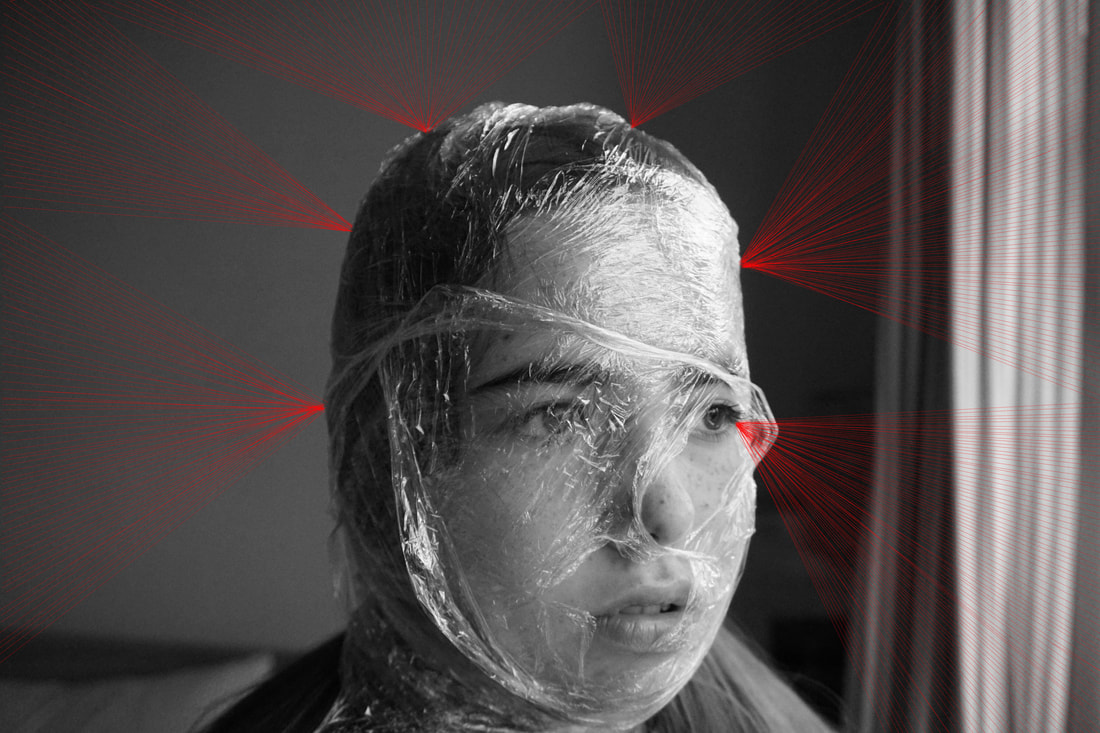
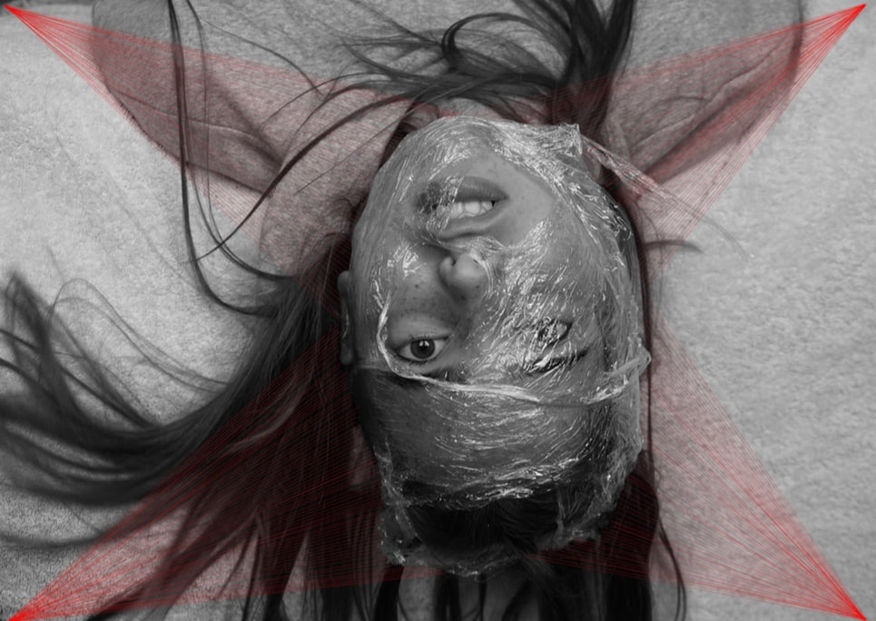
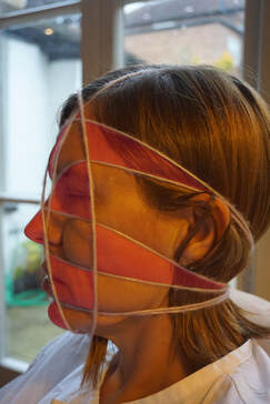
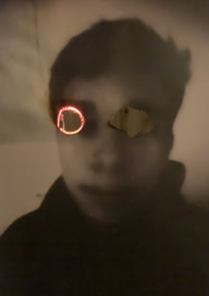
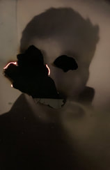
After taking the series of my sister i then began to think what else i could do with these photographs to enhance their appearance. I then came to the conclusion that the images were very organic looking, as if she has skin melting off her face or if someone was pouring water over her head. From this conclusion i decided i wanted to add a more geometric style to contrast the organic form. I went onto photoshop and added hundreds of red lines exiting my sisters head at various points. By doing this i had almost created shapes with the empty areas such as triangles which the image almost seem religious as she had a star rising above her head.
After taking the series of my sister i then began to think what else i could do with these photographs to enhance their appearance. I then came to the conclusion that the images were very organic looking, as if she has skin melting off her face or if someone was pouring water over her head. From this conclusion i decided i wanted to add a more geometric style to contrast the organic form. I went onto photoshop and added hundreds of red lines exiting my sisters head at various points. By doing this i had almost created shapes with the empty areas such as triangles which the image almost seem religious as she had a star rising above her head.
Manual Manipulation:
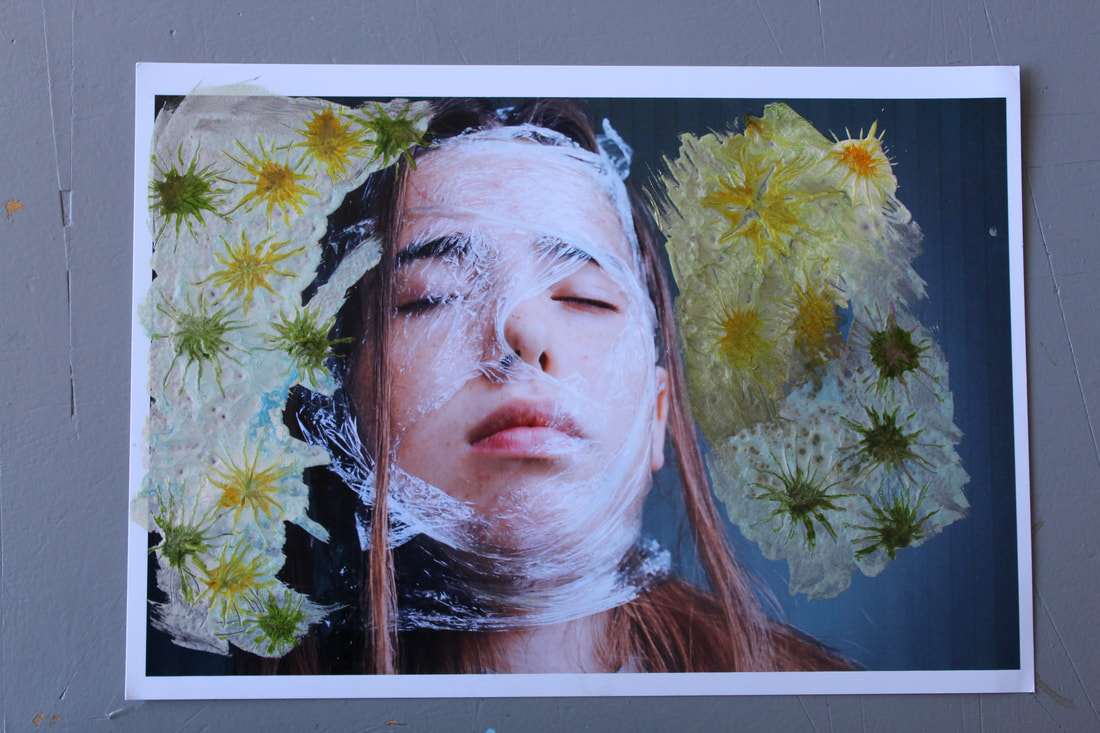
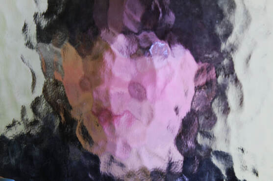
To create this image i used a series of paints and layered them onto of each other to create a organic, flower like pattern onto of the image.
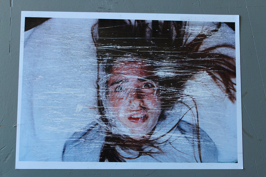
To create this effect I created a ball of wire and scratched it against the image till the surface began to peel off. I like this effect because it almost looks like the blank static effect which appears on the television when the channel finishes or you go up too high on the channel list. The white scratch marks bring out the red in my sisters face making the image look as if she has been cut and is bleeding.
|
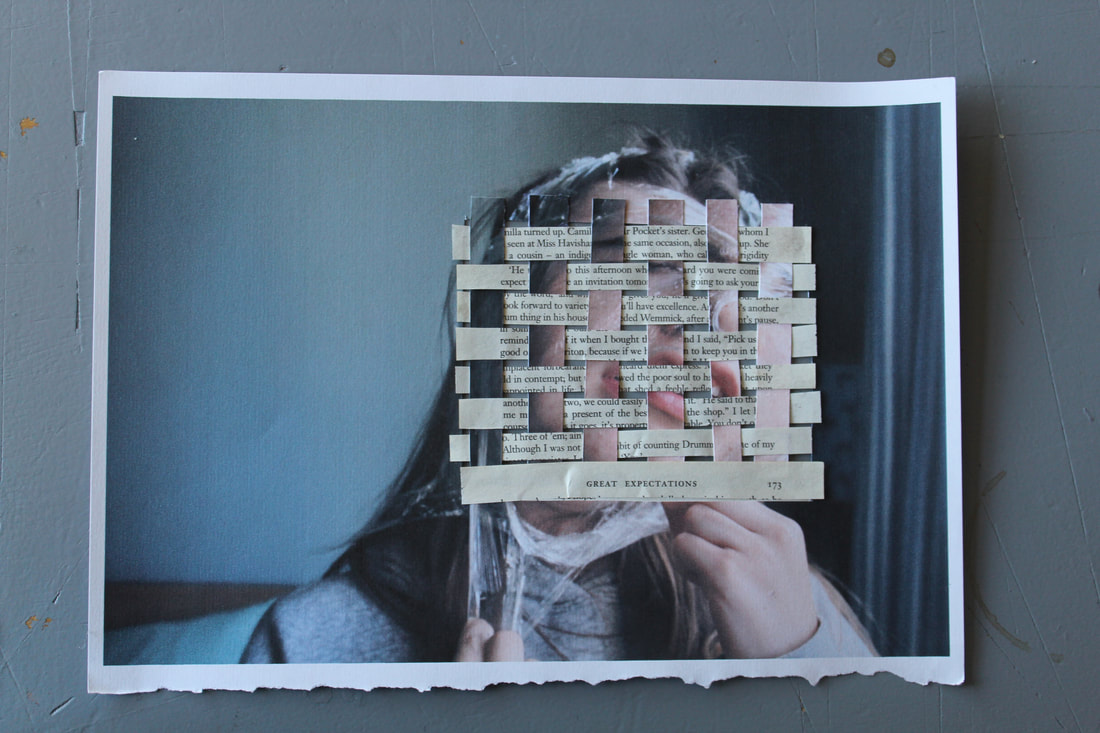
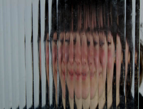
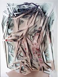
For this effect I cut 12 horizontal slits and weaved 8 stripes of paper from a book (Great Expectations). The outcome I received was interesting as the image can be interpreted in multiple ways. For example, it could be portrayed that the book its self titles ' great expectations' can link to the models own expectations. However I feel that I can make it better by weaving smaller strips to create a greater effect of distortion.
To create this image i cut out sections of one image then placed other images behind it.
|
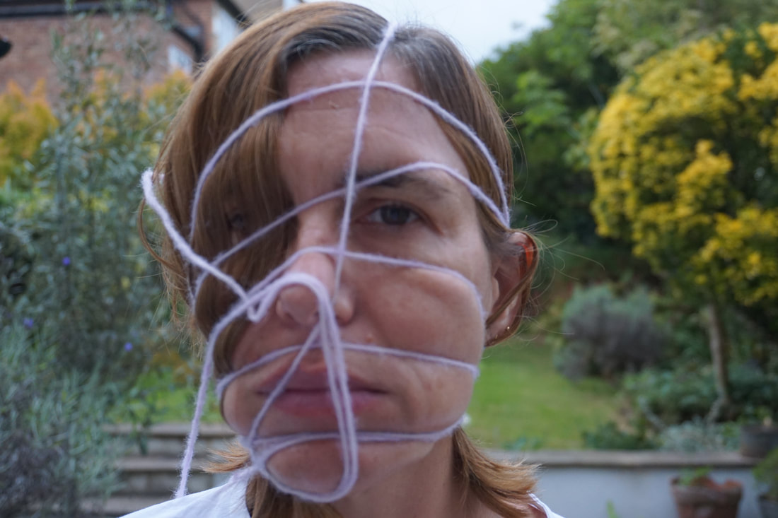
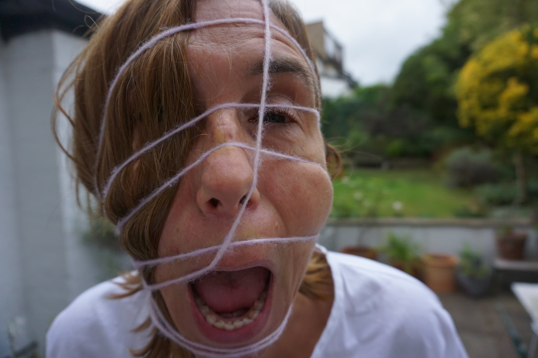
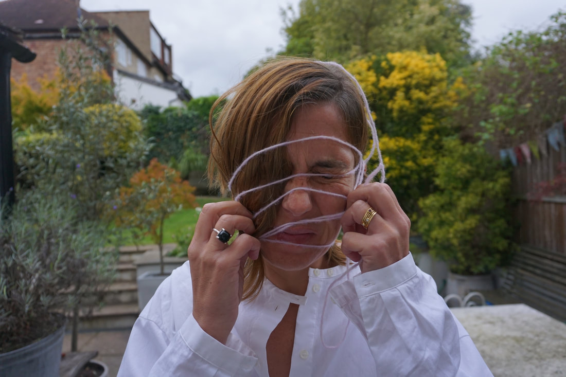
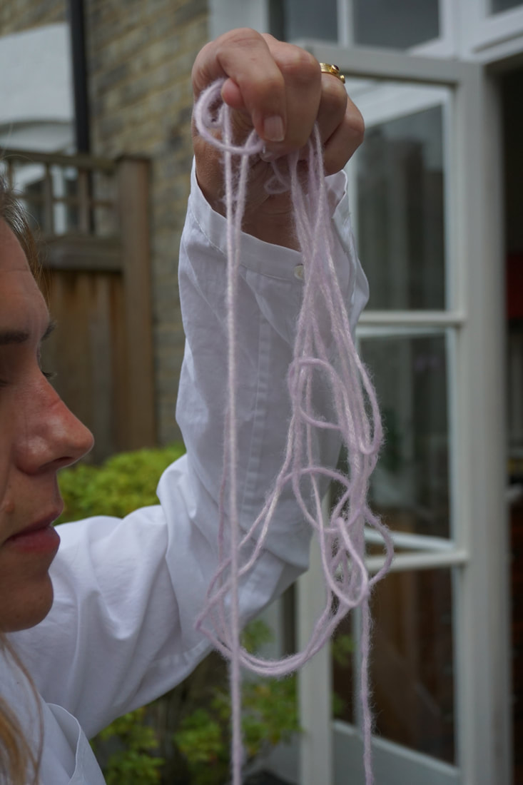
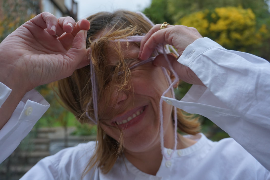
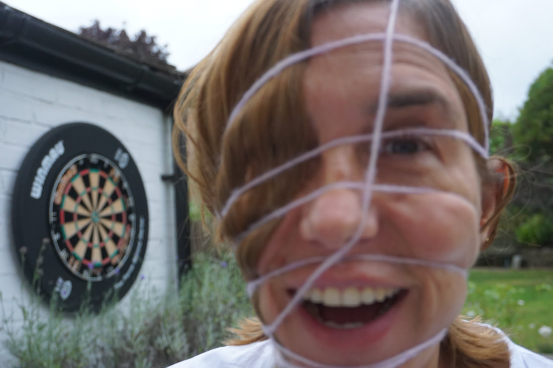
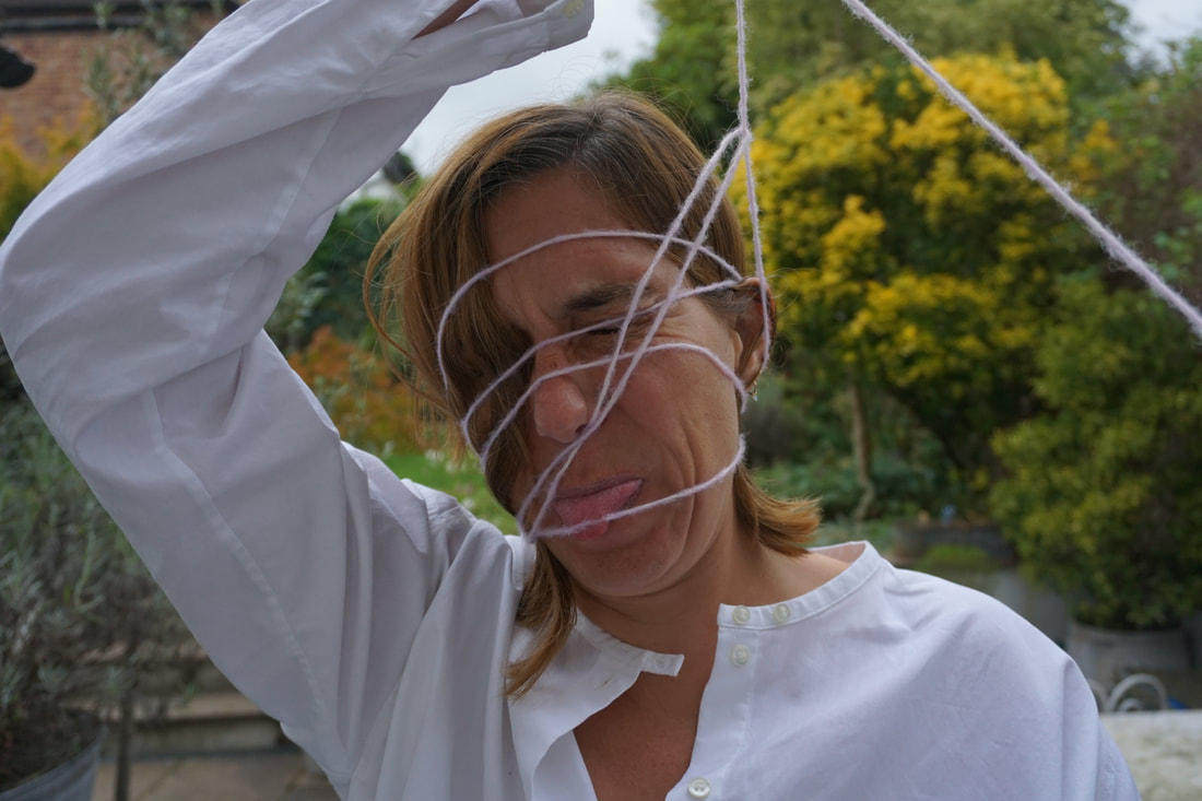
SECOND RESPONSE:
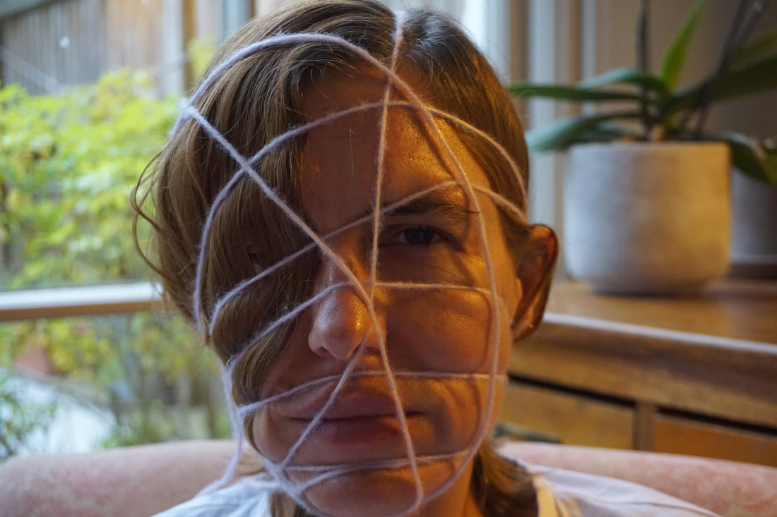
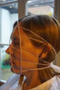
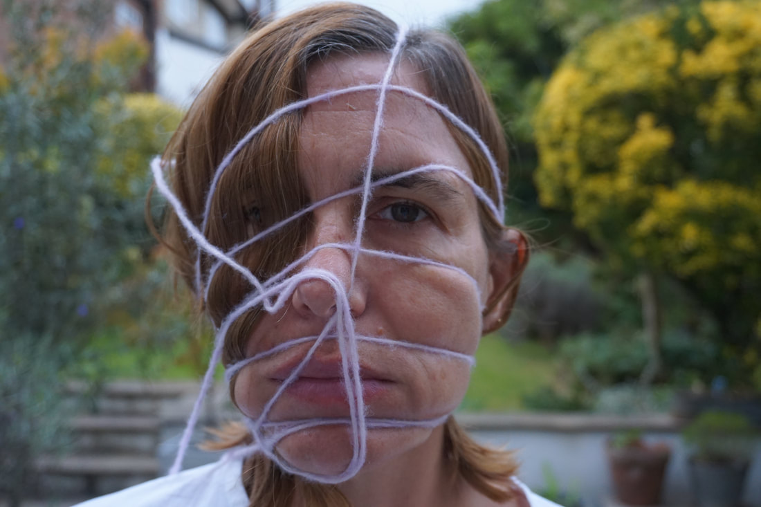
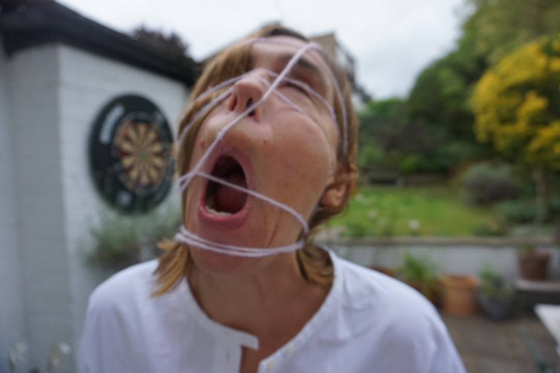
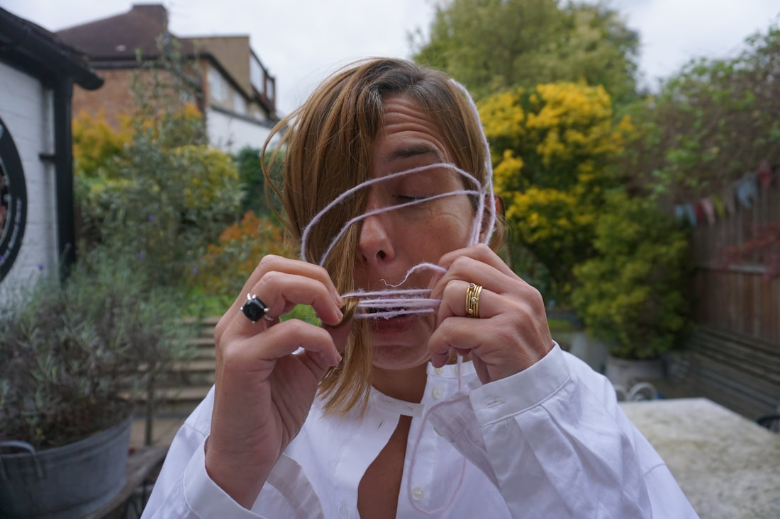
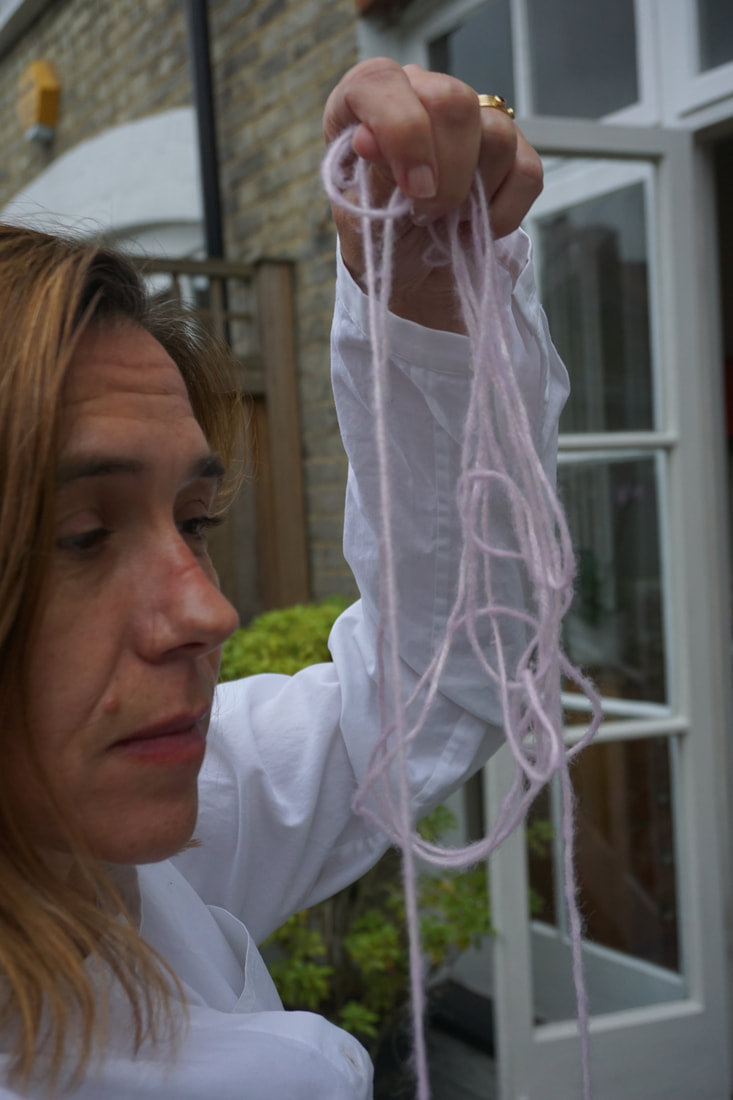
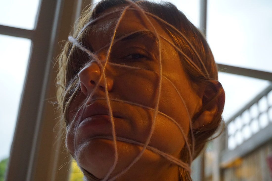
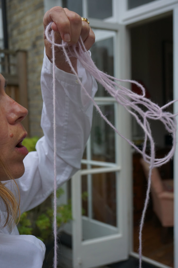
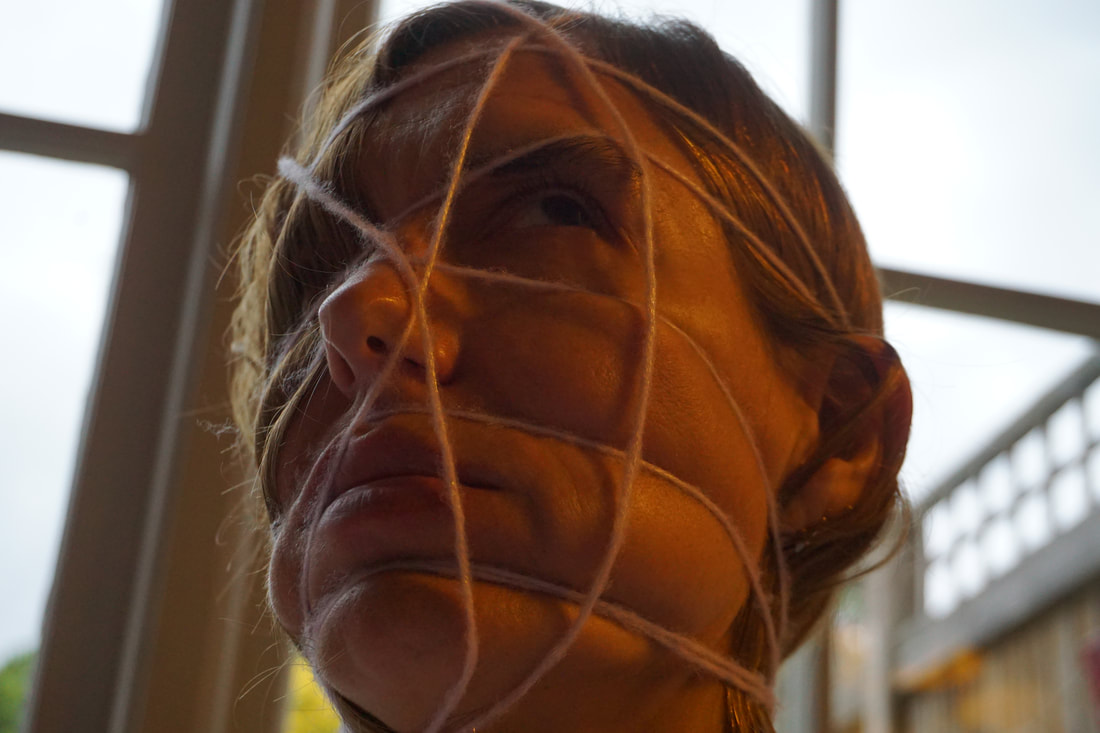
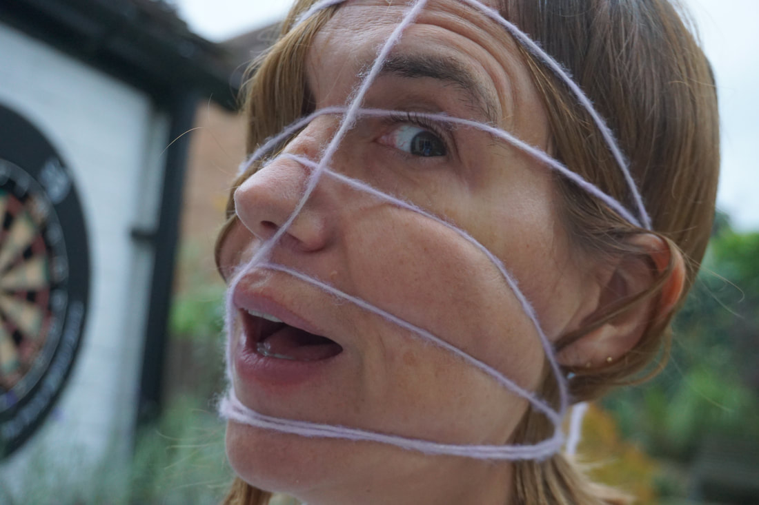
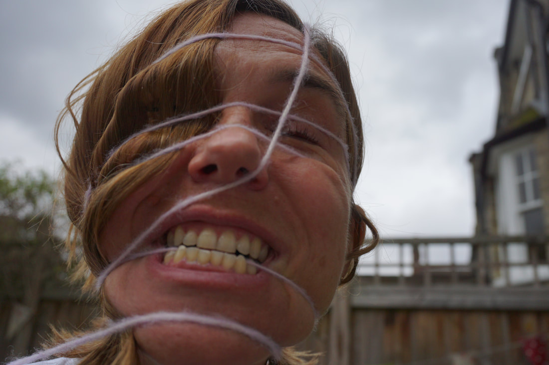
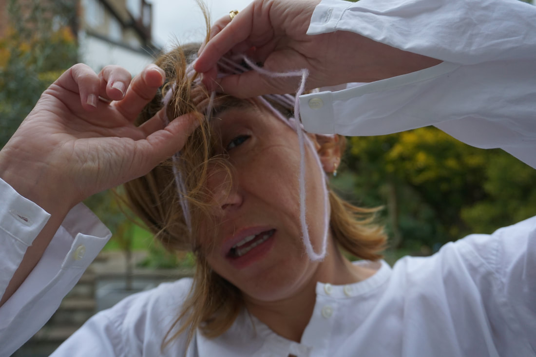
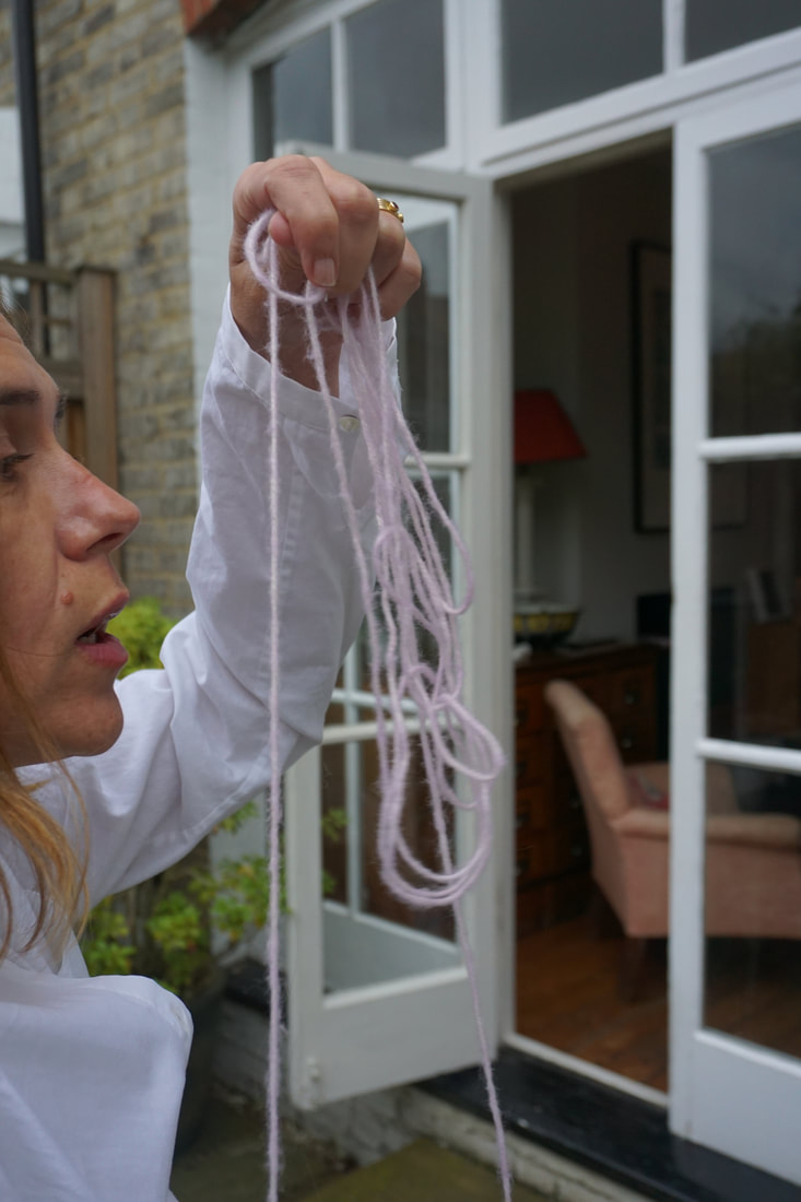
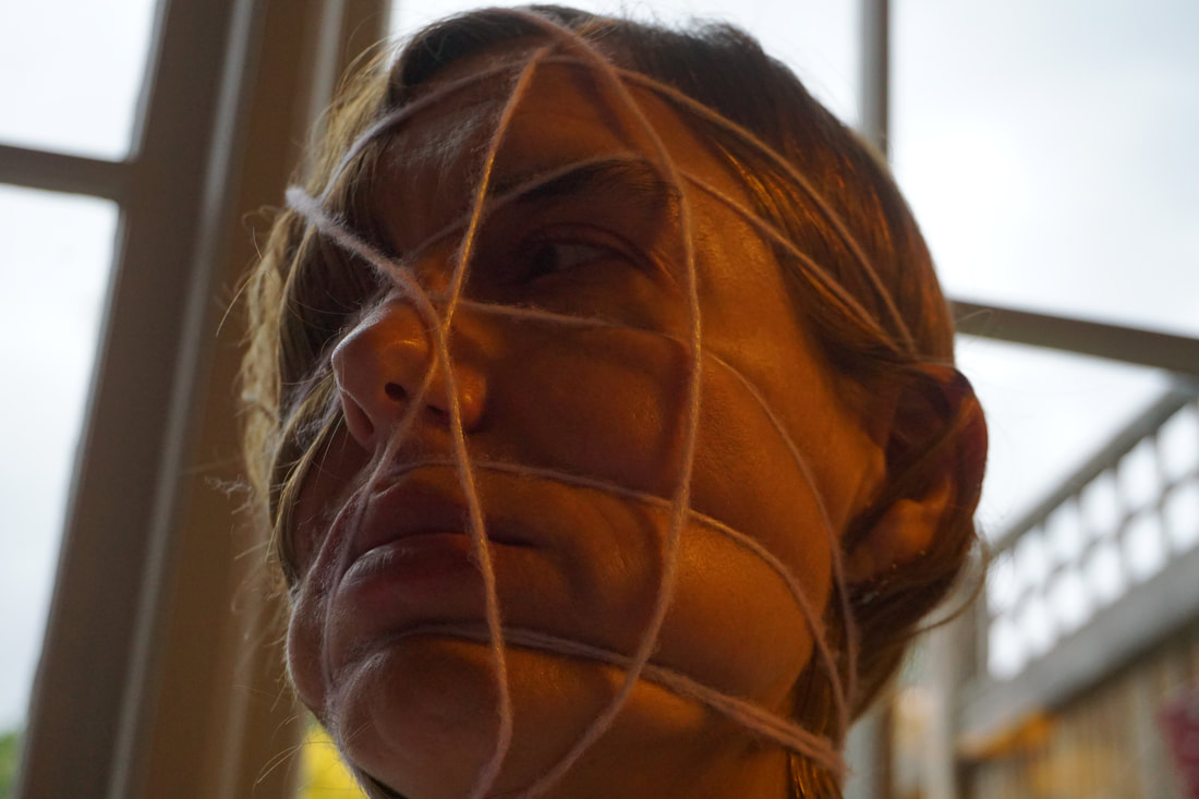
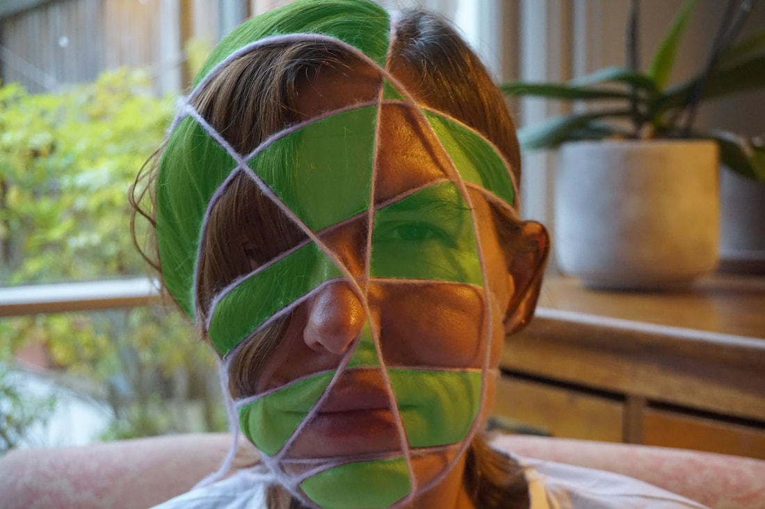
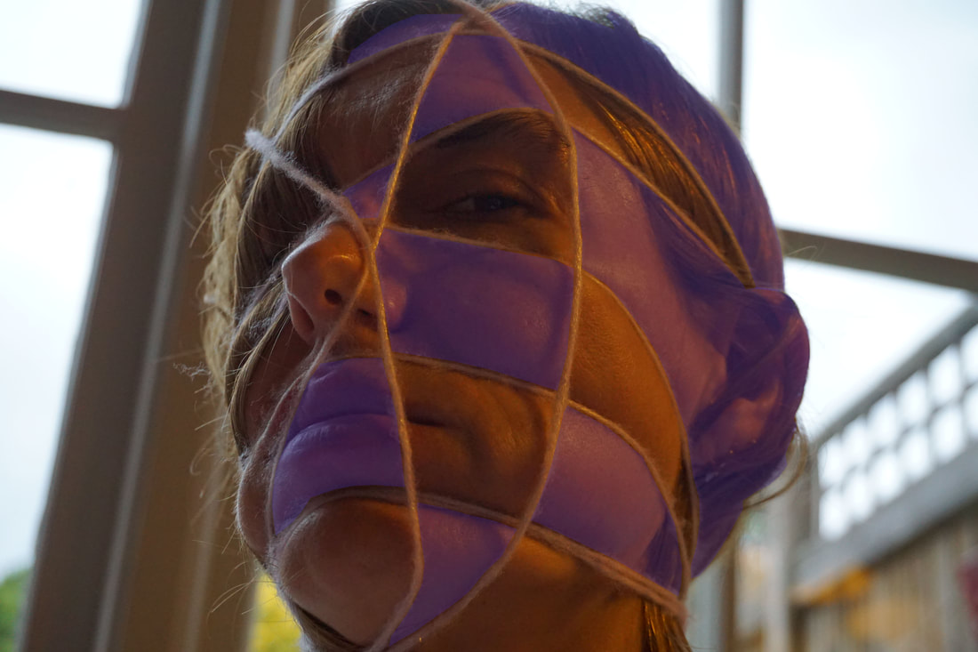
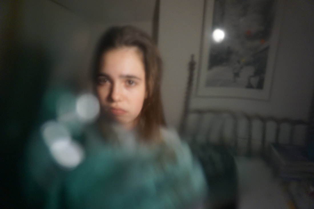
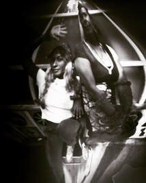
After looking back on my first photoshoot inspired by Wes Naman, I decided to take a less extreme response than using celetape. For this shoot I had a different model and used string to wrap around the models face. I tried to use different sceneries to vary the lighting. I chose to use string because it provided the effect I required without hurting the model but at the same time managed to cut up the face into sections, distorting the texture of the face, creating a wave like form across the face. I thought of using different coloured string but I cam to the conclusion that my work is not looking at the string but the way the face can be distorted.
After looking back on my first photoshoot inspired by Wes Naman, I decided to take a less extreme response than using celetape. For this shoot I had a different model and used string to wrap around the models face. I tried to use different sceneries to vary the lighting. I chose to use string because it provided the effect I required without hurting the model but at the same time managed to cut up the face into sections, distorting the texture of the face, creating a wave like form across the face. I thought of using different coloured string but I cam to the conclusion that my work is not looking at the string but the way the face can be distorted.
|
|
|
|
|
EDITS:
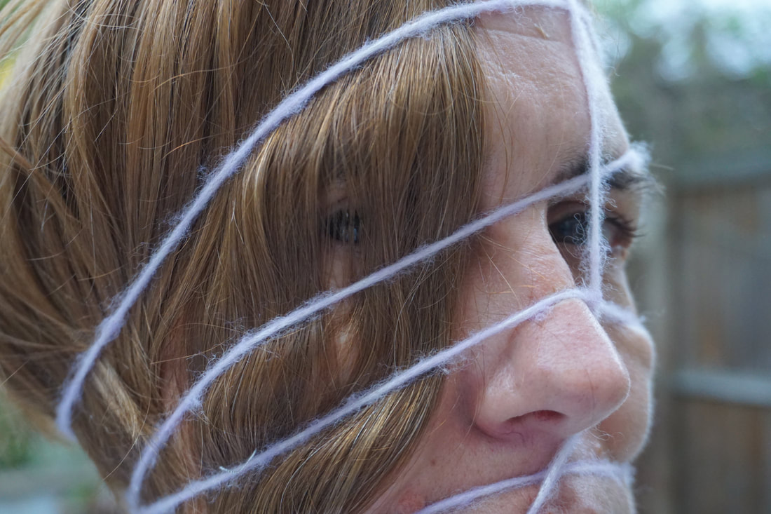
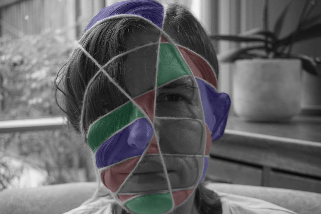
Instead of using different coloured string I decided to take a different approach and colour in different sections of the grid like face. I experimented using different colours and making the image black and white. However by making sections of the face a darker, flatter colour I came to realise that I liked the way that these coloured sections almost look flat. This gives the images a contrast between flat surfaces to the bulging of the skin which have not been coloured.
Instead of using different coloured string I decided to take a different approach and colour in different sections of the grid like face. I experimented using different colours and making the image black and white. However by making sections of the face a darker, flatter colour I came to realise that I liked the way that these coloured sections almost look flat. This gives the images a contrast between flat surfaces to the bulging of the skin which have not been coloured.
|
|
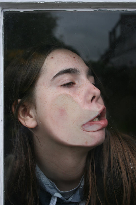
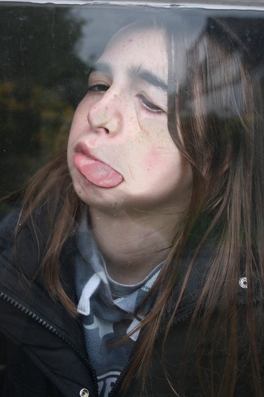
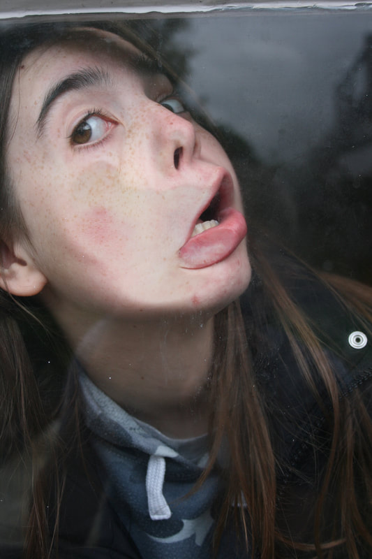
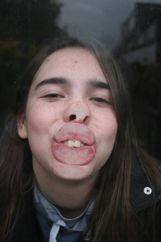
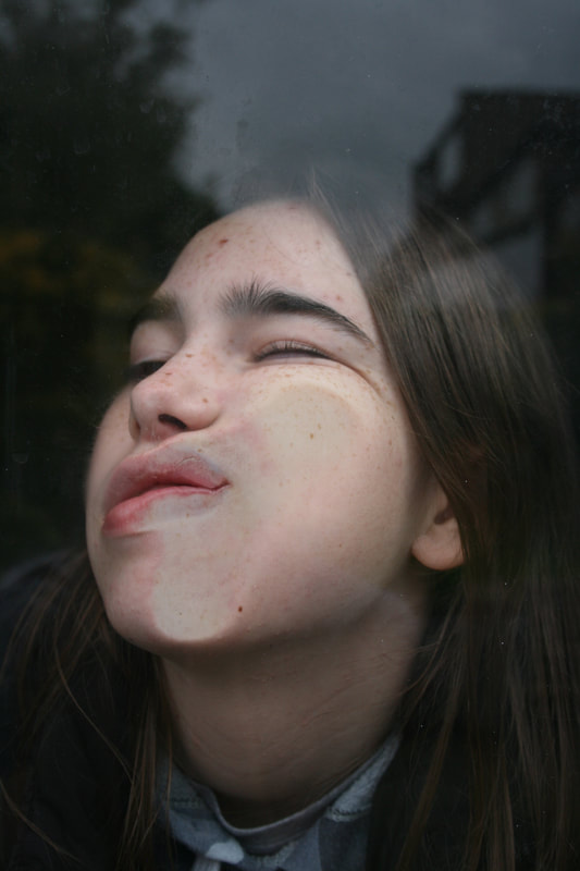
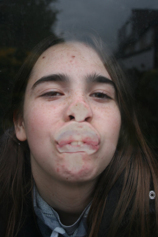
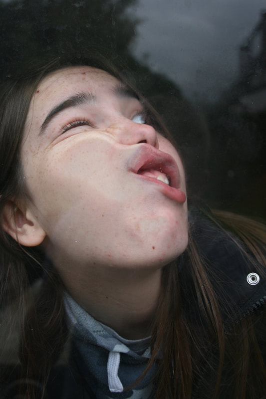
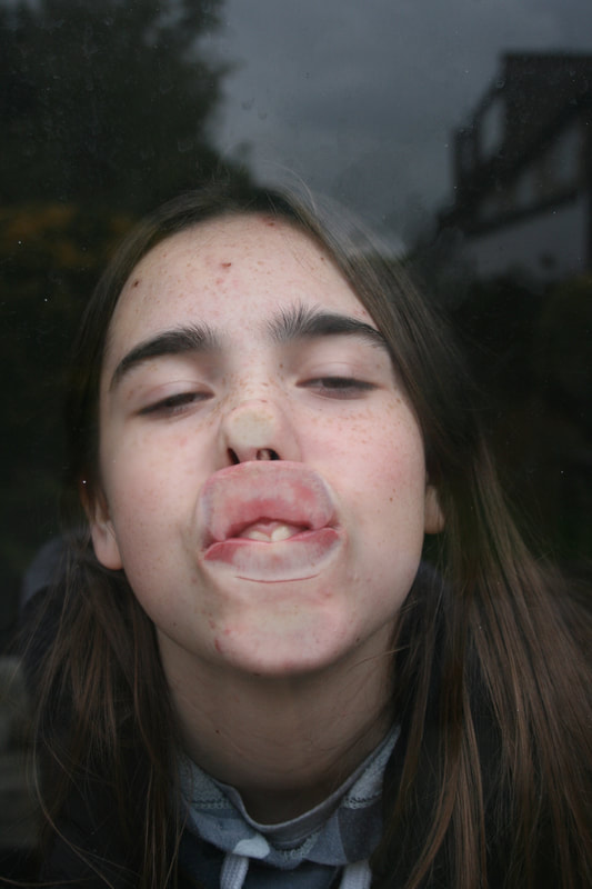
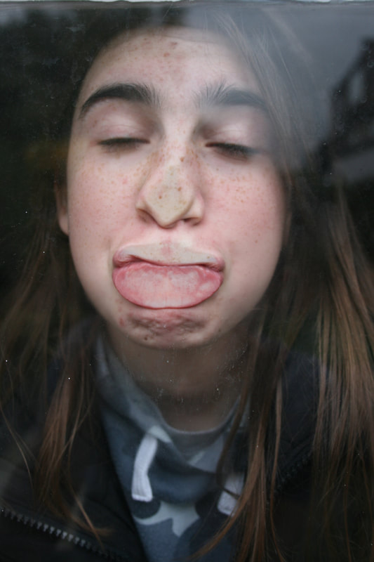
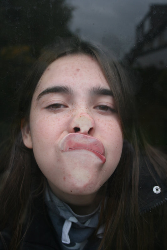
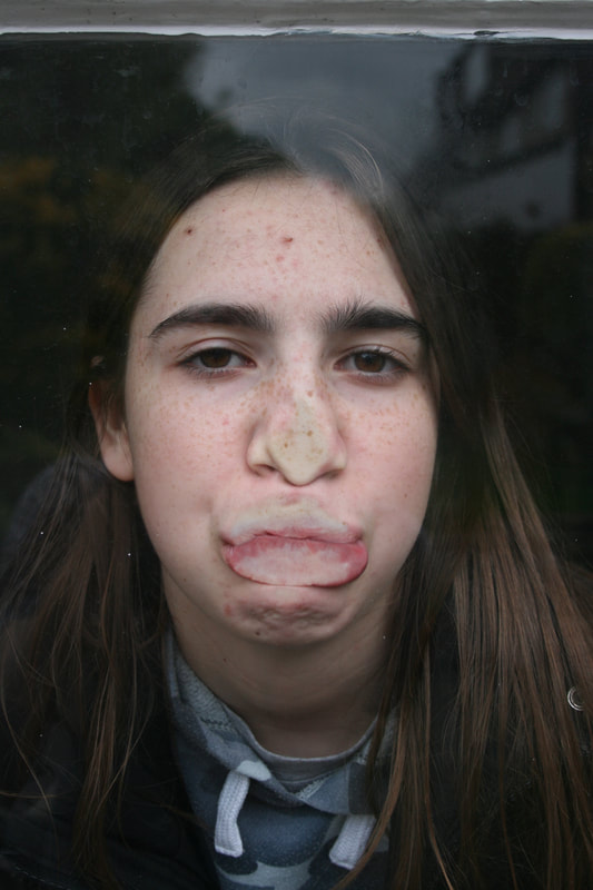
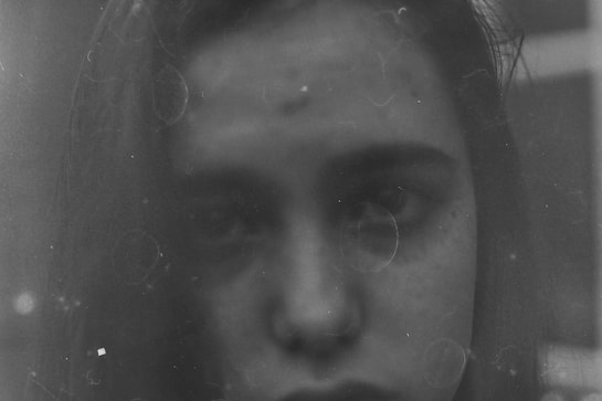
THIRD RESPONSE:
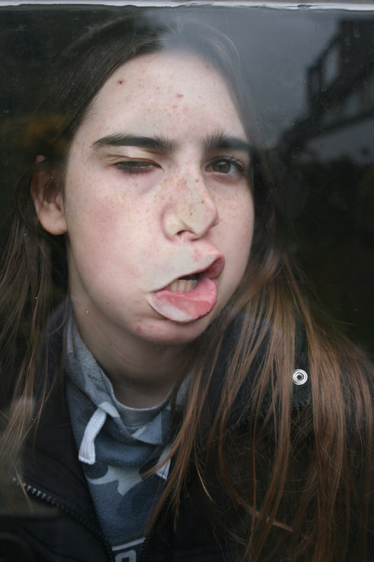
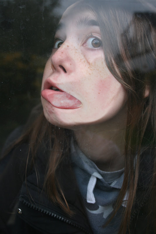
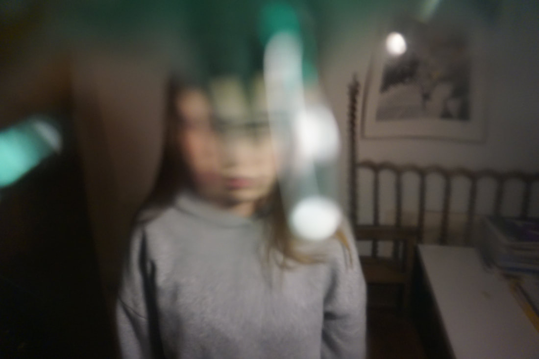
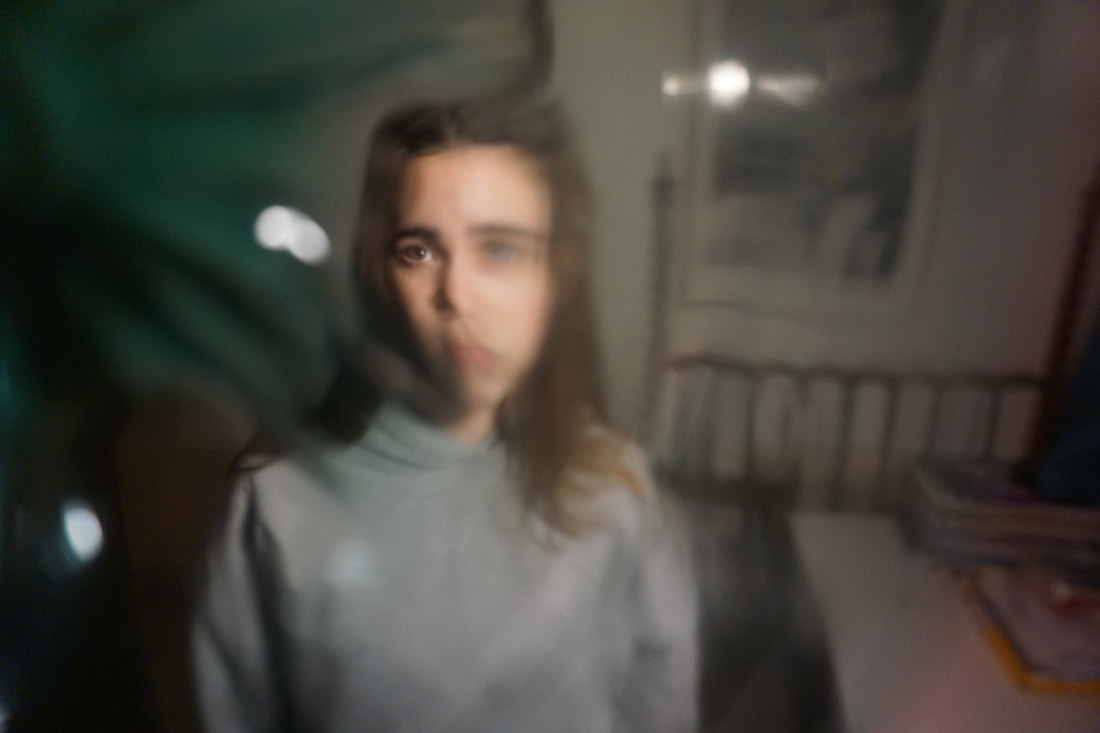
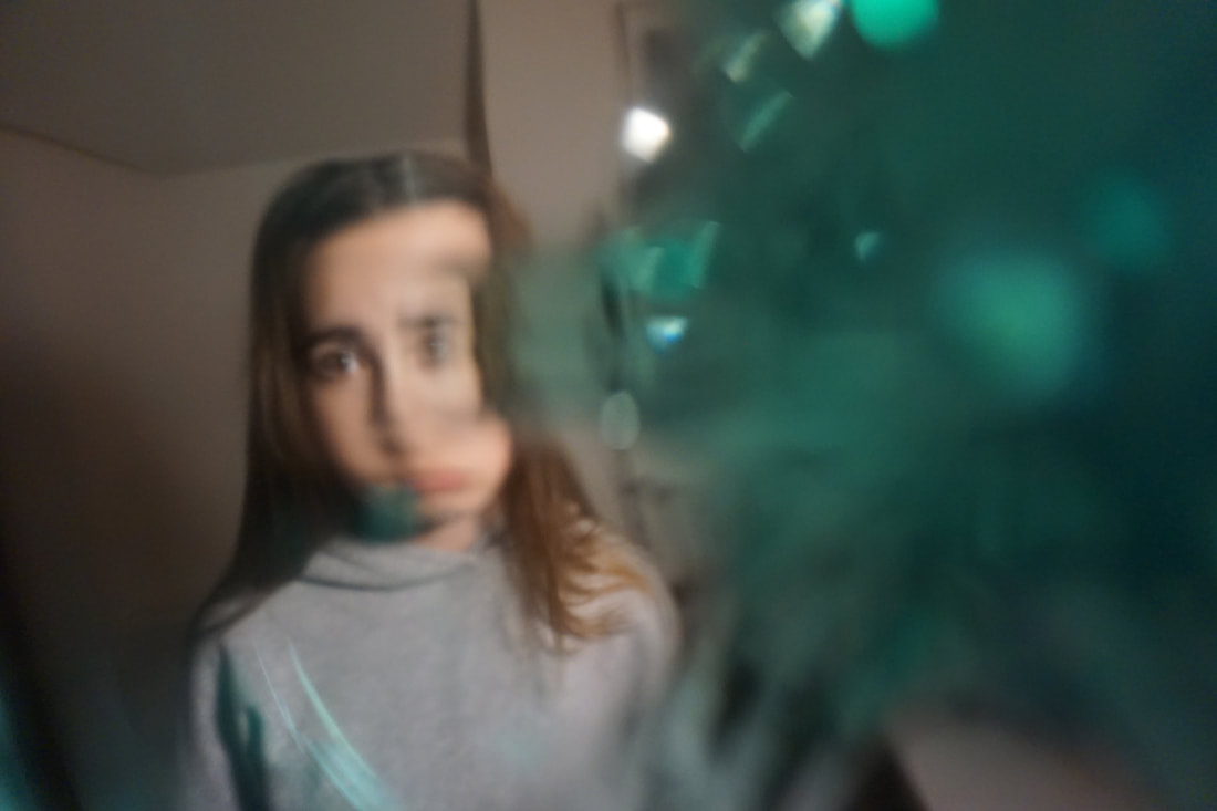
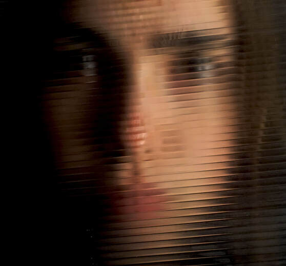
After reflecting on my previous shoot and coming to the conclusion that I liked the flat texture created, I began to think of other ways of creating a contrast between the flat and the undulating. So I came up with the idea to create this balance by pressing the models face against glass. Through this means of physical distortion I was able to create the balance I was looking for.
After reflecting on my previous shoot and coming to the conclusion that I liked the flat texture created, I began to think of other ways of creating a contrast between the flat and the undulating. So I came up with the idea to create this balance by pressing the models face against glass. Through this means of physical distortion I was able to create the balance I was looking for.
|
|
|
|
EDITS:
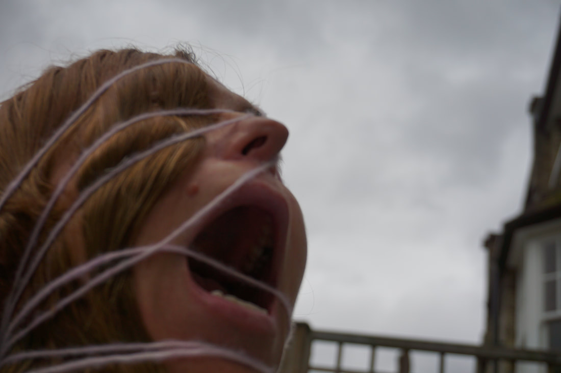
After looking at my photoshoot i decided to add some geometry to attempt to create some contrast in the image from the mangled face to straight lines. To do this i put the image into Photoshop and used the line tool to add light pink lines to the image. I layered the lines onto of the image however did not go over the face. This was an attempt to bring forward the face and keep the rest as background. I feel like this was not successful though. This could be due to the colour choice i chose the line to be as it is faint and gets lost, or maybe it is because the lines were too thin.
After looking at my photoshoot i decided to add some geometry to attempt to create some contrast in the image from the mangled face to straight lines. To do this i put the image into Photoshop and used the line tool to add light pink lines to the image. I layered the lines onto of the image however did not go over the face. This was an attempt to bring forward the face and keep the rest as background. I feel like this was not successful though. This could be due to the colour choice i chose the line to be as it is faint and gets lost, or maybe it is because the lines were too thin.
|
|
EDITS:
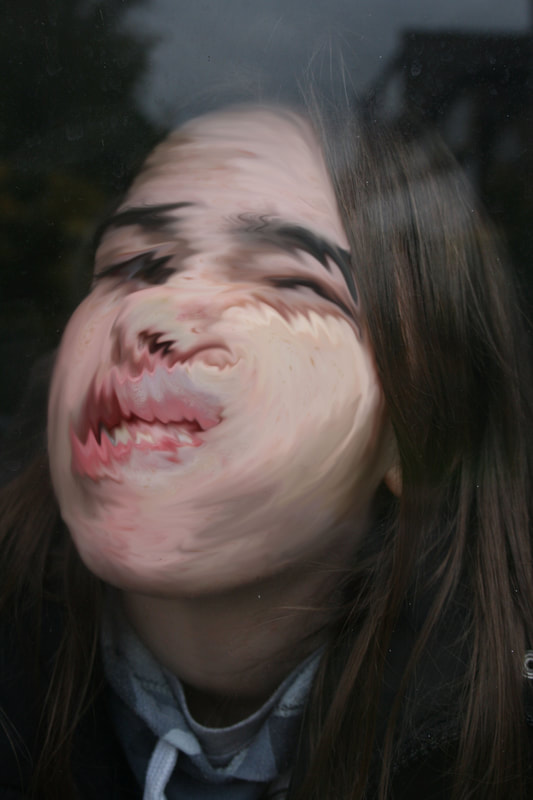
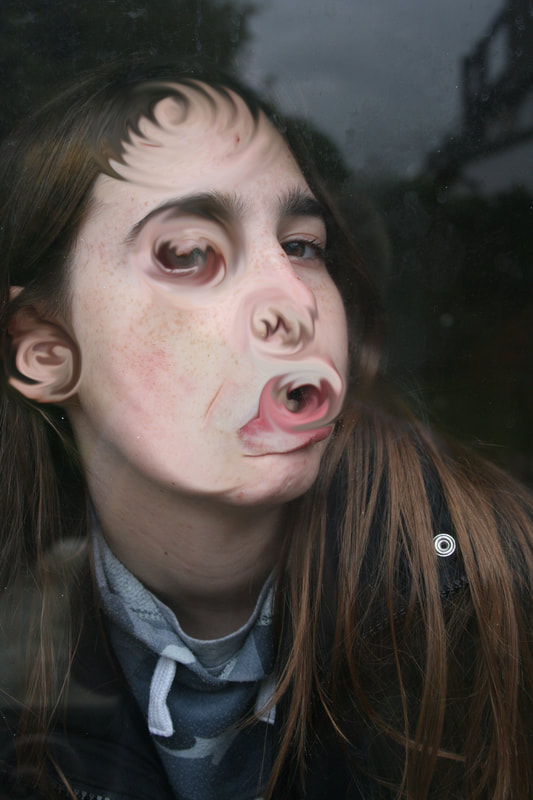
After looking at my shoot and the way I physically distorted the models face I began to think of other ways to distort it, not necessarily using physical means. So I played around with tools on photoshop, creating interesting and unique swirling patterns using the blur tool.
After looking at my shoot and the way I physically distorted the models face I began to think of other ways to distort it, not necessarily using physical means. So I played around with tools on photoshop, creating interesting and unique swirling patterns using the blur tool.
|
|
FOURTH RESPONSE:
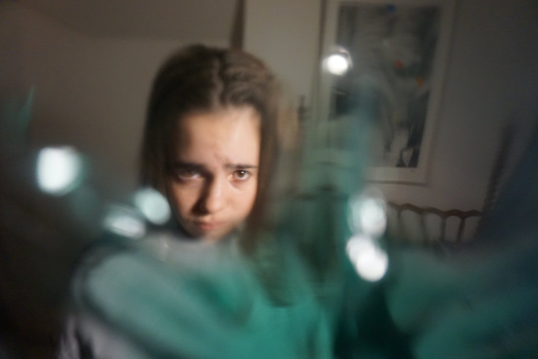
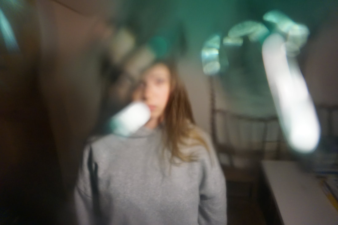
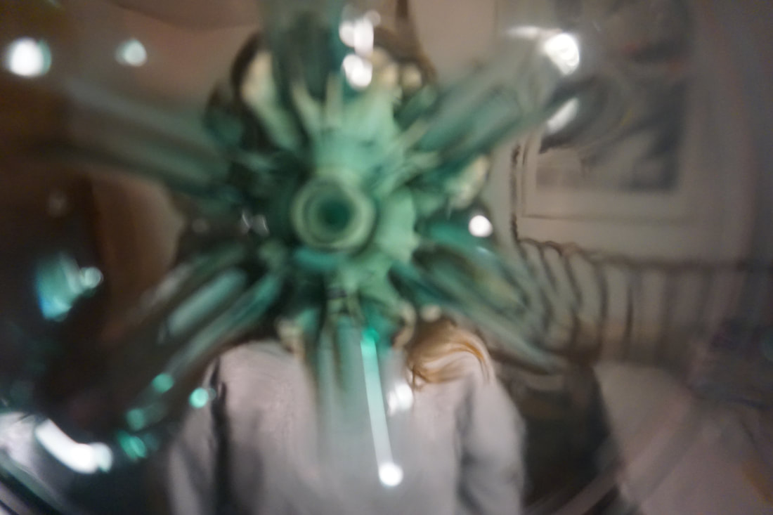
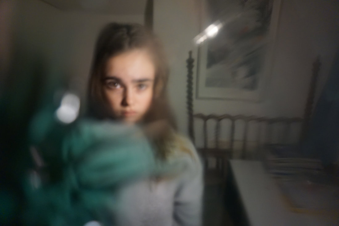
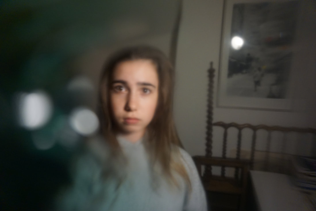
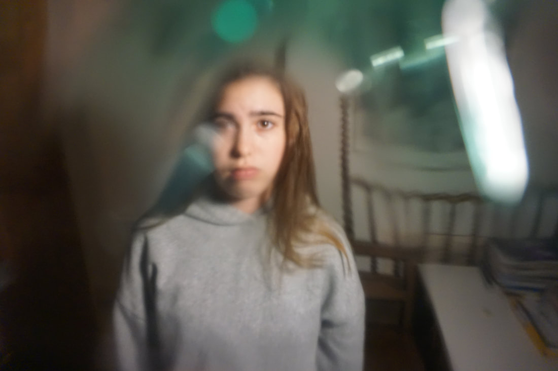
Reflecting on my previous response when I had used glass to physically distort my sisters face, I decided to take a different approach. For this shoot I cut a plastic bottle in half and used the bottom end of it to put over the camera lens. I then articulated the bottle, rotating it around to distort the models face.
Reflecting on my previous response when I had used glass to physically distort my sisters face, I decided to take a different approach. For this shoot I cut a plastic bottle in half and used the bottom end of it to put over the camera lens. I then articulated the bottle, rotating it around to distort the models face.
|
|
|
|
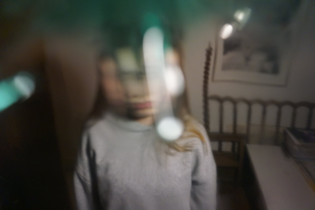
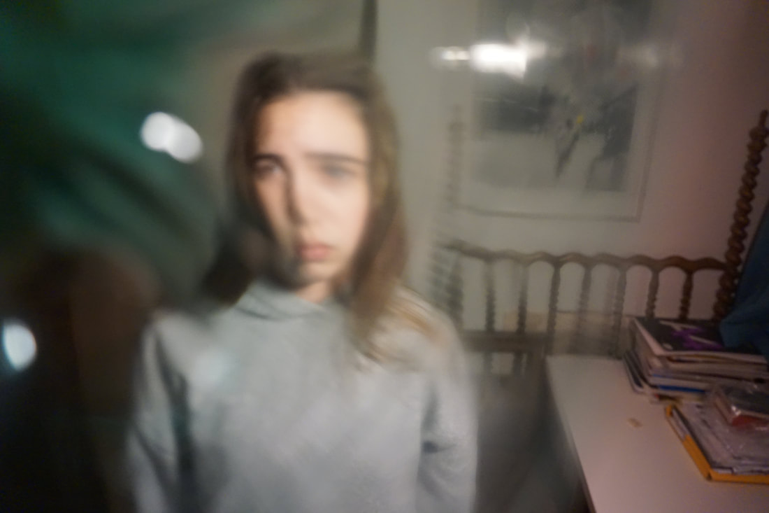
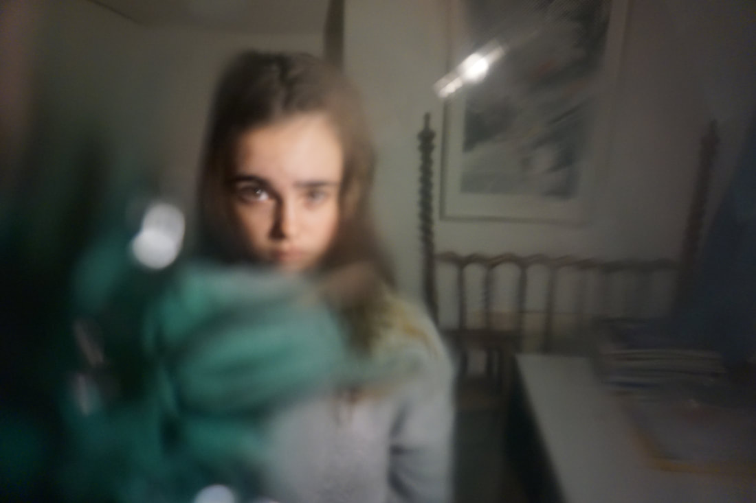
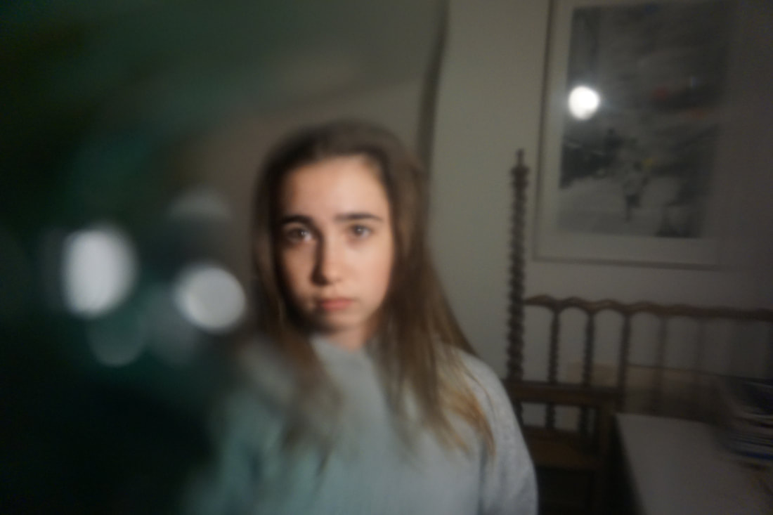
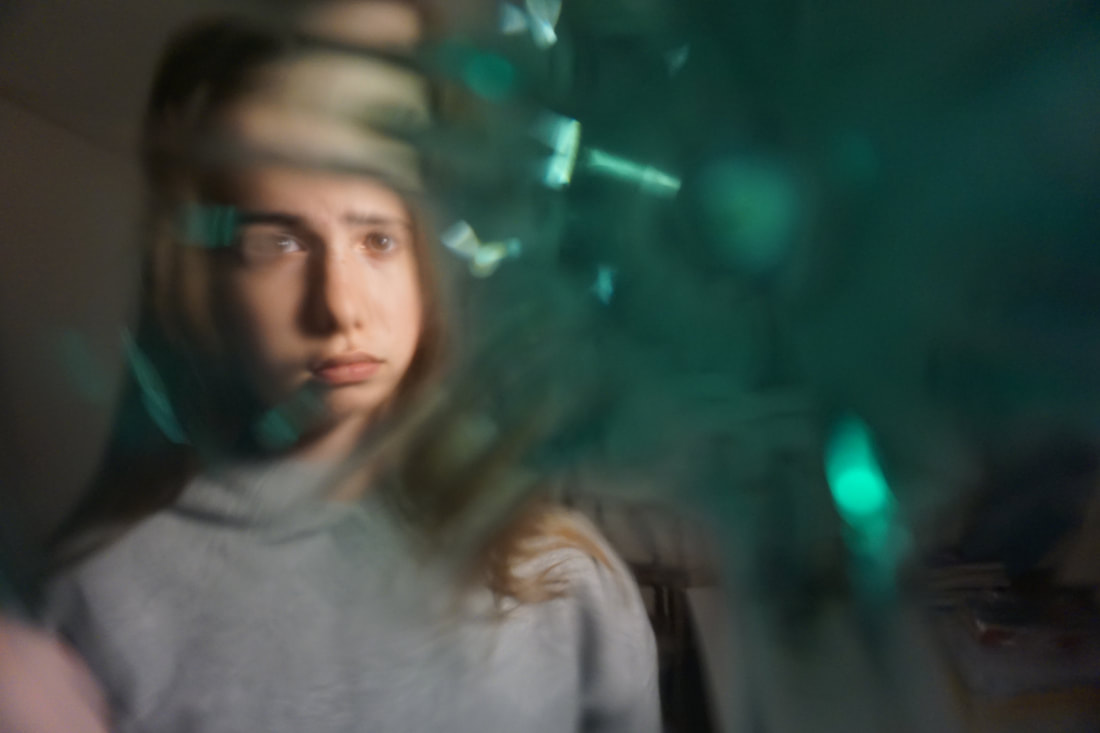
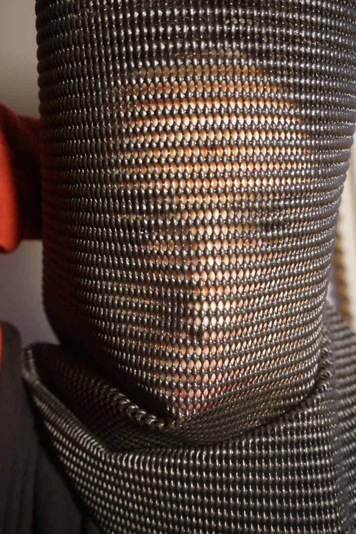
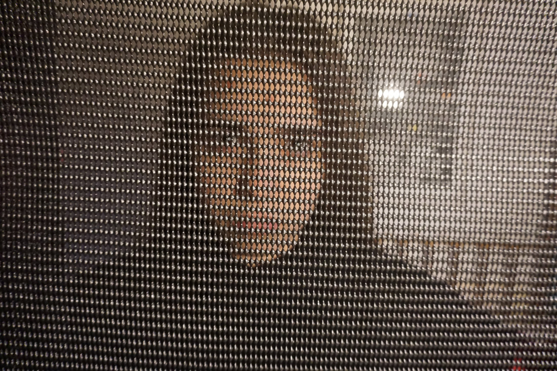
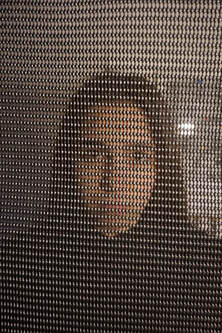
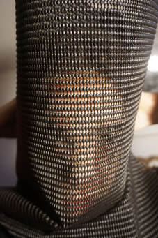
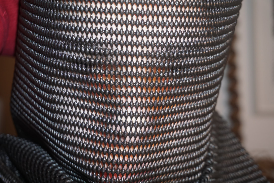
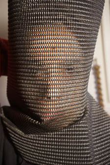
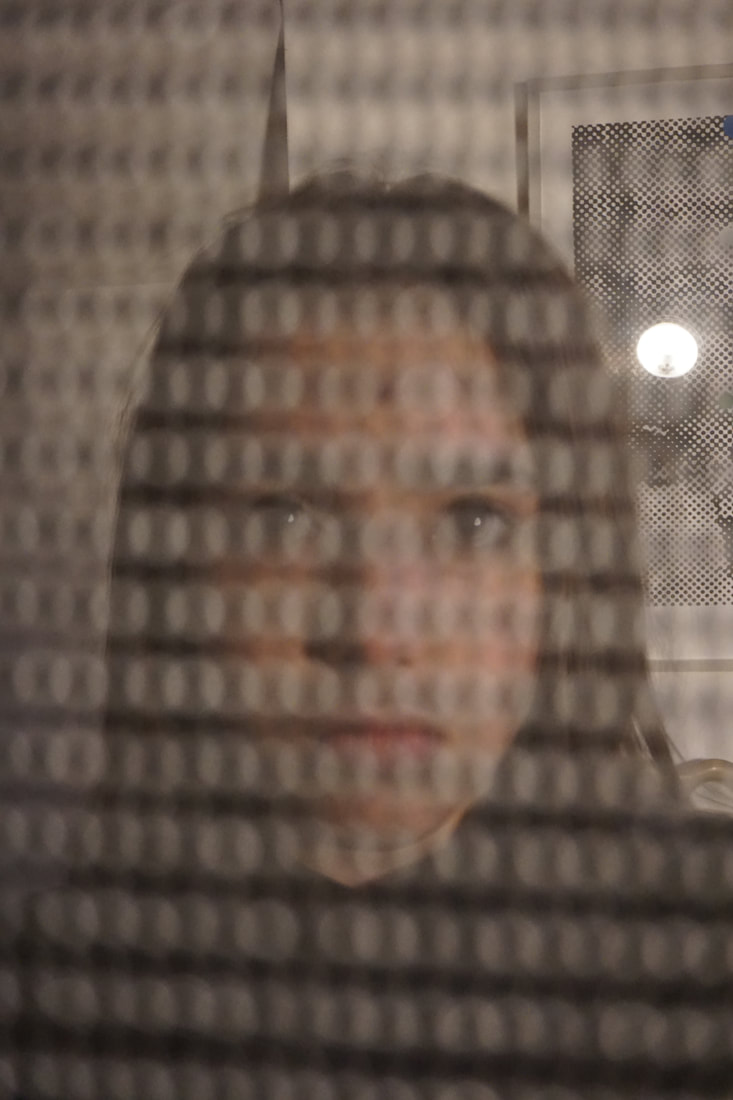
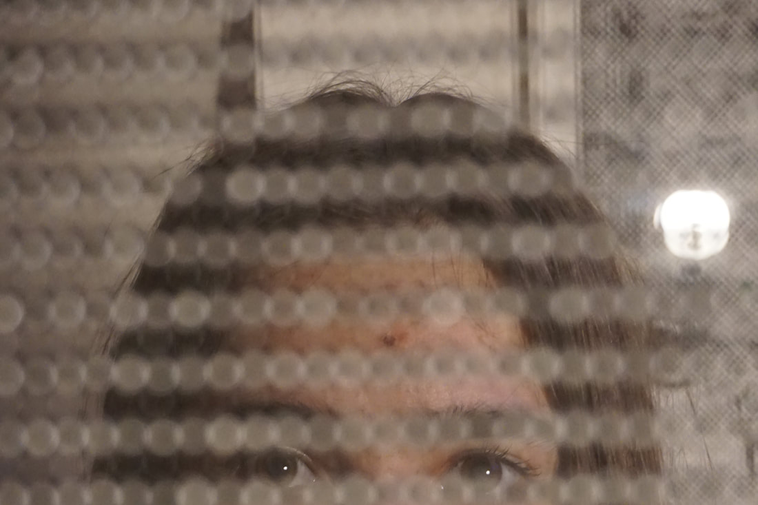
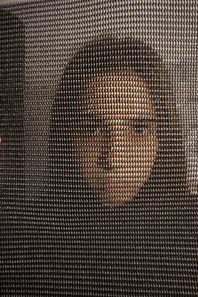
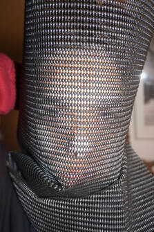
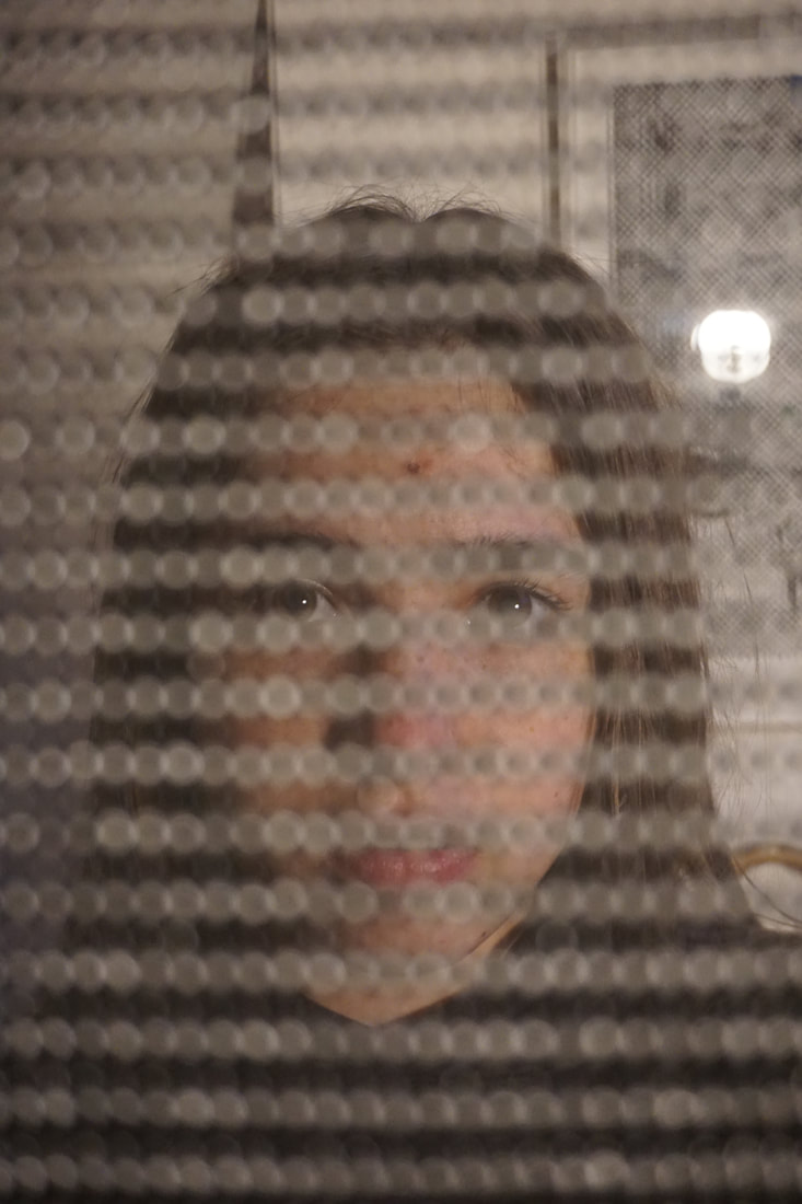
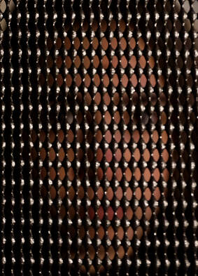
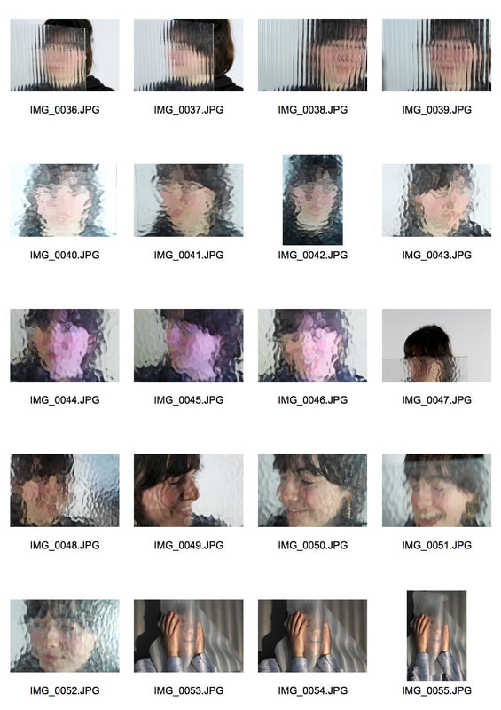
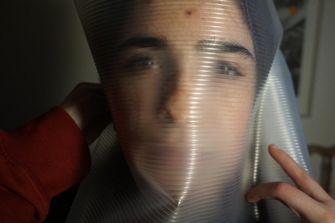
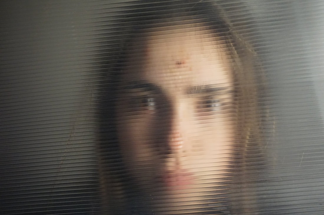
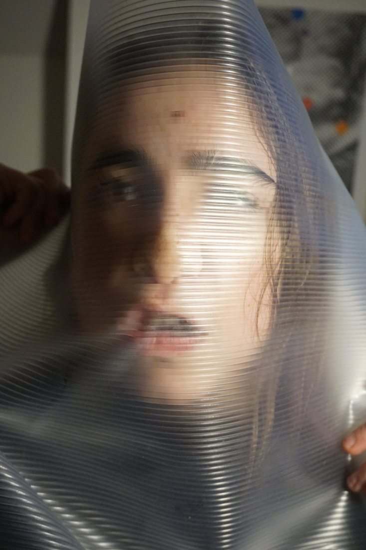
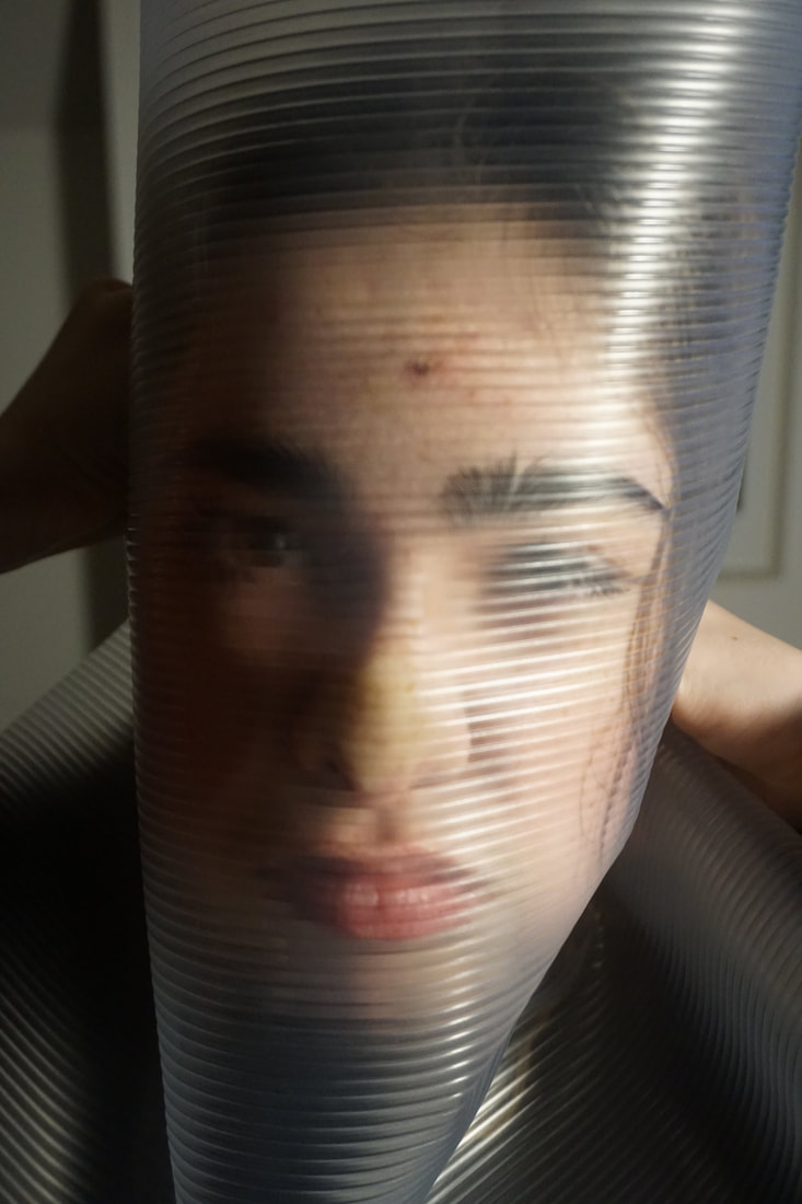
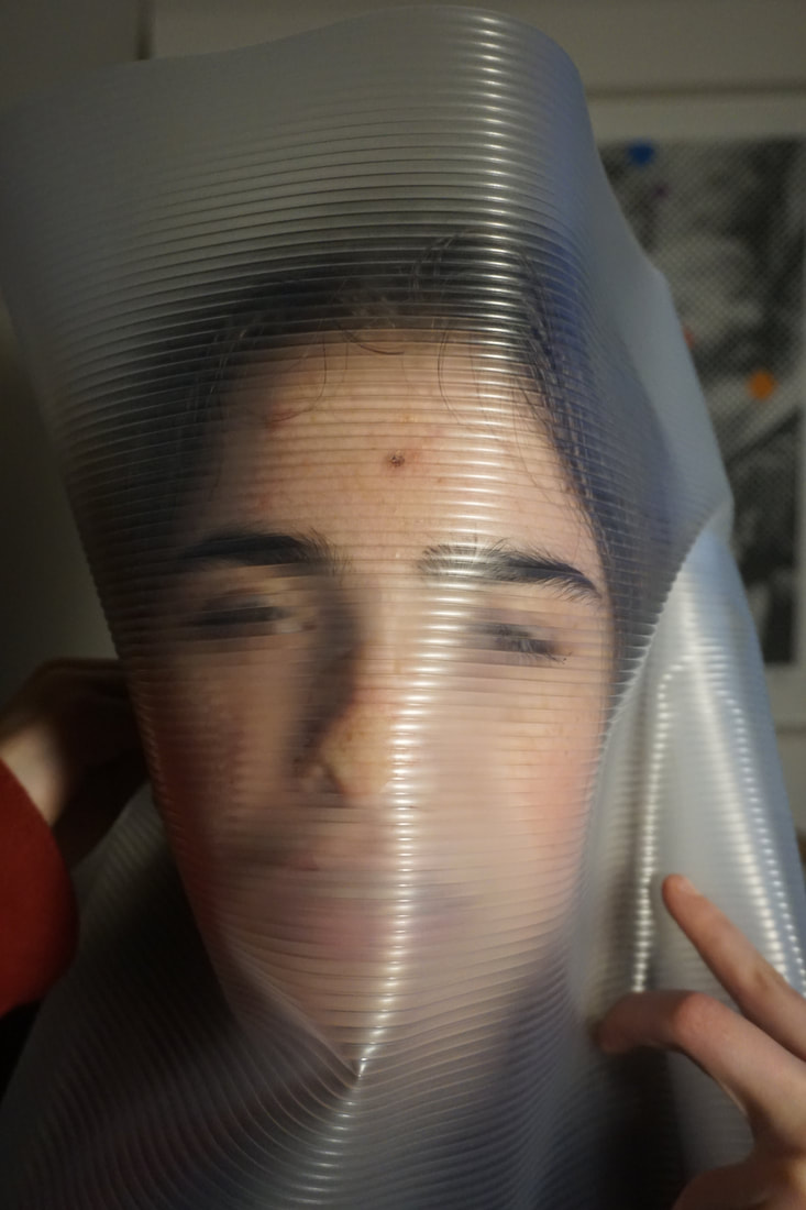
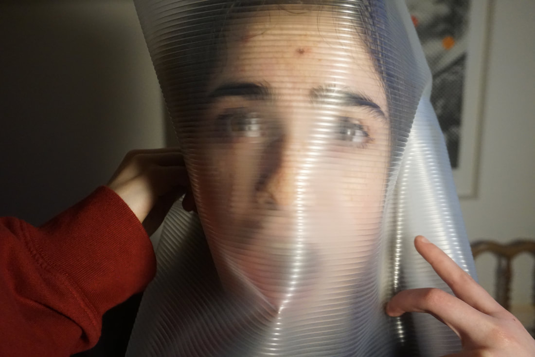
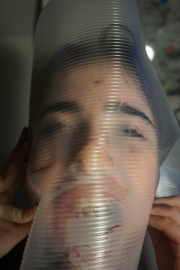
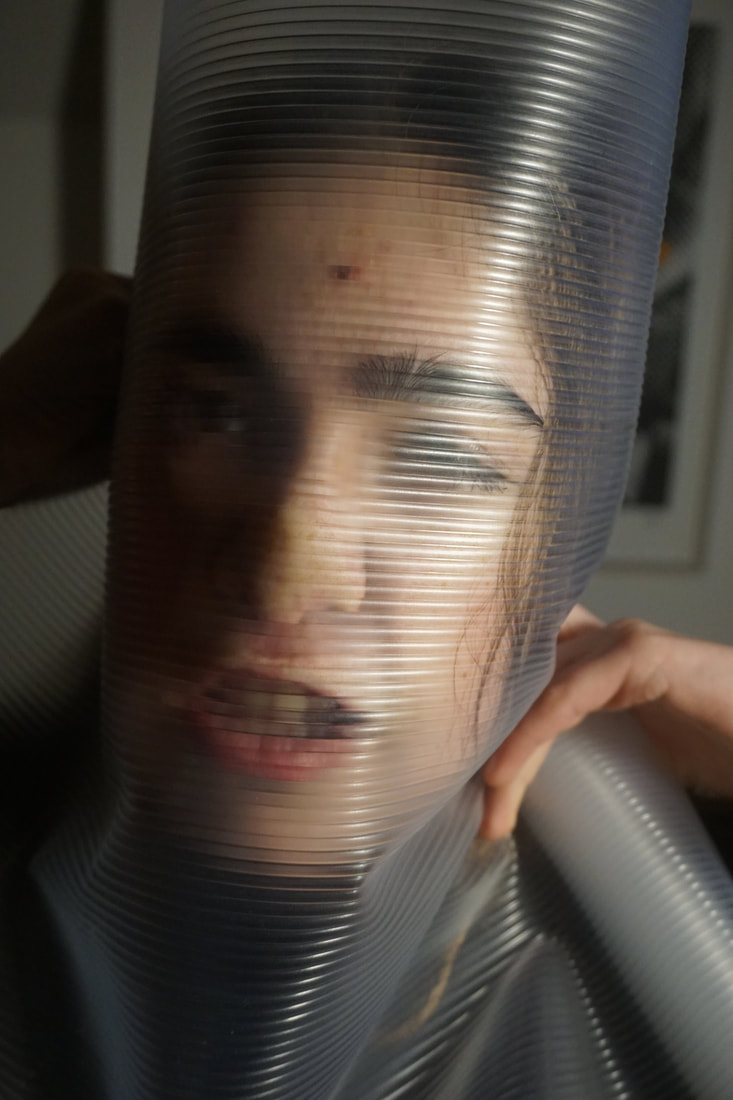
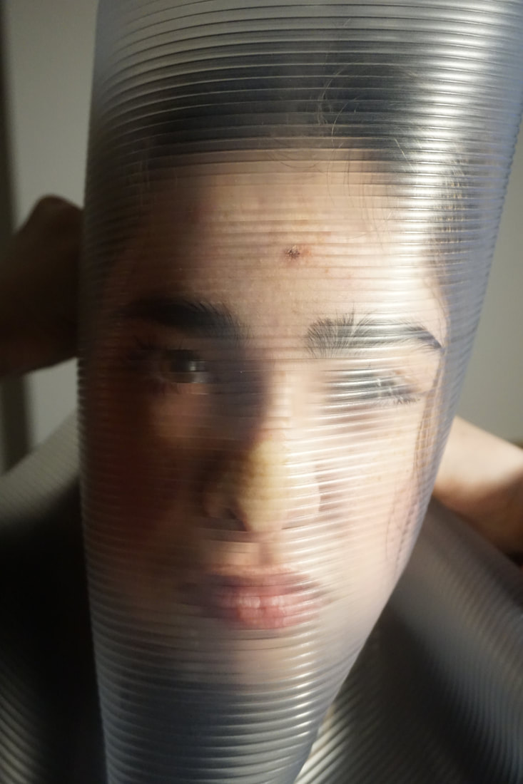
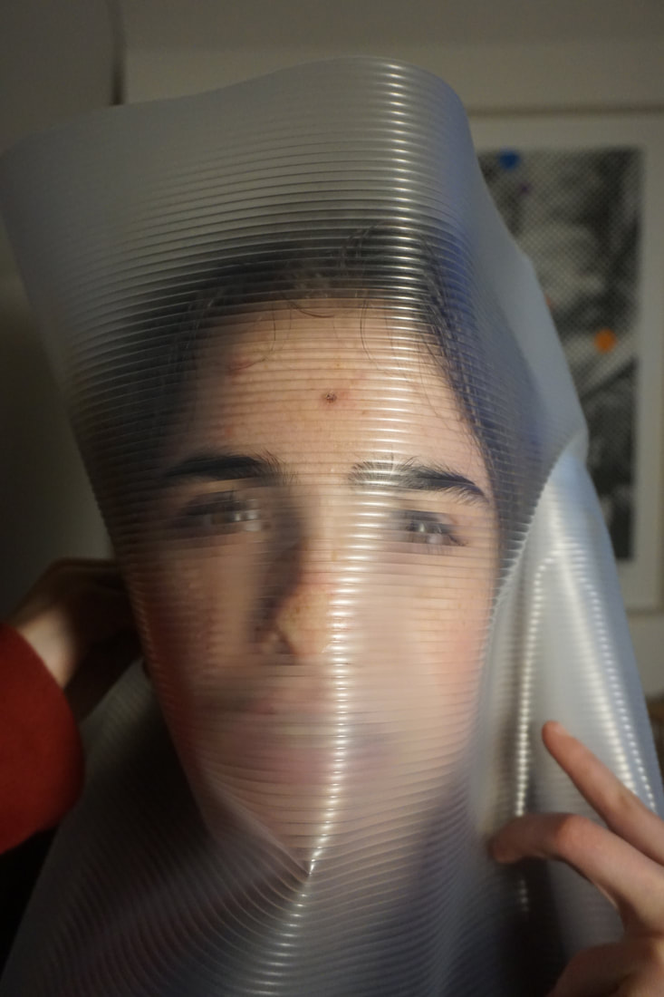
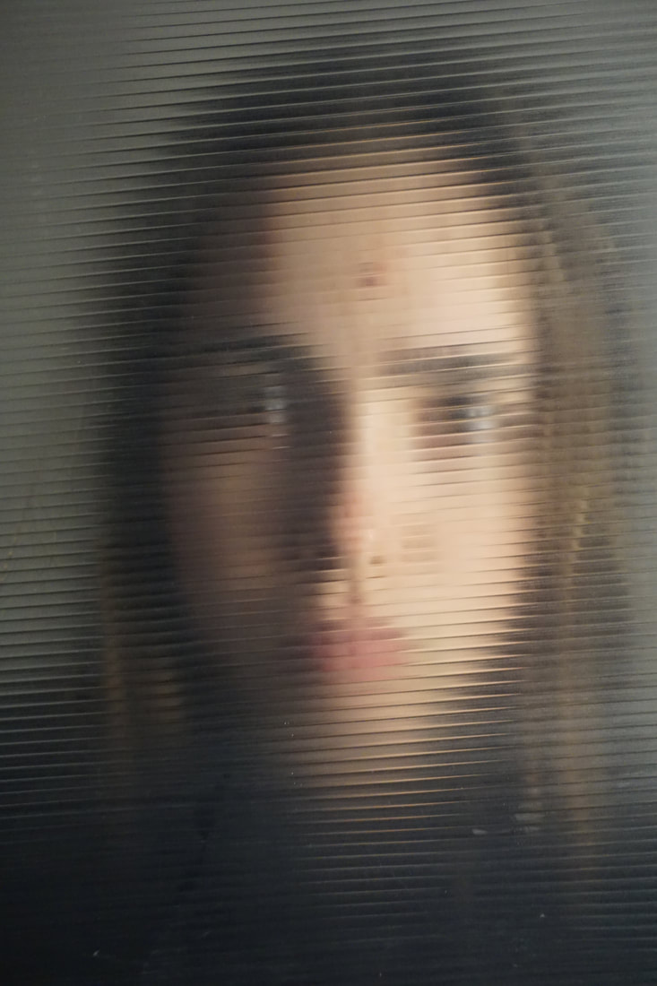
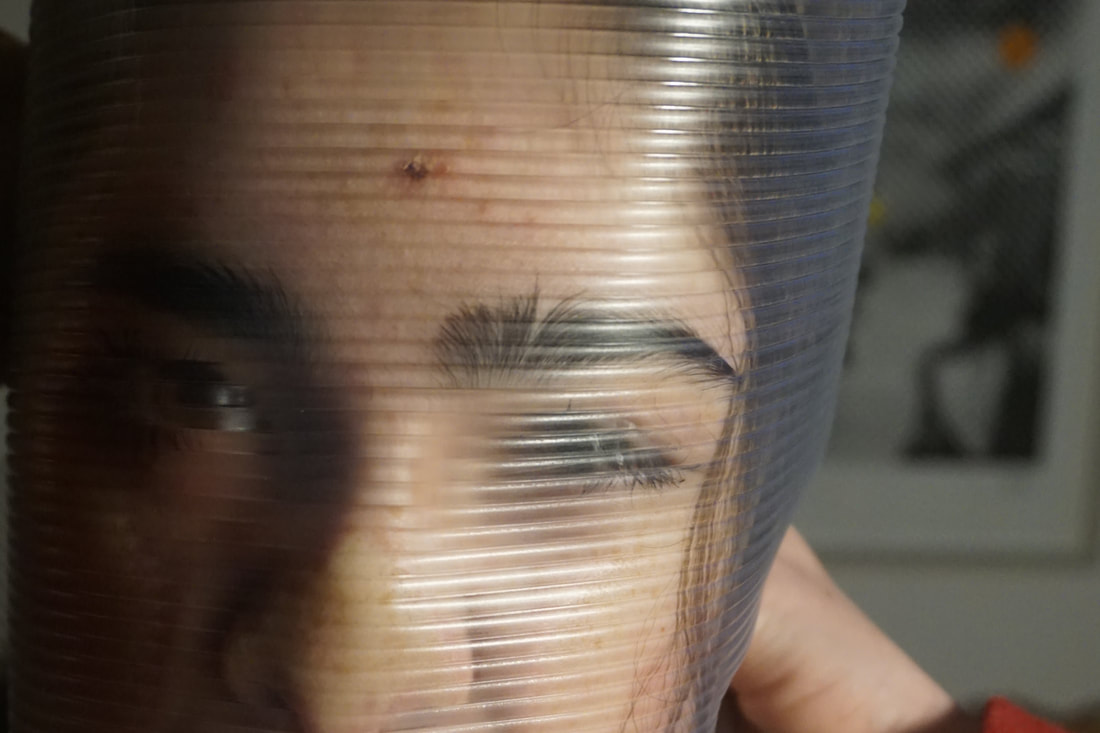
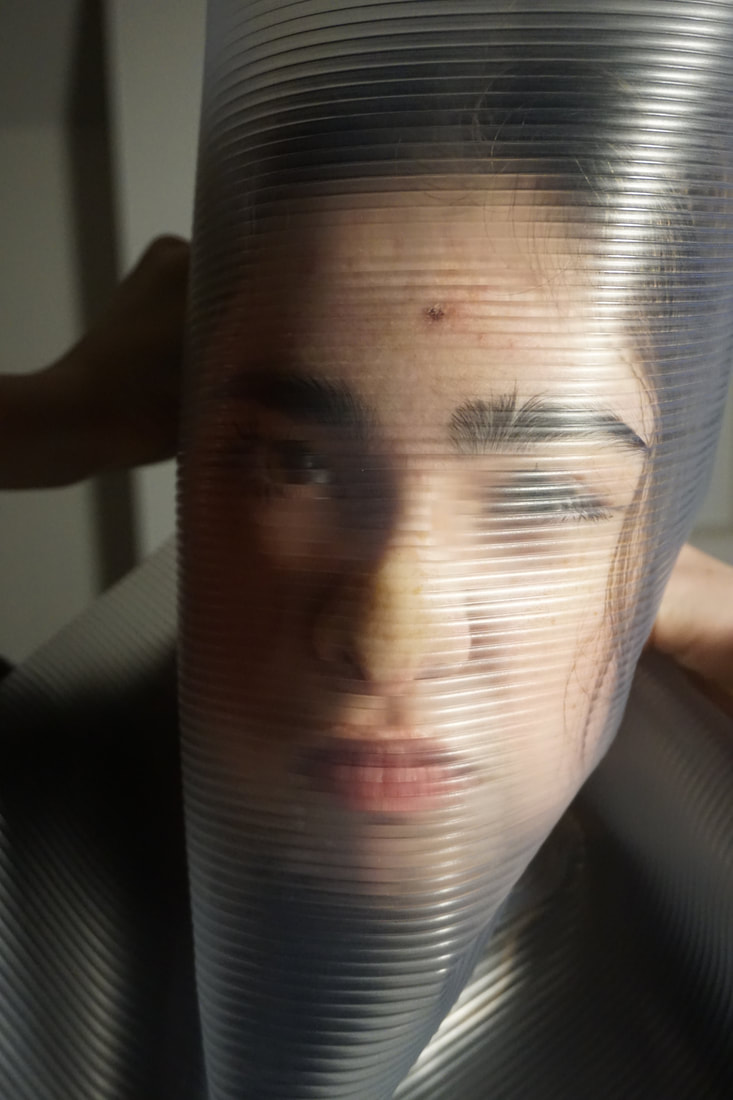
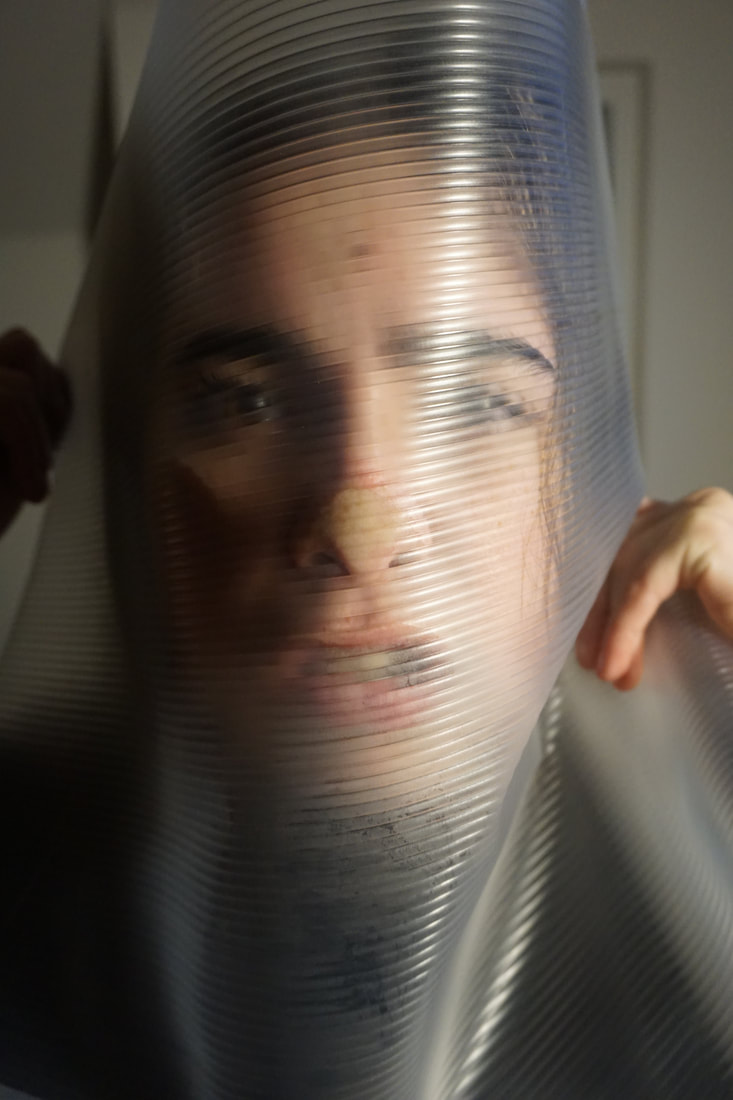
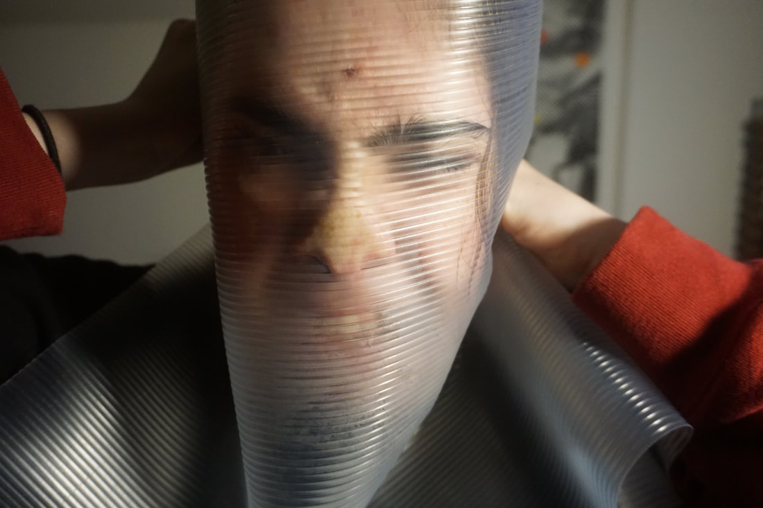
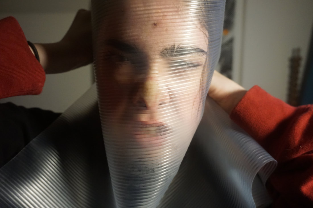
FIFTH RESPONSE:
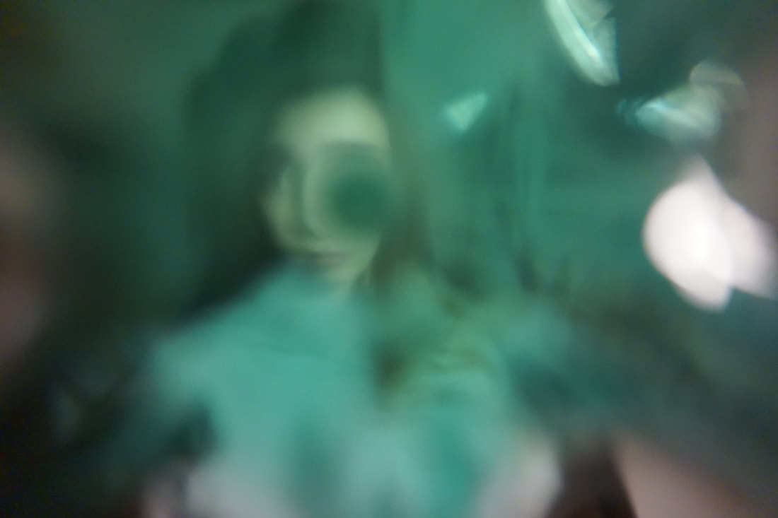
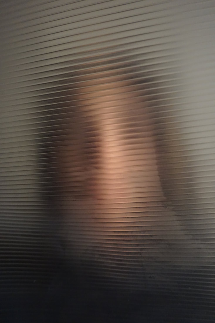
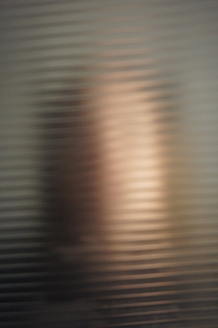
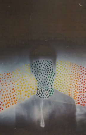
For this shoot I used a perforated plastic sheet and held it in front of the models face. I then took a series of portraits experimenting with the effects created when I moved the sheet closer to the lens. I tried to make the camera focus on the small black dots and other times the face to see the difference in the images i will get. I felt like the images that captured the face more clear were stronger as the black dots had been blurred out making it hard to determine what they actually giving the image a nice effect.
For this shoot I used a perforated plastic sheet and held it in front of the models face. I then took a series of portraits experimenting with the effects created when I moved the sheet closer to the lens. I tried to make the camera focus on the small black dots and other times the face to see the difference in the images i will get. I felt like the images that captured the face more clear were stronger as the black dots had been blurred out making it hard to determine what they actually giving the image a nice effect.
|
|
|

|
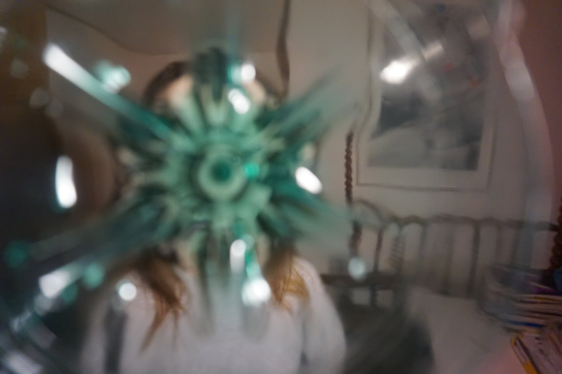
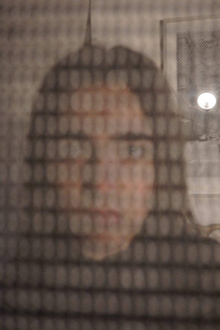
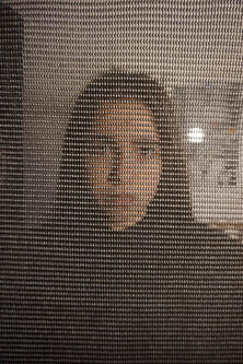
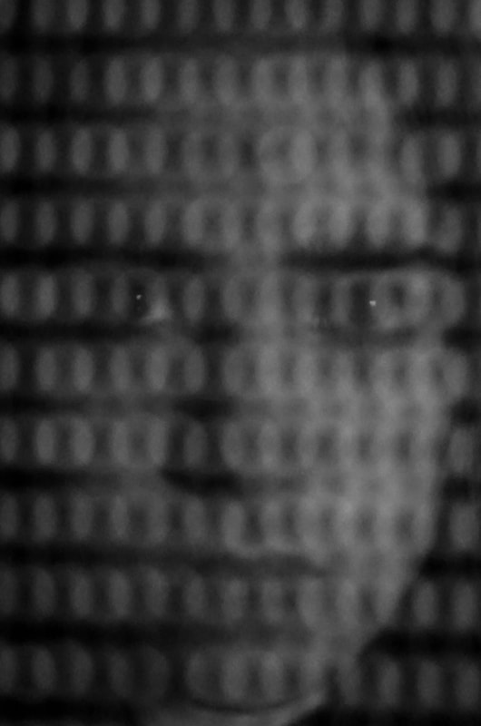
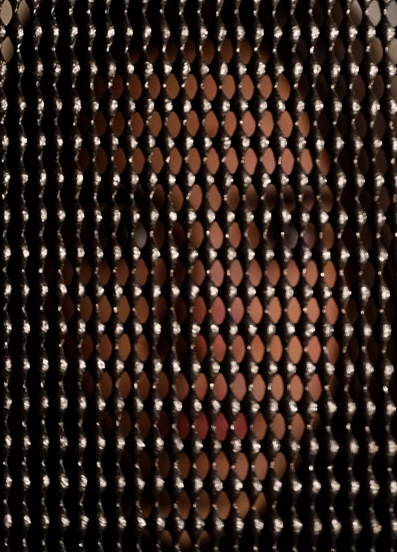
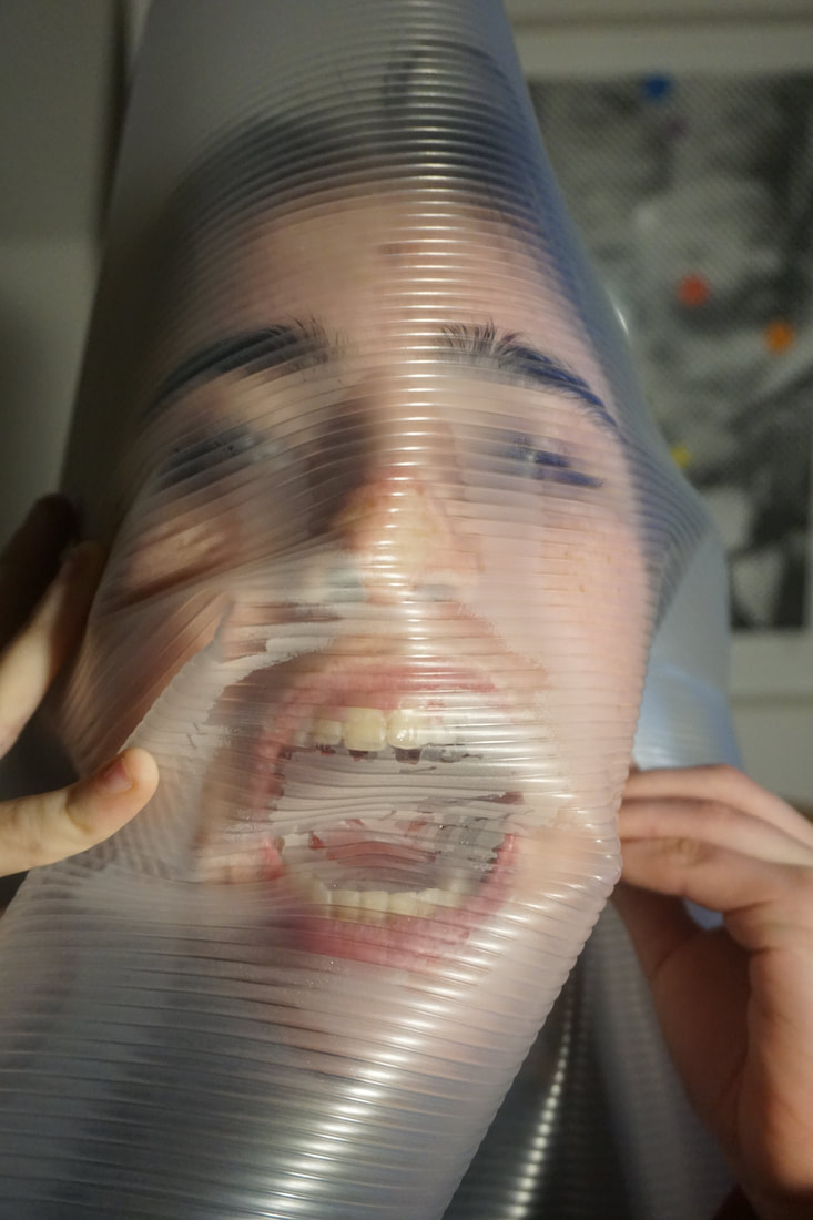
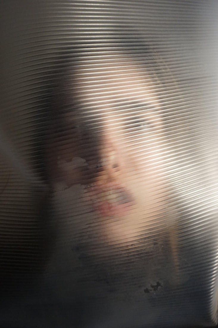
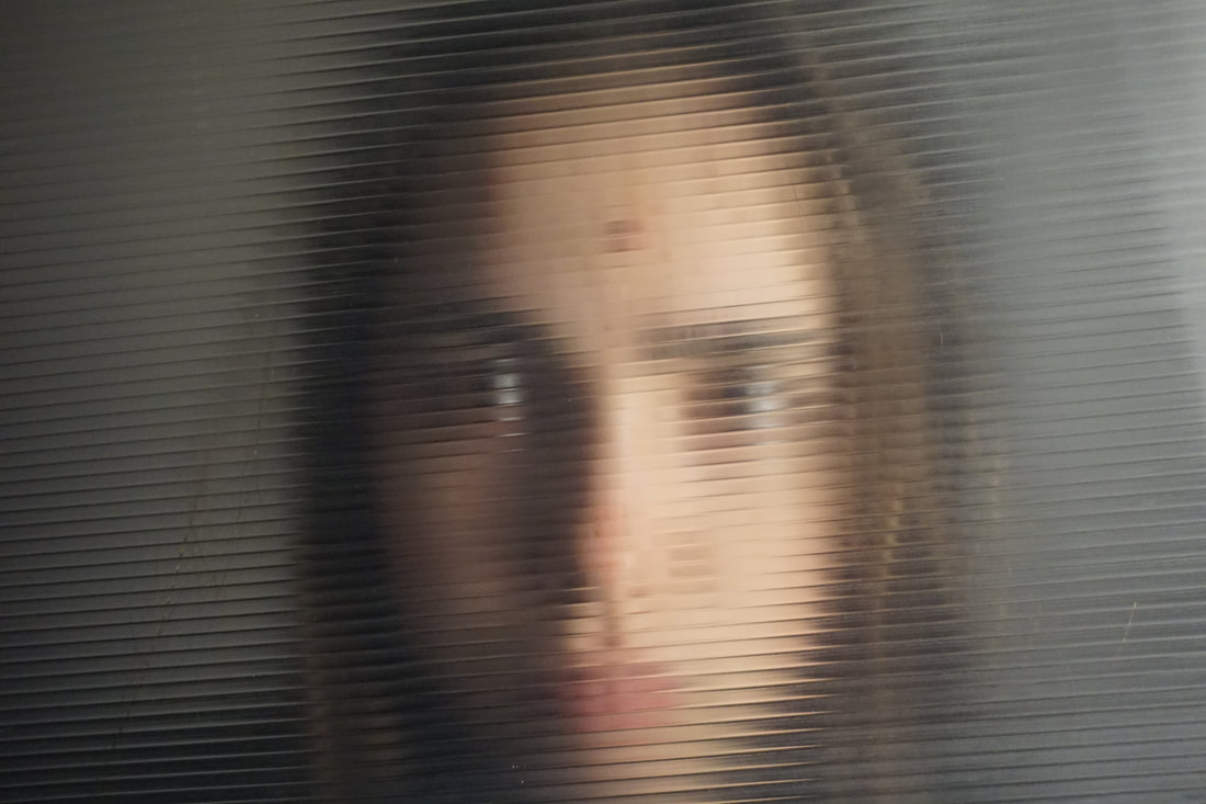
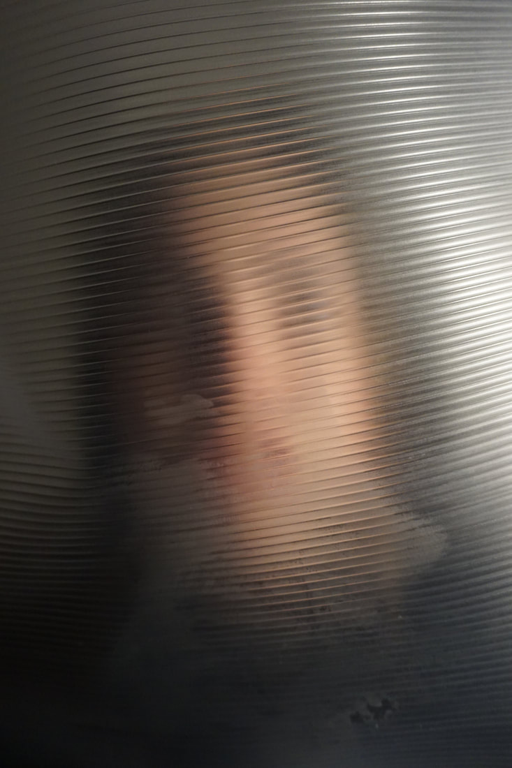
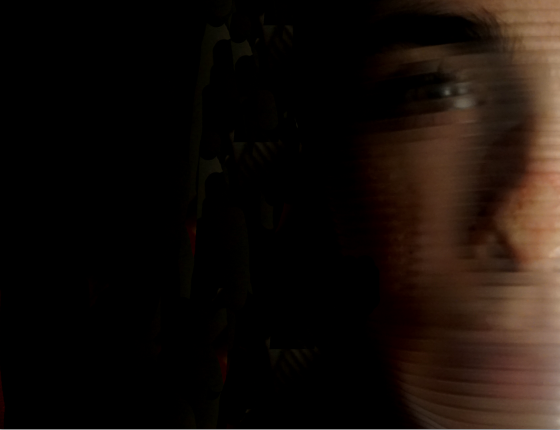
EDITS:
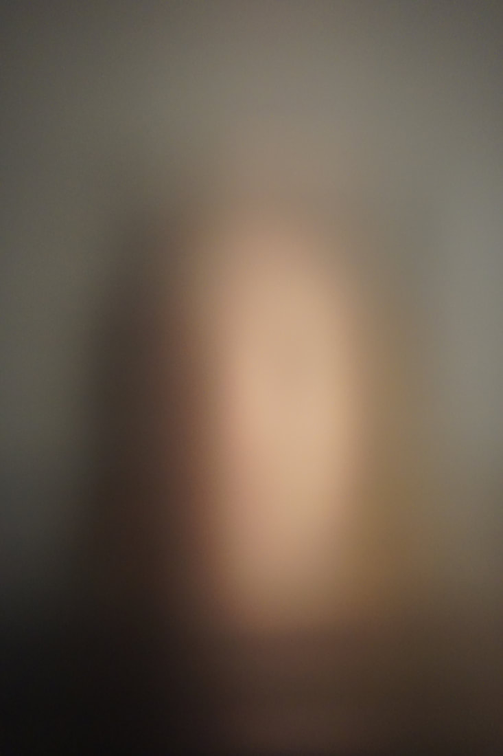
For my edits i decided to take two images, one where the camera is focused on the face and the other when it is focused on the dots, and play around with the colours and sharpness on photoshop. For the image on the left i decided to make the image sharper and raise the contrast and vibrance to bring the colours of the face through even though the camera was focused on the black dots. An element that i feel is strong in this image is the white dots of light on each black dot, this creates a sense of repetition and makes it seem as if the face is squeezing through the gaps between each black dot. For the image on the right i focused on the face. By doing this the black dots were almost lost and turned into faint circles overlapping. I turned the image into black and white using photoshop and by doing this the image lost its sharp contrast between the dots. I really like the effect created by turning it black and white and i feel it is the strongest image of this shoot.
For my edits i decided to take two images, one where the camera is focused on the face and the other when it is focused on the dots, and play around with the colours and sharpness on photoshop. For the image on the left i decided to make the image sharper and raise the contrast and vibrance to bring the colours of the face through even though the camera was focused on the black dots. An element that i feel is strong in this image is the white dots of light on each black dot, this creates a sense of repetition and makes it seem as if the face is squeezing through the gaps between each black dot. For the image on the right i focused on the face. By doing this the black dots were almost lost and turned into faint circles overlapping. I turned the image into black and white using photoshop and by doing this the image lost its sharp contrast between the dots. I really like the effect created by turning it black and white and i feel it is the strongest image of this shoot.
|

|
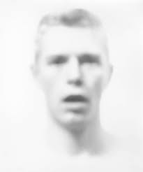
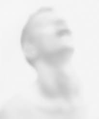
BILL JACOBSON:
In each of his photographs, the edges and features are blurred and softened in a painterly style that reflected Jacobsons preoccupation with loss and mortality in the early 1990s: themes closely tied to his observations of the AIDS epidemic. The faces are hard to grasp, difficult to discern as they recede into the white field of the photograph. Jacobson conveys the sense of futility in trying to capture a human likeness in the memory of portraiture.
In each of his photographs, the edges and features are blurred and softened in a painterly style that reflected Jacobsons preoccupation with loss and mortality in the early 1990s: themes closely tied to his observations of the AIDS epidemic. The faces are hard to grasp, difficult to discern as they recede into the white field of the photograph. Jacobson conveys the sense of futility in trying to capture a human likeness in the memory of portraiture.
|
|
FIRST RESPONSE:
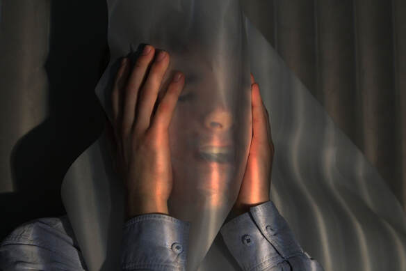
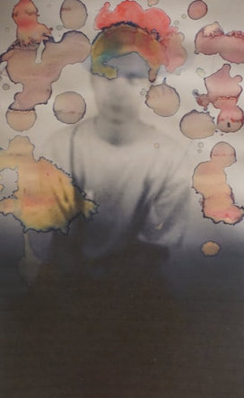
For this task i took photographs of people holding up translucent glass and paper in front of their face. I then photoshopped the pictures and made the colours strong giving more definition to the structures of the face on the other side of the glass and paper. I was happy with my outcome at the end however I felt there wasn't much variety which is something I would like to change. I could do this by using more types of glass and by maybe using coloured transparent plastic sheets. By doing this I could have more of a complex colour scheme in my images.
For this task i took photographs of people holding up translucent glass and paper in front of their face. I then photoshopped the pictures and made the colours strong giving more definition to the structures of the face on the other side of the glass and paper. I was happy with my outcome at the end however I felt there wasn't much variety which is something I would like to change. I could do this by using more types of glass and by maybe using coloured transparent plastic sheets. By doing this I could have more of a complex colour scheme in my images.
SECOND RESPONSE:
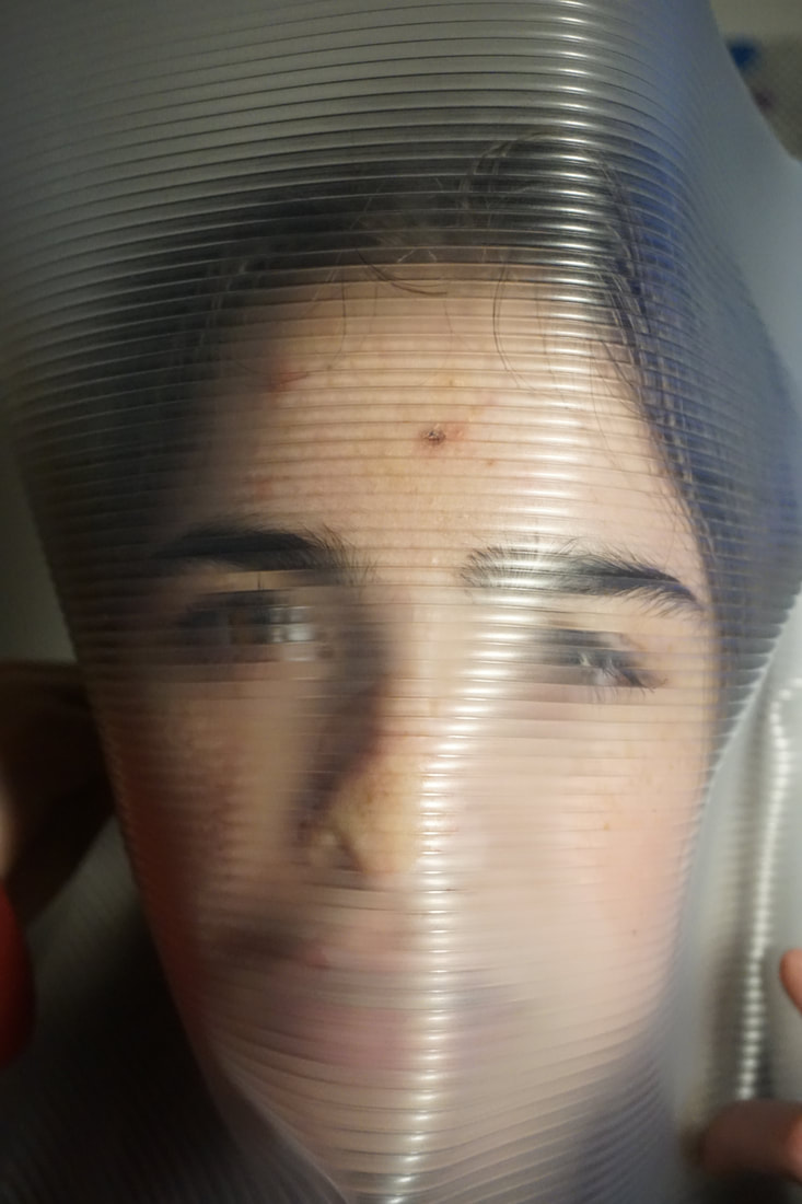
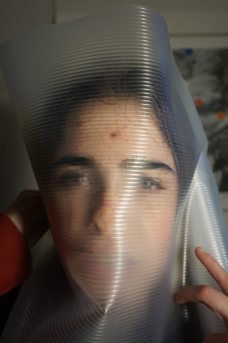
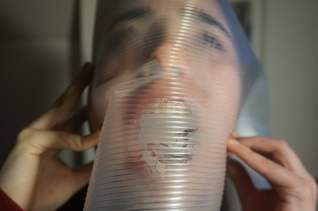
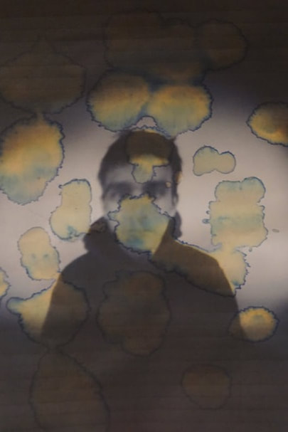
After reflecting on my previous shoot where I had used baking paper and glass I decided to use a translucent sheet with ripples in it and wrapped it around the models face. At first I was looking at the effect of the skin being push up against the plastic but then I started to explore the mist effect the plastic created. So I held the plastic further away from the models face and as I did this the plastic made it look as if it was getting more misty.
After reflecting on my previous shoot where I had used baking paper and glass I decided to use a translucent sheet with ripples in it and wrapped it around the models face. At first I was looking at the effect of the skin being push up against the plastic but then I started to explore the mist effect the plastic created. So I held the plastic further away from the models face and as I did this the plastic made it look as if it was getting more misty.
|
|

|
|
EDITS:
SZYMON ROGINSKI:
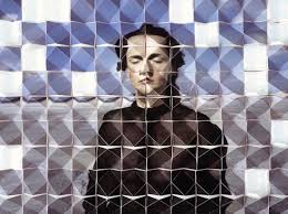
Szymon Roginski creates his sculptures by photographing fashion models then printing the image onto multiple 3D sculptures which then eventually all come together to create one sculpture and one image. I like the way his sculptures almost look like they are mirrors reflecting someone.
Szymon Roginski creates his sculptures by photographing fashion models then printing the image onto multiple 3D sculptures which then eventually all come together to create one sculpture and one image. I like the way his sculptures almost look like they are mirrors reflecting someone.
|
|
|
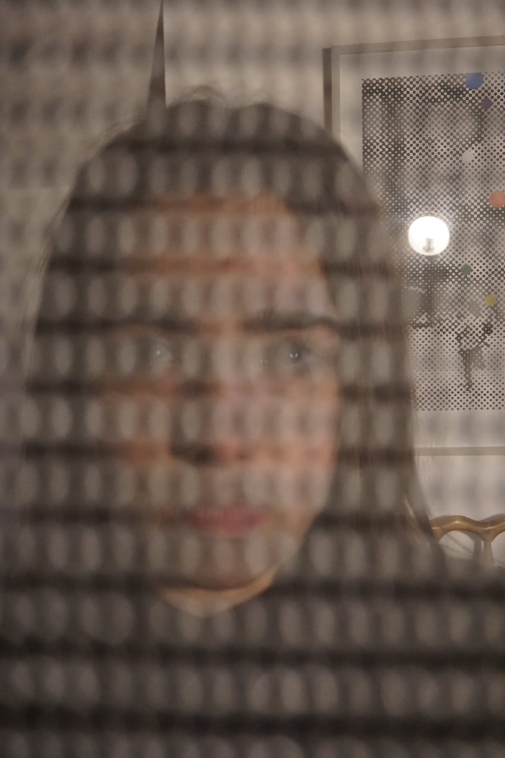
LUCAS SIMOES:
In this series of works he invented intimate friends over to his house to tell him a secret as he created their portrait. His intentions was not to focus on the secret but to capture the moment they decided to reveal their secret. He also asked each one to choose a song to listen to whilst he created their portrait.
I like the fractured state leaves his portraits in, they look so naturally although they are distorted and almost blurred. Looking at the images below makes me feel like I'm looking through translucent glass and there is someone on the other side.
|
|
|
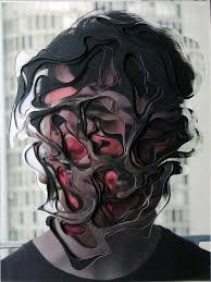
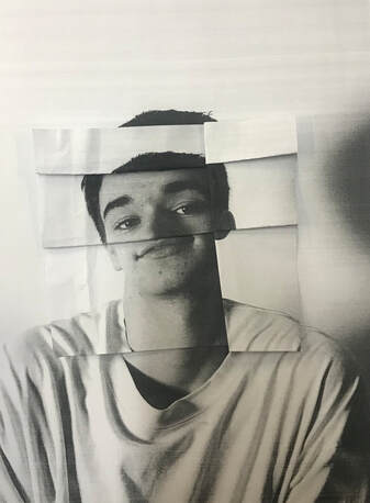
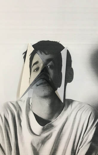
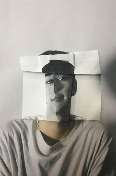
Responding to the style of Szymon Roginski I took photographs of people and printed them off twice. I placed one image flat down then I folded and cut the second image to place on top. I cut, folded and ripped the second image trying to create an illusion to trick the mind. I really liked the first two pictures I created where I had folded one image out and the other one in. I like these pictures because I have lined up the lines of the neck giving the picture a sense of normality when it is completely wrong. However I find this effect to be more subtle than the other ones which for some reason I like.
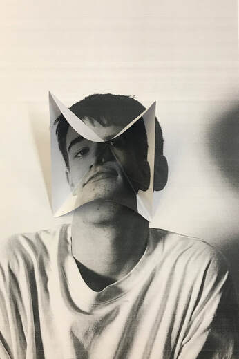
For this image I printed off two of the same images, I placed on flat then the other on top. I decided to rip the second image and leave the white tear marks on the side. I find that the white tear marks o really well with the folds of the shirt. I feel like maybe I should have not lined up the images and maybe it would look more interesting if I made them slightly off centred.
For this image I folded the image which was on top, trying not to rip the image or cut it. I also lined u the lined of the shoulders to make it look more 'realistic'. I really like this effect as it is so weird and makes the viewer feel uneasy when looking at it. I find that the way I have missed out the nose creates a comedically sense.
For this photograph I printed off the same image twice, one in black and white and the other in colour. I placed the coloured one on top and ripped the the centre of the face and bent back the the triangular rips. The effect created reminded me of a flower which I liked because it almost didn't feel right, a flower opening to reveal a duller, more simpler structure, which is not what anyone would expect to see from a flower.
|
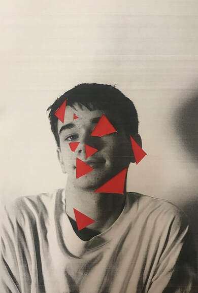
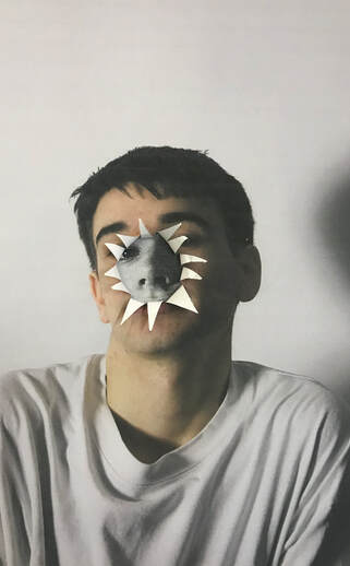
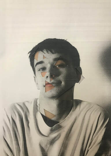
For this image I decided to cut out triangular shapes out of the photograph and placed it on top of a red piece of card. I like the effect which is given however I find it bit to cliche as it is what someone would expect if parts of the face was removed. To improve this image I could place a different colour of card underneath to throw off the viewer like a bright blue or maybe even a metallic colour.
|
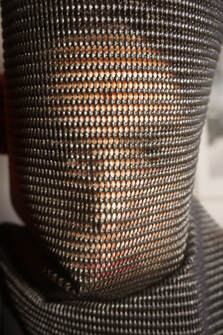
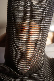
Ben Nathan:
|
|
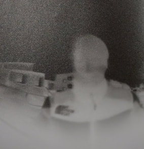
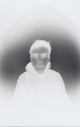
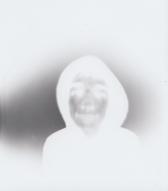
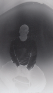
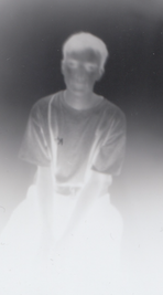
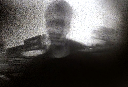
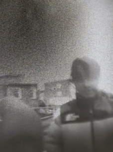
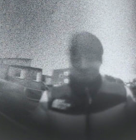
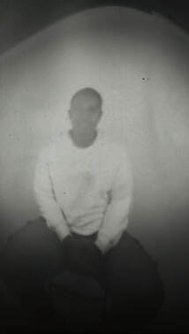
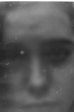
Ben Nathan is a British artist who uses media such as paint, film, sculpture and photography. In Nathan's stenope work he used a beer can with a small hole in the middle, almost like a pinhole camera, and then cut the top open to allow film to be placed inside the can.
First Response:
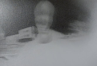
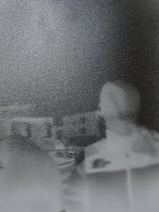
Using the style of Ben Nathan I decided to take my own shoot. I made a pin hole camera out of a beer can and put film inside it. Once I did this I then took portraits of people around my school. For each portrait the time of exposure varied from 3 seconds to 7 seconds. I then did a series of portraits inside which meant that the exposure time went up to 70 seconds. After developing my film in the dark room I then uploaded them onto the computer and put them onto photoshop to invert the colours.
Using the style of Ben Nathan I decided to take my own shoot. I made a pin hole camera out of a beer can and put film inside it. Once I did this I then took portraits of people around my school. For each portrait the time of exposure varied from 3 seconds to 7 seconds. I then did a series of portraits inside which meant that the exposure time went up to 70 seconds. After developing my film in the dark room I then uploaded them onto the computer and put them onto photoshop to invert the colours.
|
|
Manual Edits:
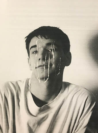
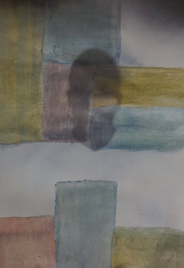
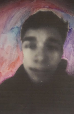
For these edits used a variation of water colour and acrylic paints. I attempted to distort each image in completely different and unique styles. I feel like the images where i have used brighter and stronger colours are less effective than the subtle ones as the eye is drawn to the colour and less to the image. However i felt that the last two images on the bottom were the strongest as they provided the perfect balance between strong colour and subtleness. For those images i dipped my paintbrush into a pot of water white had been used to mix water colours and then held it over the images. As the water dripped onto the images and expanded it left a darker colour where it had stopped. These droplets reminded me of the irises of eyes, creating a ghostly effect.
For these edits used a variation of water colour and acrylic paints. I attempted to distort each image in completely different and unique styles. I feel like the images where i have used brighter and stronger colours are less effective than the subtle ones as the eye is drawn to the colour and less to the image. However i felt that the last two images on the bottom were the strongest as they provided the perfect balance between strong colour and subtleness. For those images i dipped my paintbrush into a pot of water white had been used to mix water colours and then held it over the images. As the water dripped onto the images and expanded it left a darker colour where it had stopped. These droplets reminded me of the irises of eyes, creating a ghostly effect.
|
|
|
MANUAL EDITS:
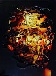
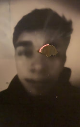
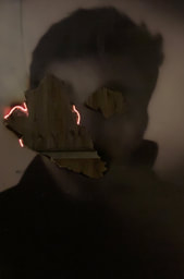
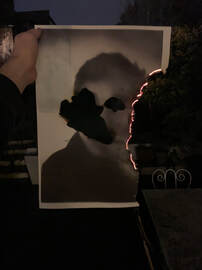
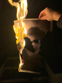
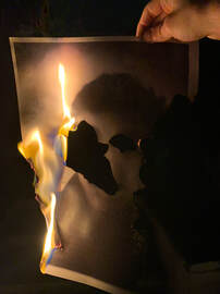
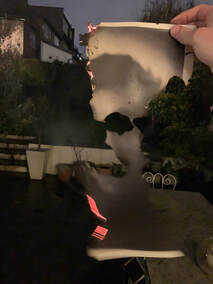
After printing out my images into A3 paper from my beer can shoot i then selected areas to set on fire. I did this to experiment with different ways of distorting my images. I felt like so far through this project i had used a lot of artificial distortion such as plastics and paints and for these edits felt like i wanted to take a more naturalistic approach of distorting them. So i used a lighter and set my images on fire, leaving the flames to distort my image in which i had no control over and could only hope for the best.
After printing out my images into A3 paper from my beer can shoot i then selected areas to set on fire. I did this to experiment with different ways of distorting my images. I felt like so far through this project i had used a lot of artificial distortion such as plastics and paints and for these edits felt like i wanted to take a more naturalistic approach of distorting them. So i used a lighter and set my images on fire, leaving the flames to distort my image in which i had no control over and could only hope for the best.
|
|
SECOND RESPONSE:
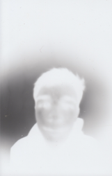
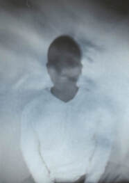
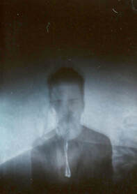
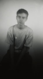
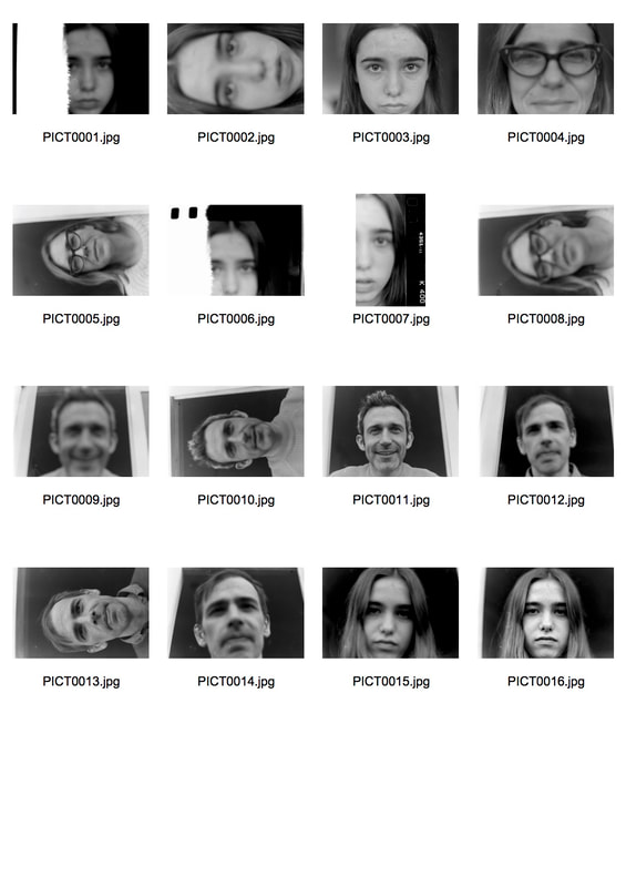
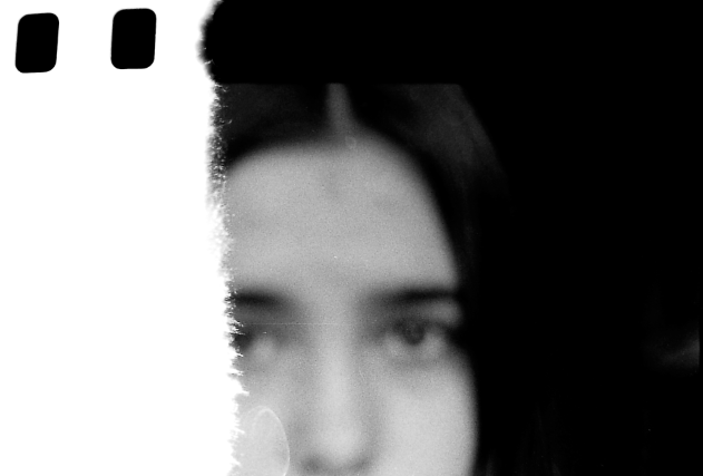
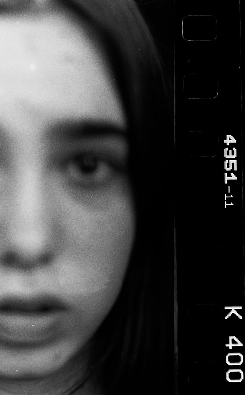
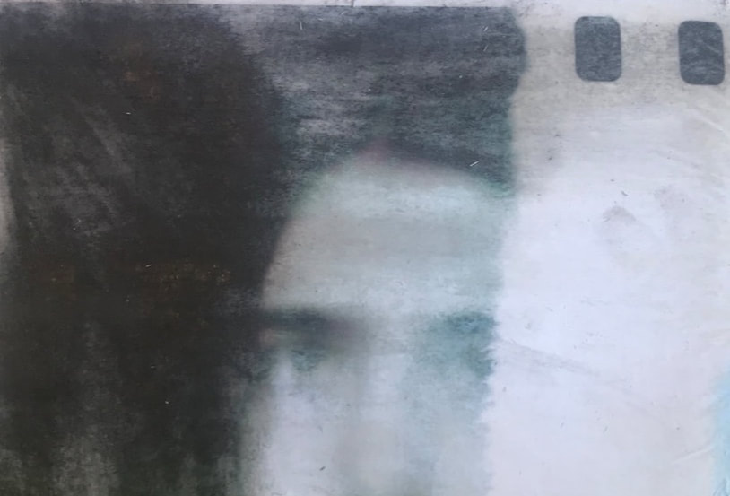
After looking back on my previous shoot using a beer can as a pinhole i decided i wanted to create the same effect but more clear. So i used a film camera to take a series of photographs of members of my family. I changed the exposure with each image, trying to distort the images by using light. Once i had developed my photographs i then scanned them in digitally. Whilst doing this i moved the images about in an attempt to capture the numbering and texts found on the side of film rolls. I did this to create a aesthetic look and thought i created a sense of contrast within the image.
After looking back on my previous shoot using a beer can as a pinhole i decided i wanted to create the same effect but more clear. So i used a film camera to take a series of photographs of members of my family. I changed the exposure with each image, trying to distort the images by using light. Once i had developed my photographs i then scanned them in digitally. Whilst doing this i moved the images about in an attempt to capture the numbering and texts found on the side of film rolls. I did this to create a aesthetic look and thought i created a sense of contrast within the image.
EDITS:
Transferred images:
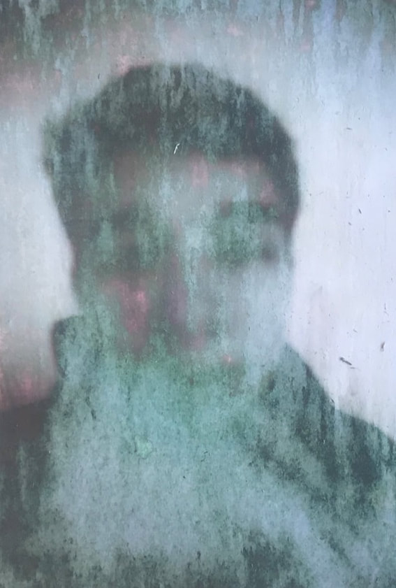
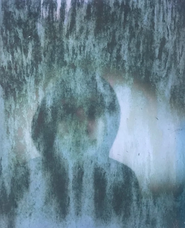
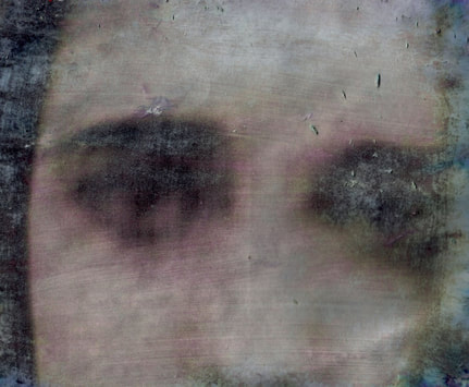
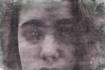
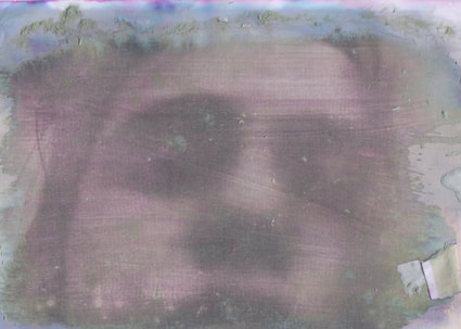
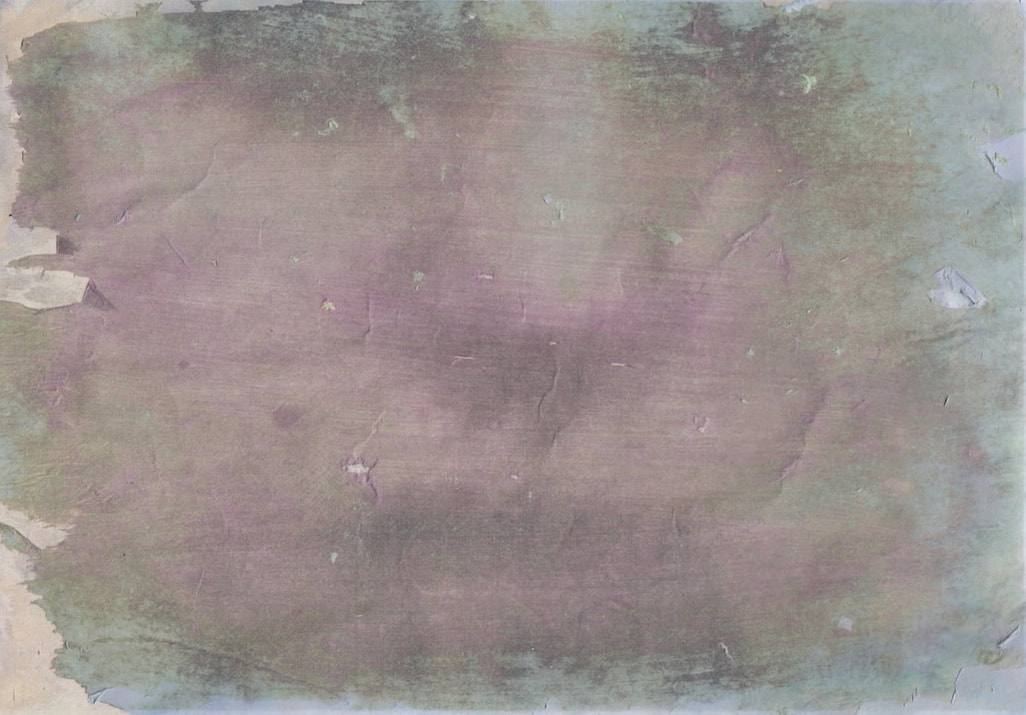
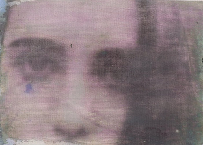
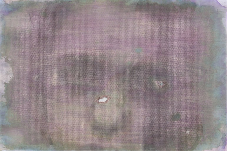
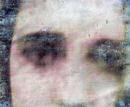
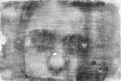
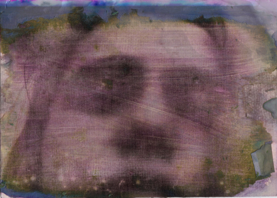
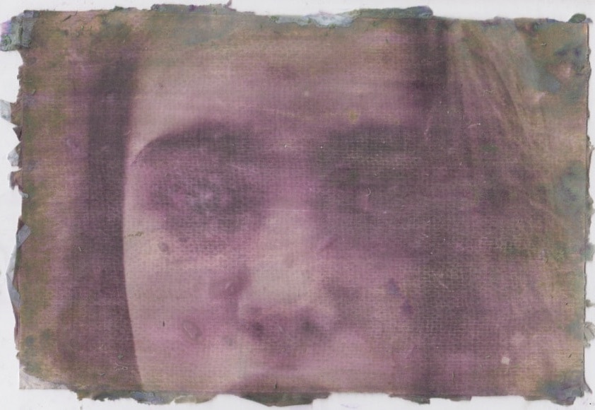
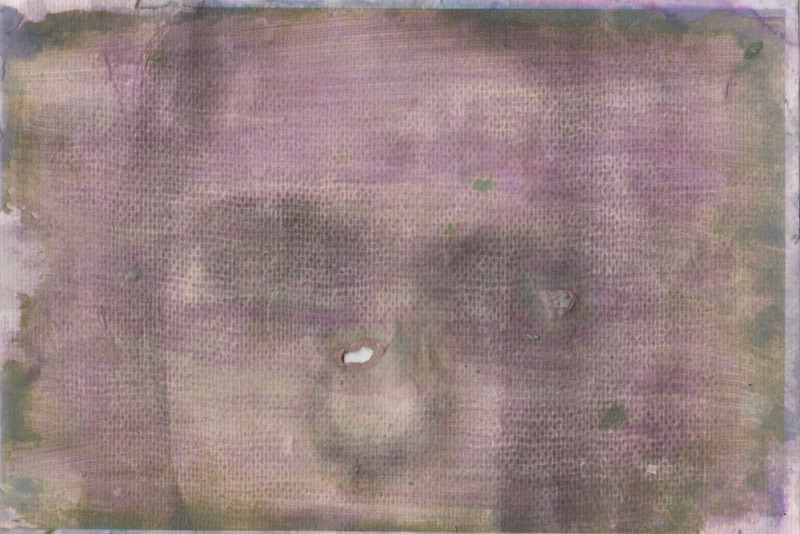
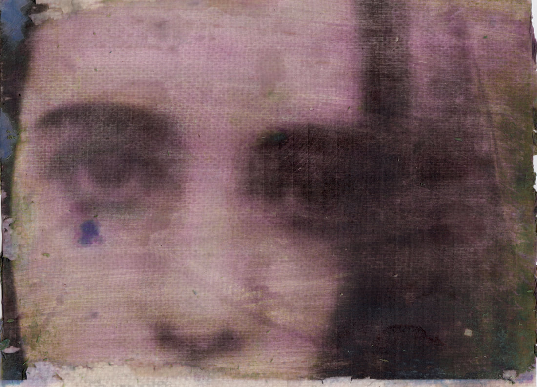
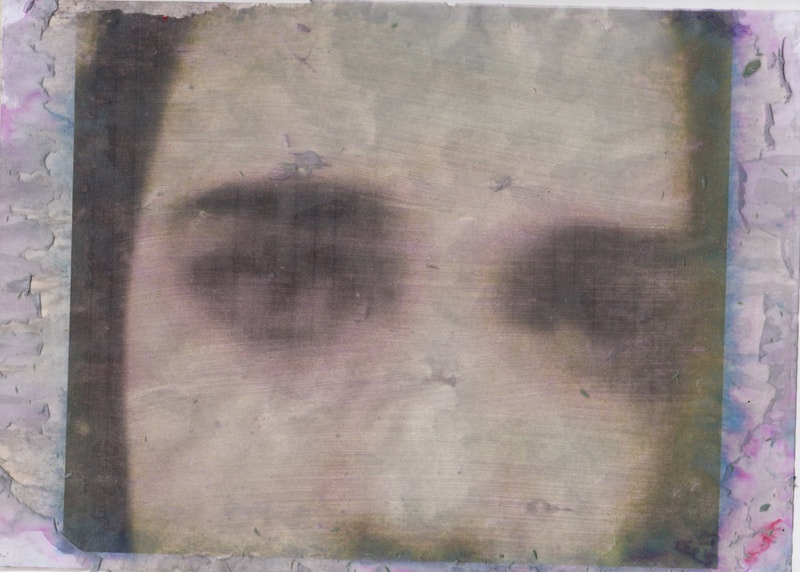
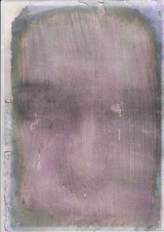
For these images I printed off the selected photographs on to plain paper and placed them face down onto a piece of card. Once I had done this I then applied image transfer to the back the paper. I then left the image to dry for 3 hours. After the 3 hours I applied hot water to the back of the paper and rubbed off the paper only leaving the card and the transferred image. I like the green limescale effect combined with the light pink left from transferring the image. However an issue with the technique that I used is that after the paper has been removed with hot water and the card drys, some pieces of the paper left on the card will dry and attach itself to the image leaving small marks across the image.
For these images I printed off the selected photographs on to plain paper and placed them face down onto a piece of card. Once I had done this I then applied image transfer to the back the paper. I then left the image to dry for 3 hours. After the 3 hours I applied hot water to the back of the paper and rubbed off the paper only leaving the card and the transferred image. I like the green limescale effect combined with the light pink left from transferring the image. However an issue with the technique that I used is that after the paper has been removed with hot water and the card drys, some pieces of the paper left on the card will dry and attach itself to the image leaving small marks across the image.
|

|
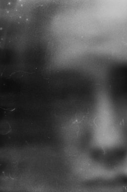
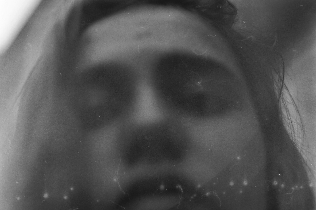
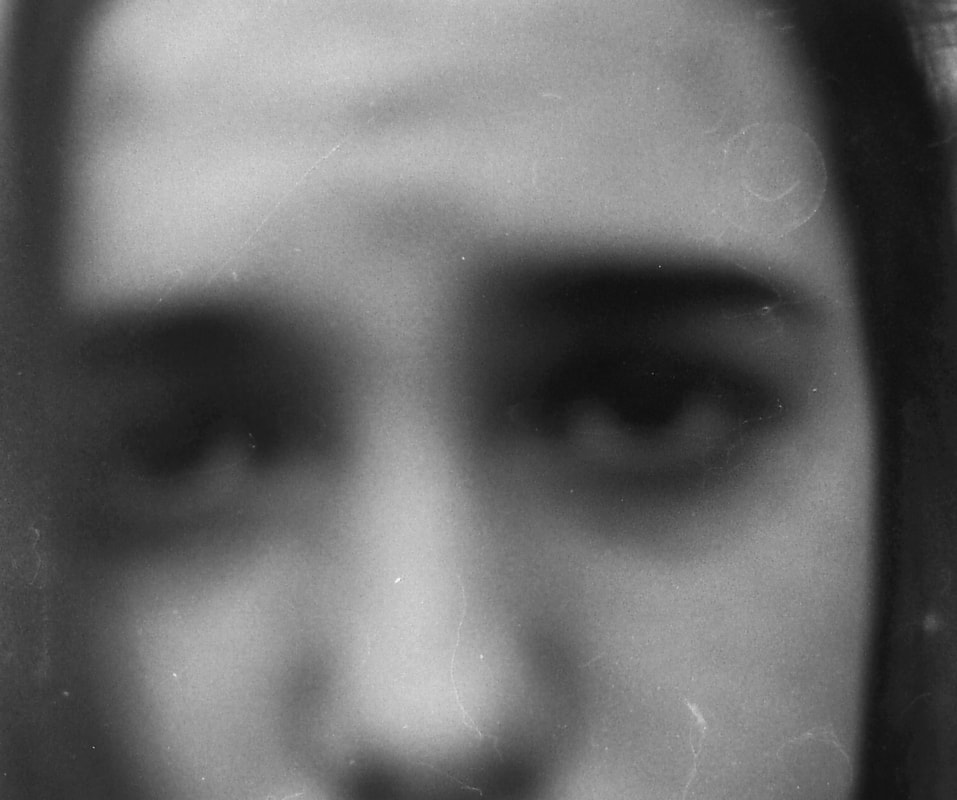
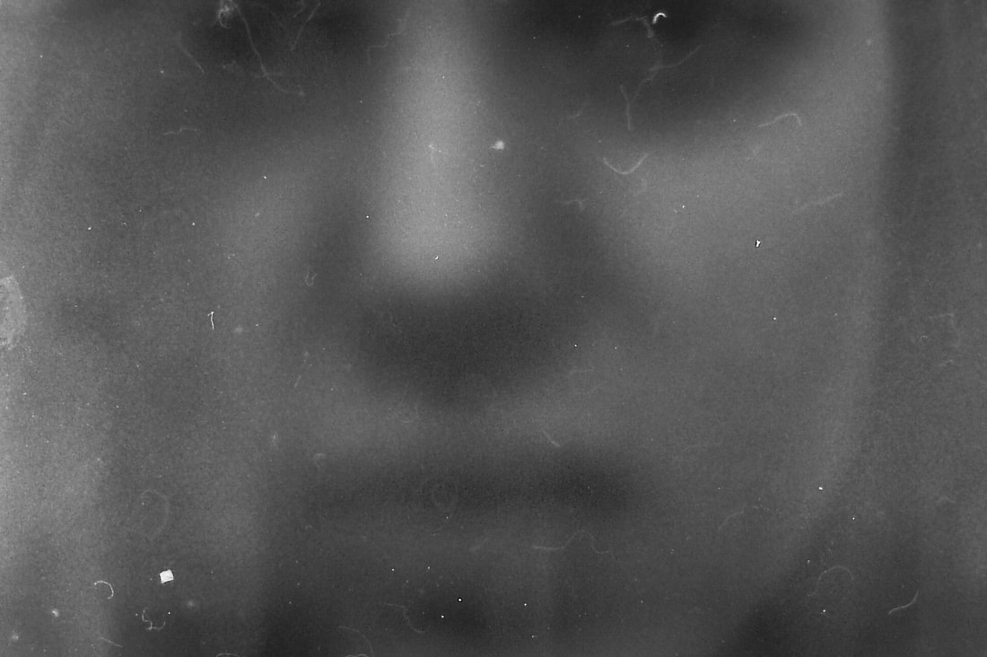
THIRD RESPONSE:
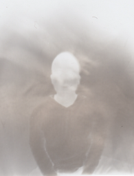
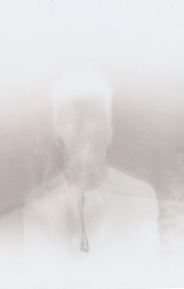
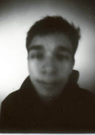
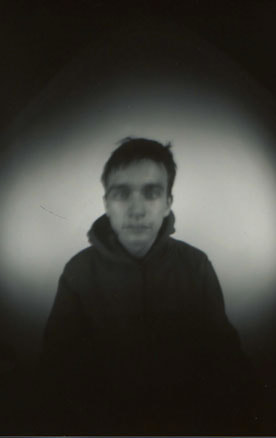
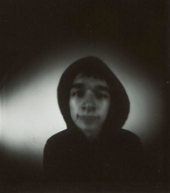
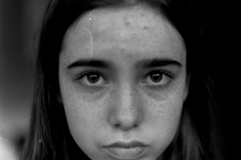
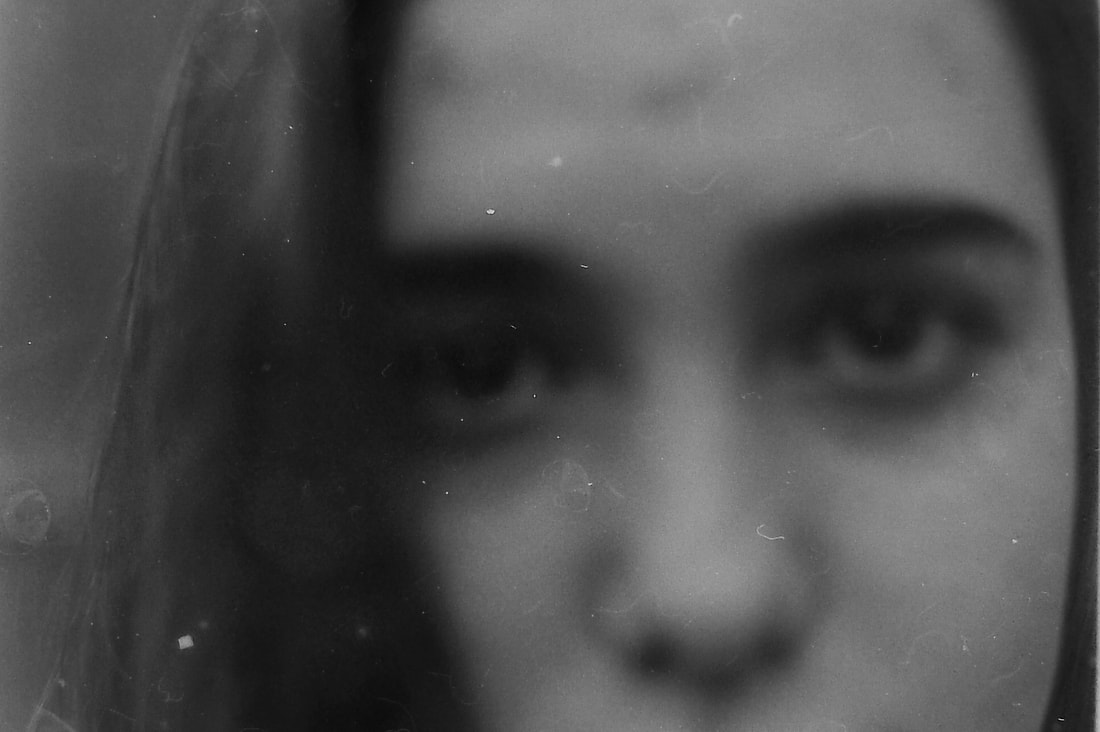
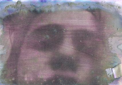
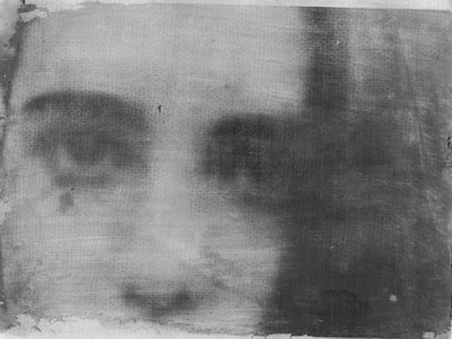
After reflecting on my previous photo shoot where I had used the images to transfer onto card I decided I wanted to try again using darker images. For this shoot I used a film camera and used the natural light to provide the lighting for my images. when taking the images I tried to make the focus points in each image different, some focusing on the eyes and others on the mouth and nose.
After reflecting on my previous photo shoot where I had used the images to transfer onto card I decided I wanted to try again using darker images. For this shoot I used a film camera and used the natural light to provide the lighting for my images. when taking the images I tried to make the focus points in each image different, some focusing on the eyes and others on the mouth and nose.
|

|
|
ORIGINAL:
|
EDITS:
|
|

|
RESCANNED:
|
|
