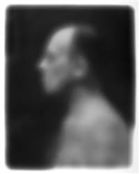
Saul Leiter:
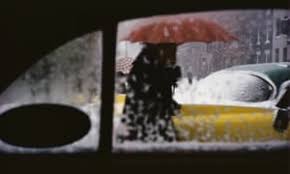
Leiter had been documenting street life in black and white, intriguing the eye with his use of obstructions, blurred movement and half concealed details. In 1992, his work came to the attention of the curator Jane Livingston, who included him in her "New York School" a group of noteworthy midcentury photographers.
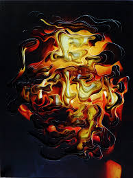
Leiter was also a pioneer of colour photography. He created a distinctive, dreamy style that played with shallow depths of field and a vibrant palette.
Leiter had been documenting street life in black and white, intriguing the eye with his use of obstructions, blurred movement and half concealed details. In 1992, his work came to the attention of the curator Jane Livingston, who included him in her "New York School" a group of noteworthy midcentury photographers.
Leiter was also a pioneer of colour photography. He created a distinctive, dreamy style that played with shallow depths of field and a vibrant palette.
|
|
FIRST RESPONSE:
|
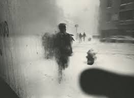
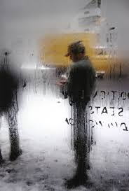
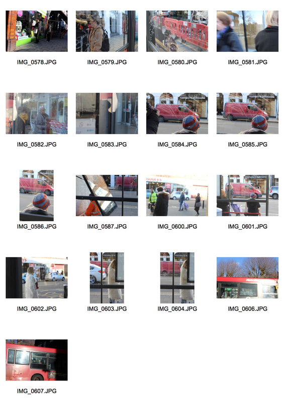
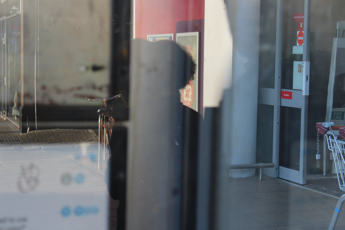
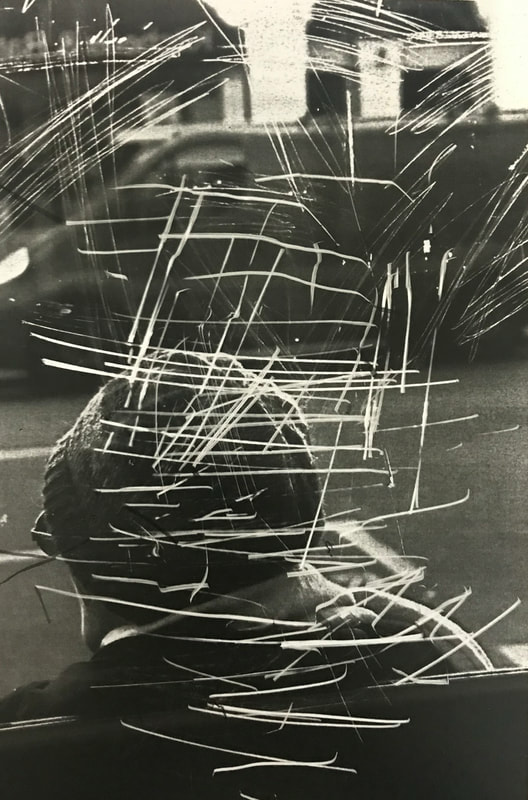
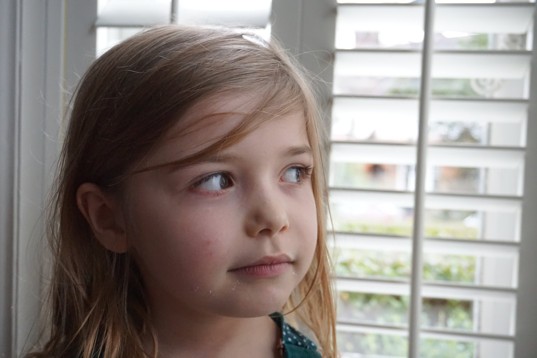
For this photograph I tried to copy Saul Lieters technique by trying to blur the figure by using the window. I feel like this image is a bit too abstract as it is hard to see the figure on the other side.
|
SECOND RESPONCE:
|
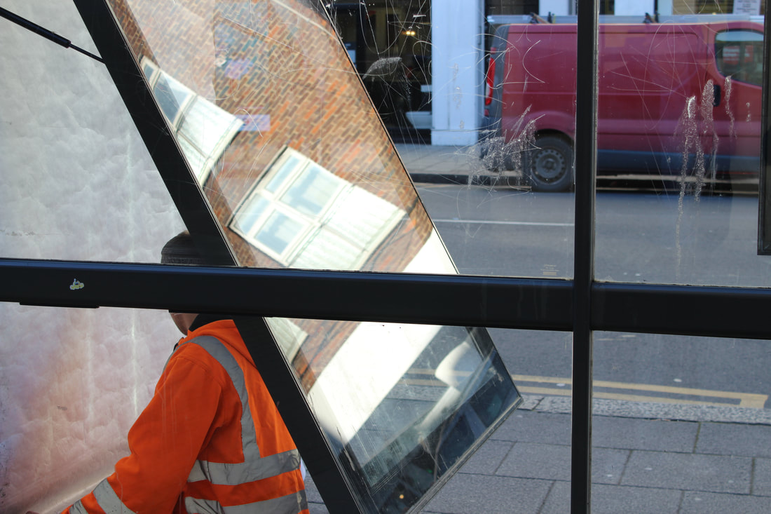
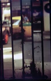
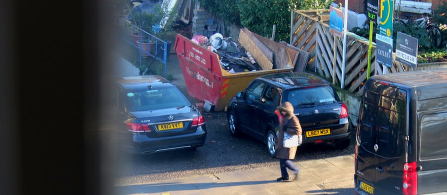
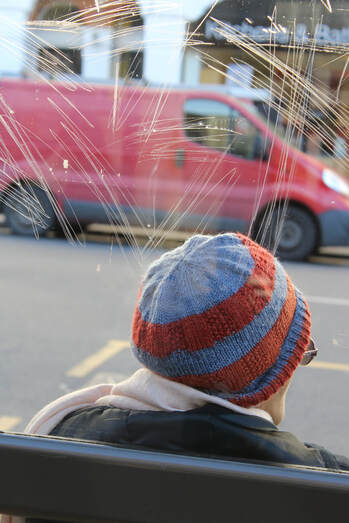
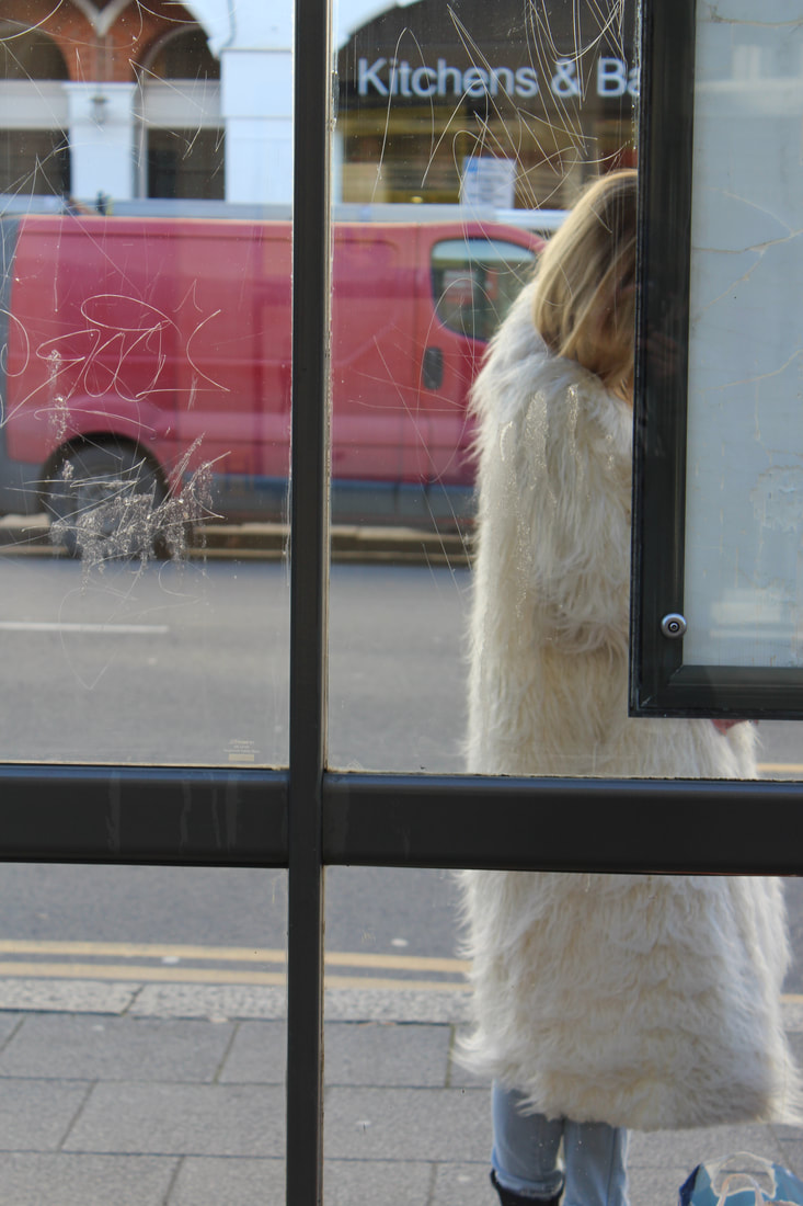
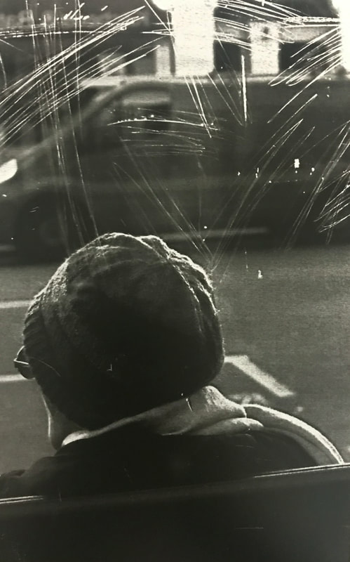
For this photograph I took a picture of a man putting up a new sign at a bus stop. What was interesting about this photograph was that when the man lifted up the plastic protective sheet, a reflection of the buildings across the road appear on it.
|
ABSTRACT PORTRAITURE:
BILL JACOBSON
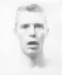
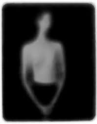
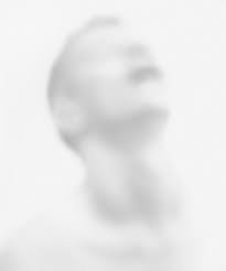
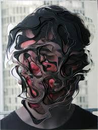
In each of his photographs, the edges and features are blurred and softened in a painterly style that reflected Jacobsons preoccupation with loss and mortality in the early 1990s: themes closely tied to his observations of the AIDS epidemic. The faces are hard to grasp, difficult to discern as they recede into the white field of the photograph. Jacobson conveys the sense of futility in trying to capture a human likeness in the memory of portraiture.
|
|
ABSTRACT STUDIO PORTRAITURE:
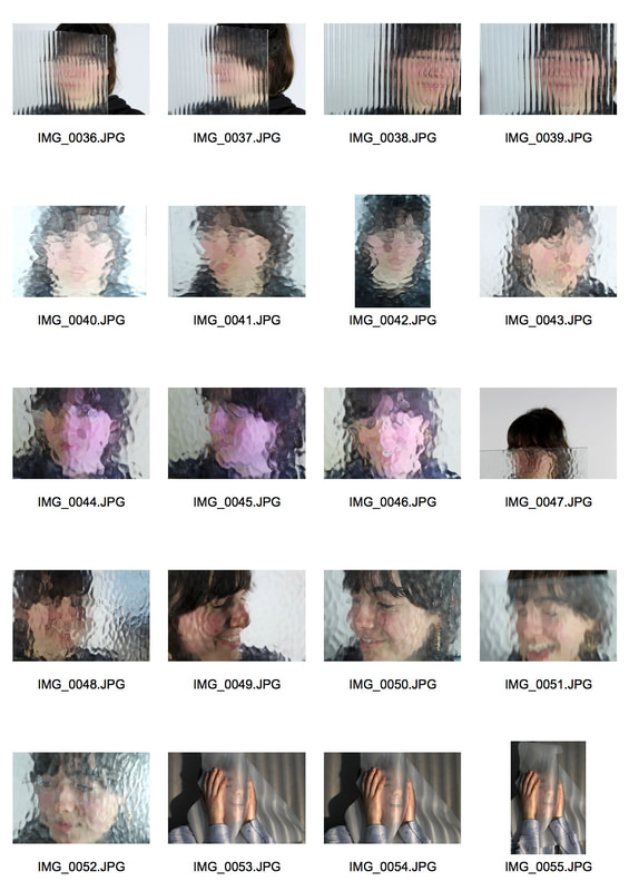
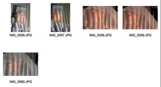
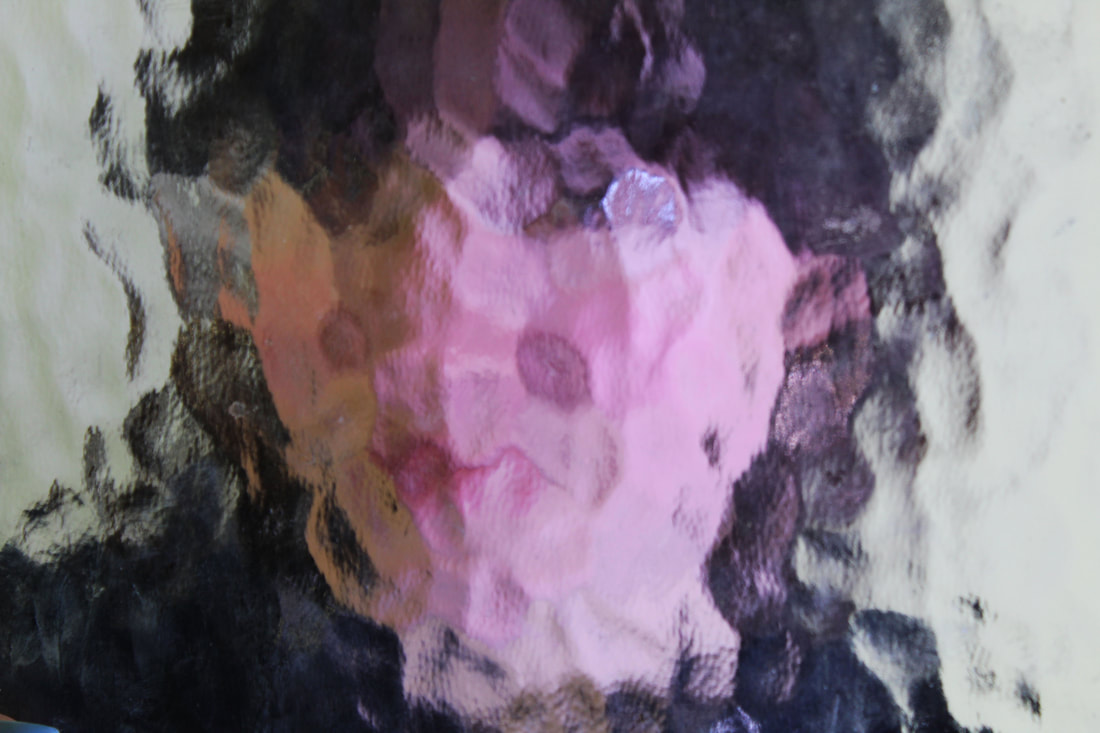
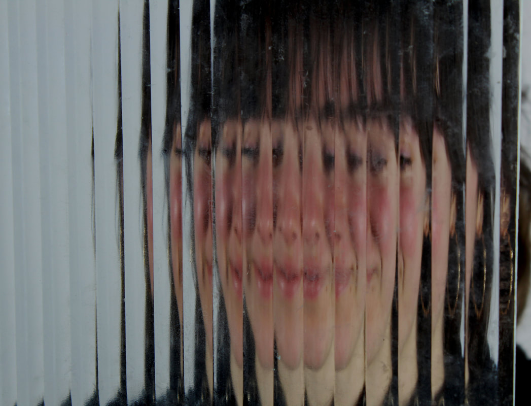
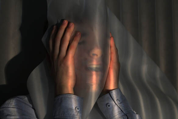
For this task i took photographs of people holding up translucent glass and paper in front of their face. I then photoshopped the pictures and made the colours strong giving more definition to the structures of the face on the other side of the glass and paper. I was happy with my outcome at the end however I felt there wasn't much variety which is something I would like to change. I could do this by using more types of glass and by maybe using coloured transparent plastic sheets. By doing this I could have more of a complex colour scheme in my images.
For this task i took photographs of people holding up translucent glass and paper in front of their face. I then photoshopped the pictures and made the colours strong giving more definition to the structures of the face on the other side of the glass and paper. I was happy with my outcome at the end however I felt there wasn't much variety which is something I would like to change. I could do this by using more types of glass and by maybe using coloured transparent plastic sheets. By doing this I could have more of a complex colour scheme in my images.
DARKROOM ABSTRACTION
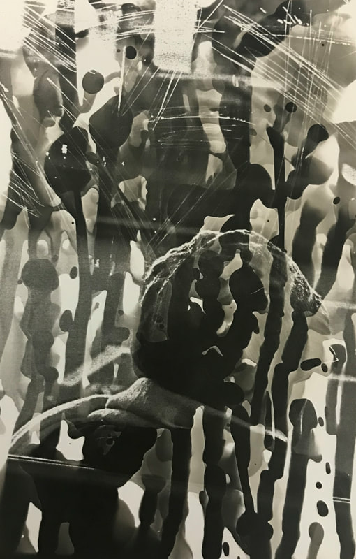
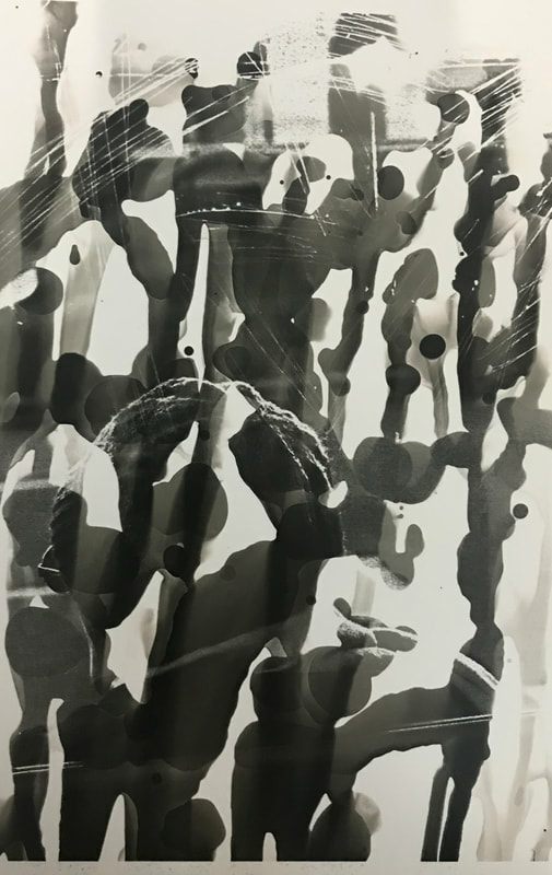
For this task I used the photographs I had previously taken in Muswell Hill for another abstraction shoot. I then turned them into photograms and attempted to use different techniques when developing them. For one of the images I decided to scratch the photogram with a key whilst it was in the developer. I liked the effect that I got from doing this as it almost gives more depth to the image, creating another layer. Also, instead of placing my photogram into the developer I dripped the developer onto my photogram with a paint brush. I really like the effect it created as it almost creates a lucid, fragmented, dreamy image.
|
|
3D PHOTOGRAPHIC ABSTRACTION:
|
|
|
|
|
|
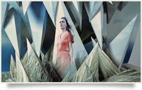
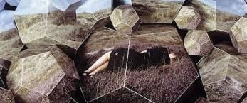
SZYMON ROGINSKI
Szymon Roginski creates his sculptures by photographing fashion models then printing the image onto multiple 3D sculptures which then eventually all come together to create one sculpture and one image. I like the way his sculptures almost look like they are mirrors reflecting someone.
|
|
|
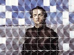
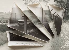
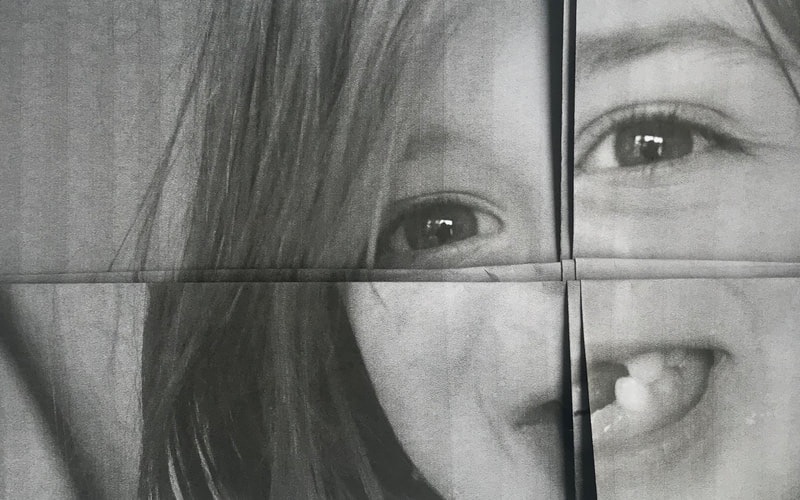
LUCAS SIMOES
In this series of works he invented intimate friends over to his house to tell him a secret as he created their portrait. His intentions was not to focus on the secret but to capture the moment they decided to reveal their secret. He also asked each one to choose a song to listen to whilst he created their portrait.
I like the fractured state leaves his portraits in, they look so naturally although they are distorted and almost blurred. Looking at the images below makes me feel like I'm looking through translucent glass and there is someone on the other side.
I like the fractured state leaves his portraits in, they look so naturally although they are distorted and almost blurred. Looking at the images below makes me feel like I'm looking through translucent glass and there is someone on the other side.
|
|
|
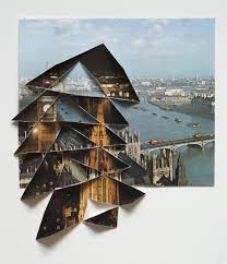
ABIGAIL REYNOLDS
Abigail Reynolds creates her images by splicing two photographs of the same monument but from different times and different photographers. I like how her images seem so 3D, her images almost feel like I'm looking through a window as she almost creates another frame inside her image.
|
|
|
1ST RESPONSE:
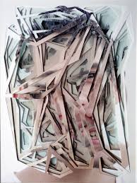
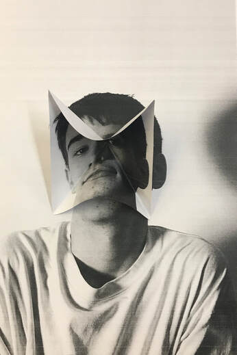
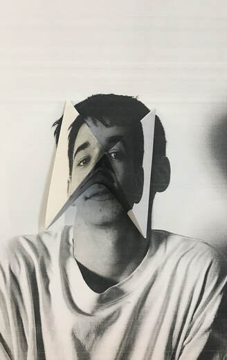
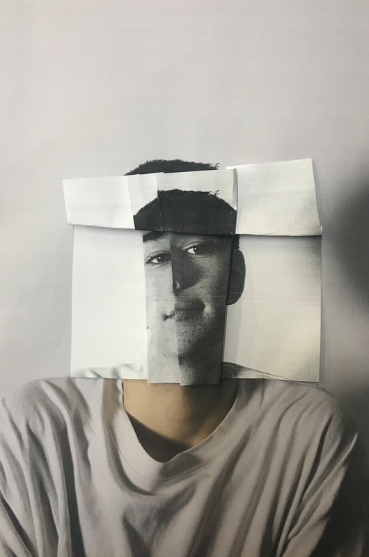
Responding to the style of Szymon Roginski I took photographs of people and printed them off twice. I placed one image flat down then I folded and cut the second image to place on top. I cut, folded and ripped the second image trying to create an illusion to trick the mind. I really liked the first two pictures I created where I had folded one image out and the other one in. I like these pictures because I have lined up the lines of the neck giving the picture a sense of normality when it is completely wrong. However I find this effect to be more subtle than the other ones which for some reason I like.
For this image I printed off two of the same images, I placed on flat then the other on top. I decided to rip the second image and leave the white tear marks on the side. I find that the white tear marks o really well with the folds of the shirt. I feel like maybe I should have not lined up the images and maybe it would look more interesting if I made them slightly off centred.
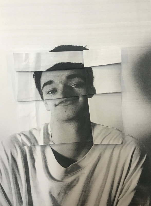
For this image I folded the image which was on top, trying not to rip the image or cut it. I also lined u the lined of the shoulders to make it look more 'realistic'. I really like this effect as it is so weird and makes the viewer feel uneasy when looking at it. I find that the way I have missed out the nose creates a comedically sense.
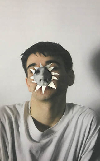
For this photograph I printed off the same image twice, one in black and white and the other in colour. I placed the coloured one on top and ripped the the centre of the face and bent back the the triangular rips. The effect created reminded me of a flower which I liked because it almost didn't feel right, a flower opening to reveal a duller, more simpler structure, which is not what anyone would expect to see from a flower.
|
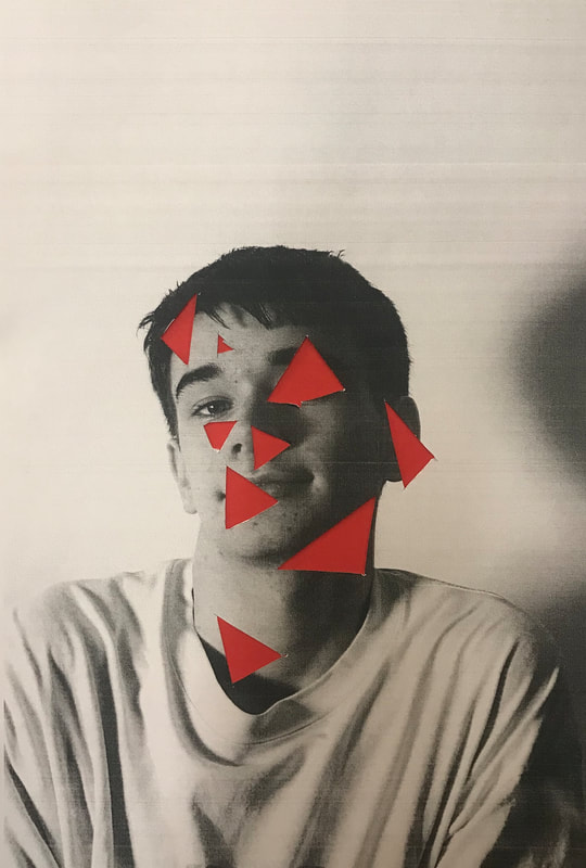
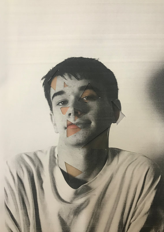
For this image I decided to cut out triangular shapes out of the photograph and placed it on top of a red piece of card. I like the effect which is given however I find it bit to cliche as it is what someone would expect if parts of the face was removed. To improve this image I could place a different colour of card underneath to throw off the viewer like a bright blue or maybe even a metallic colour.
|
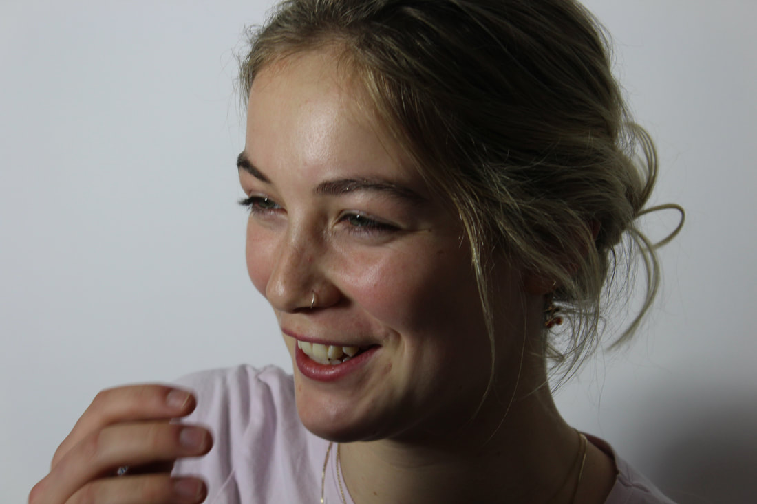
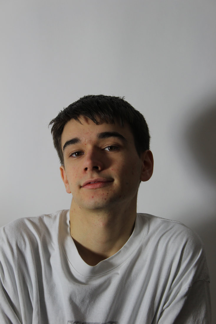
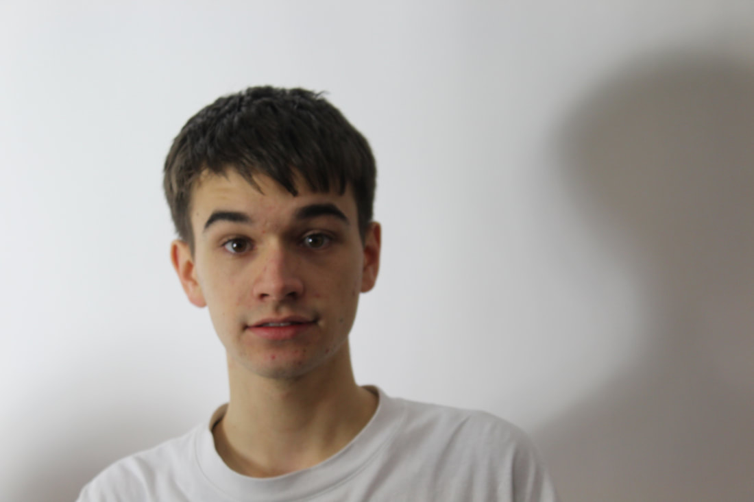
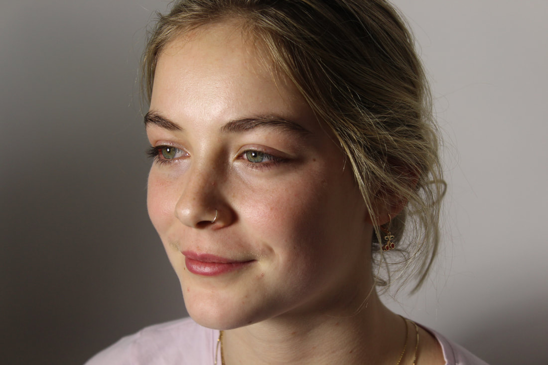
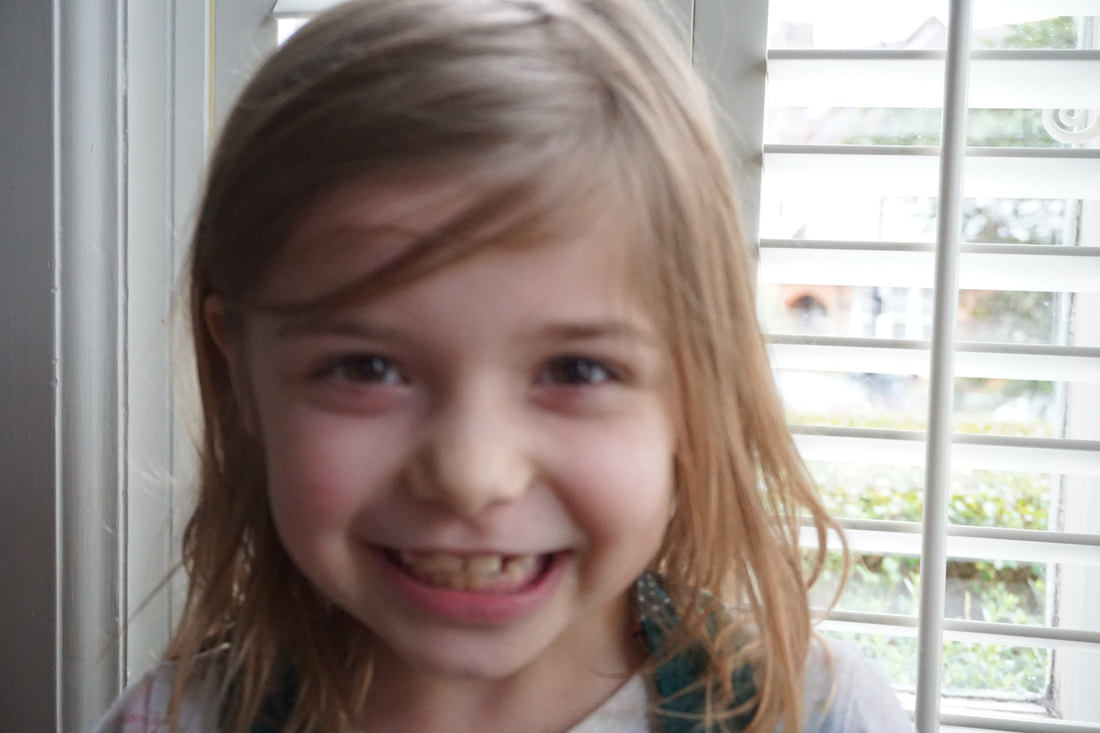
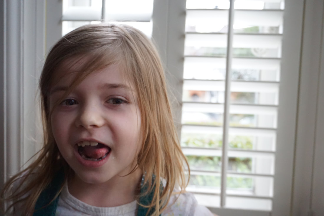
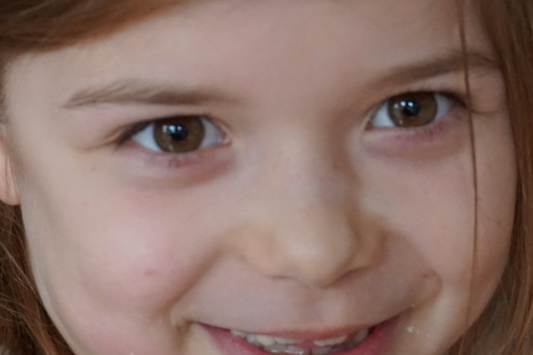
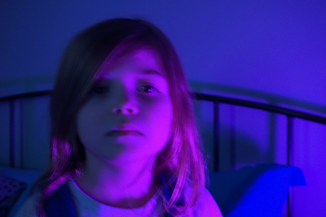
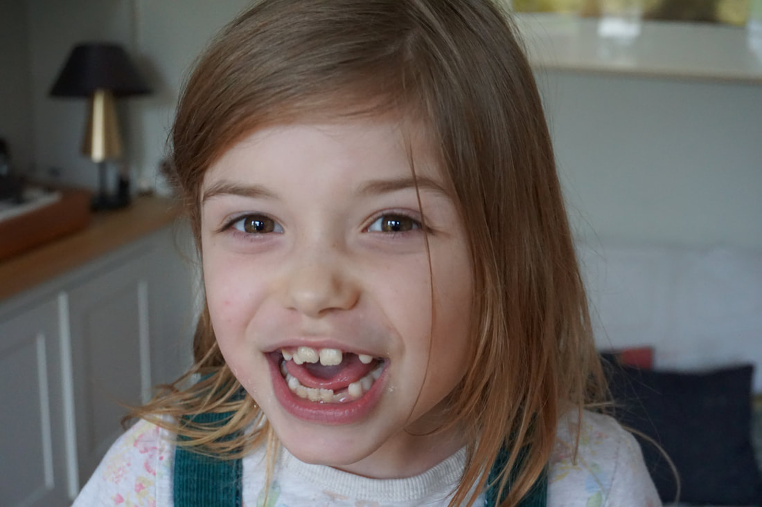
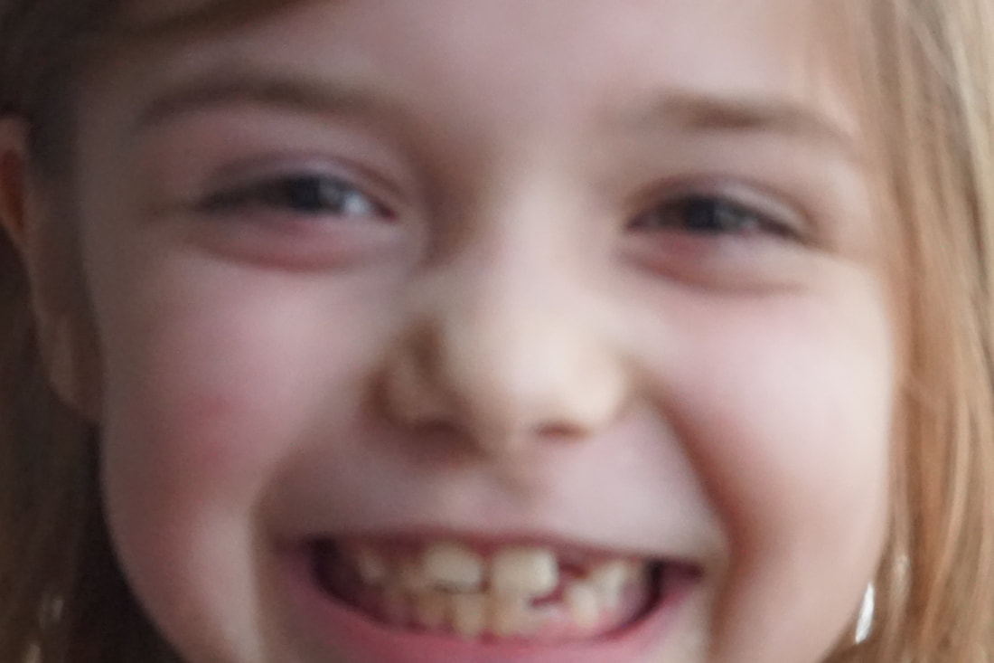
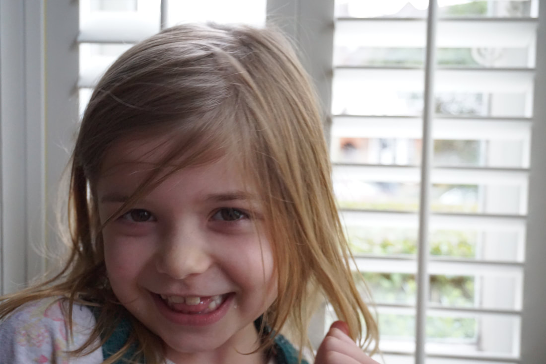
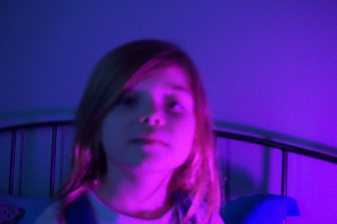
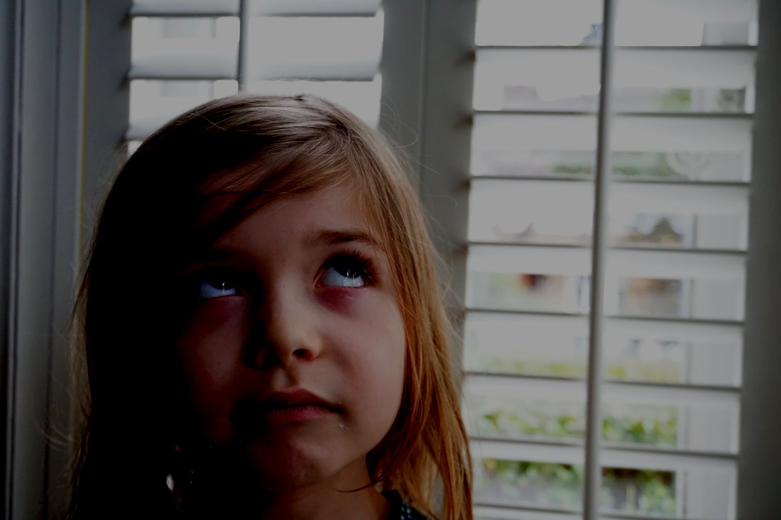
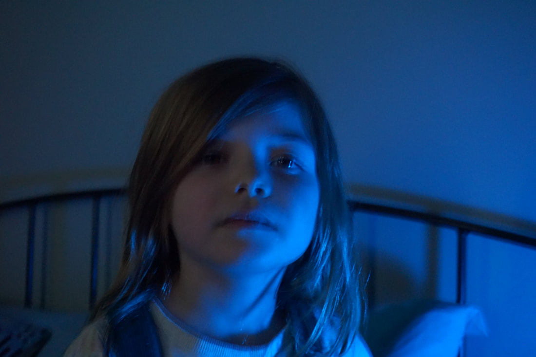
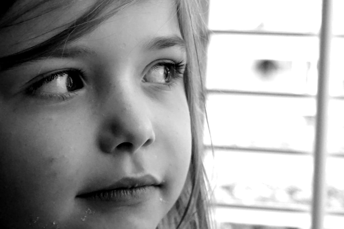
Development of my Final piece:
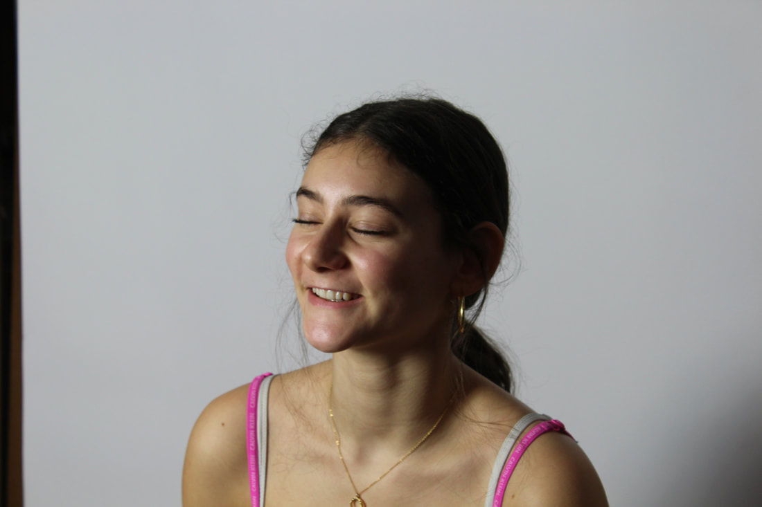
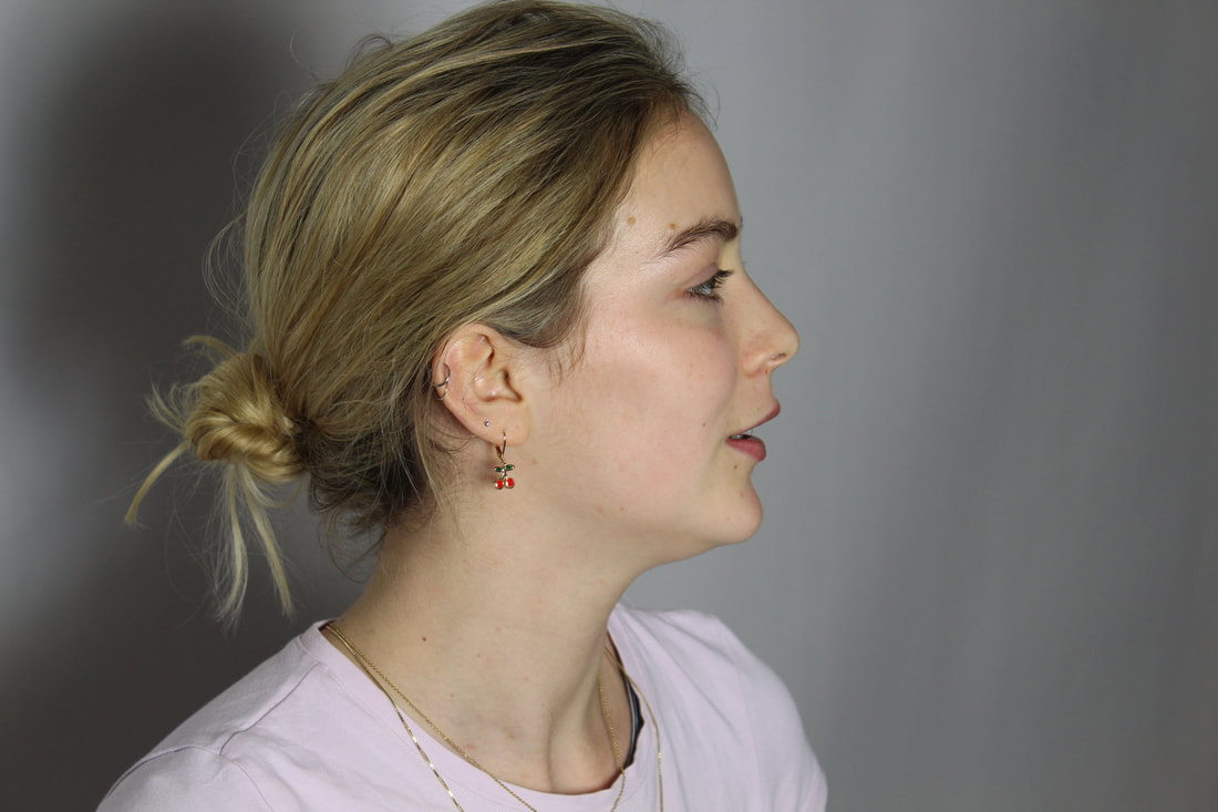
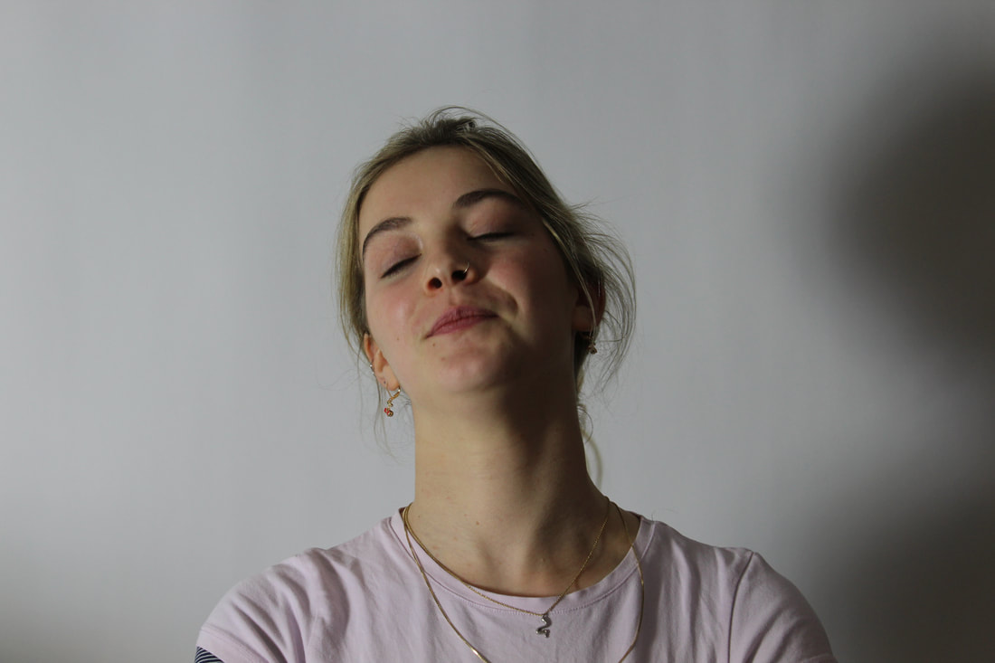
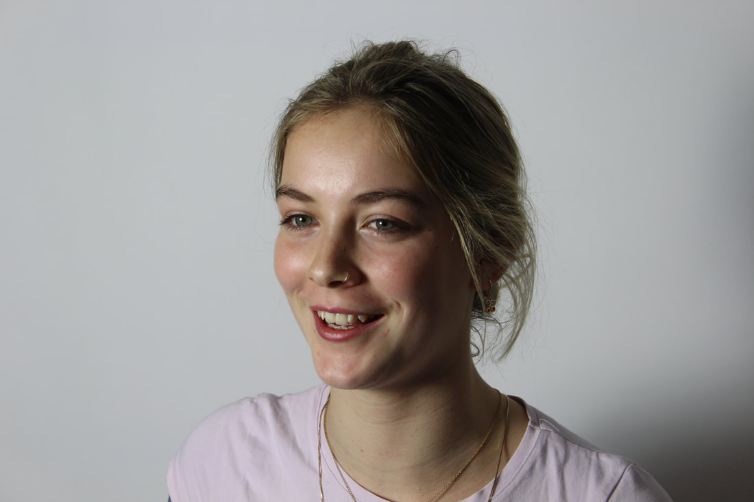
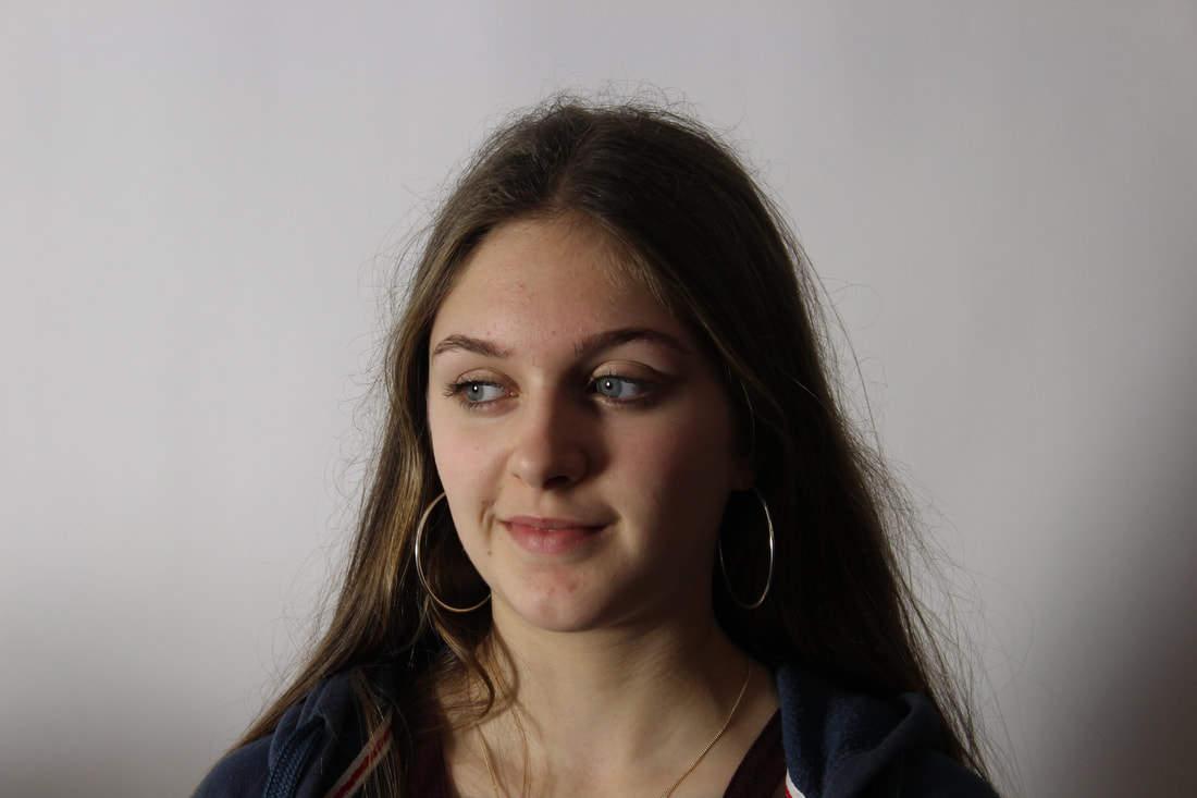
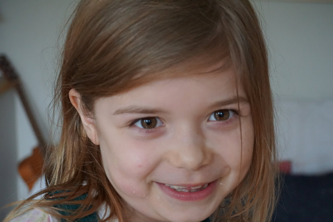
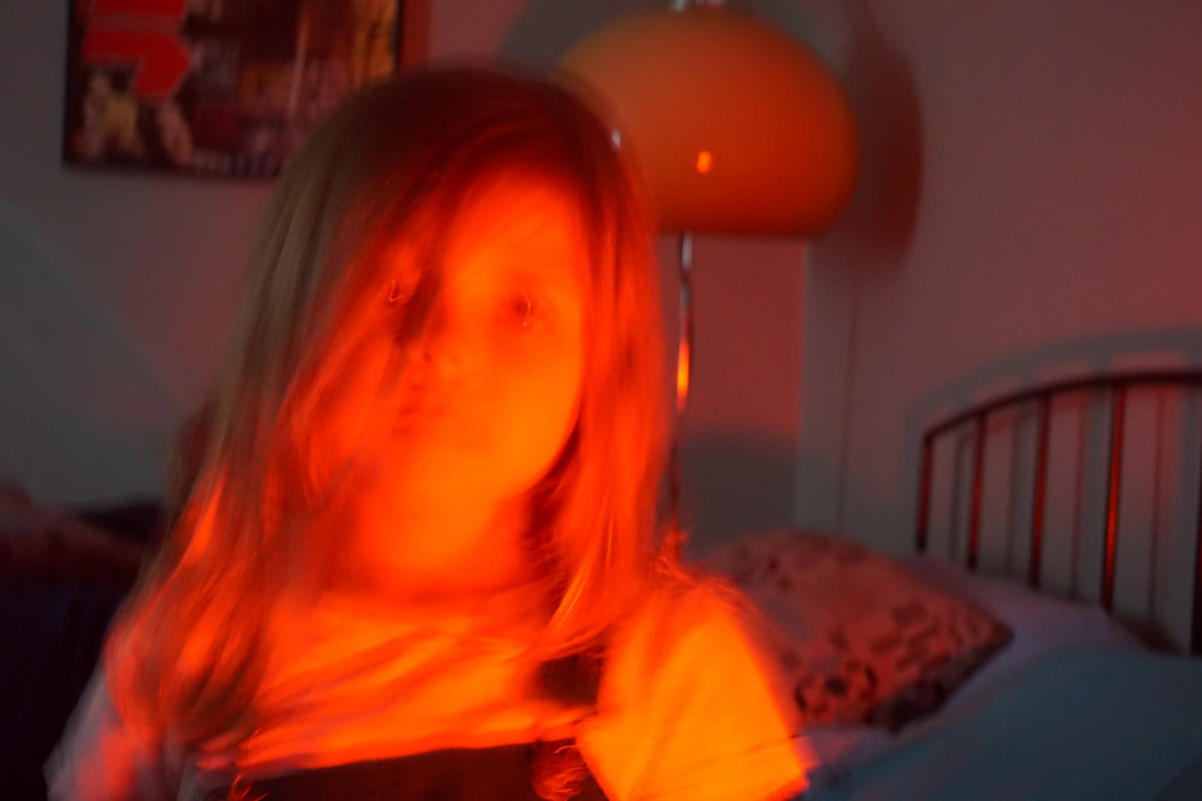
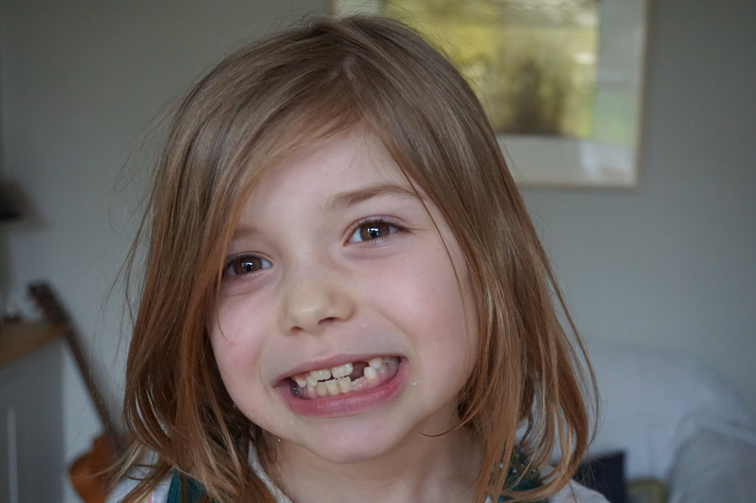
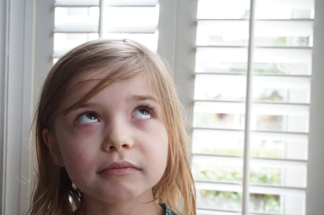
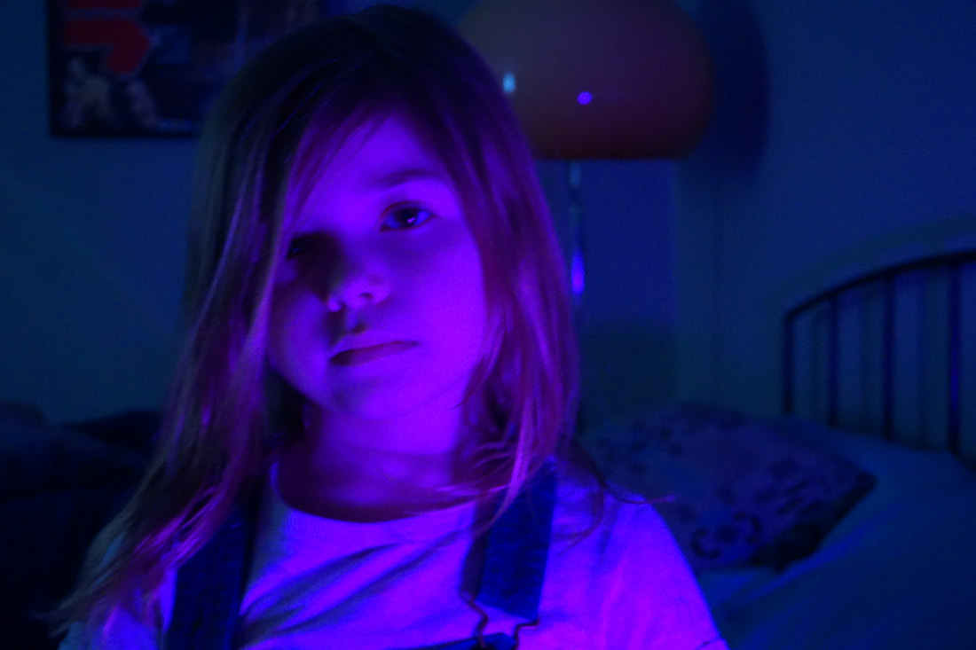
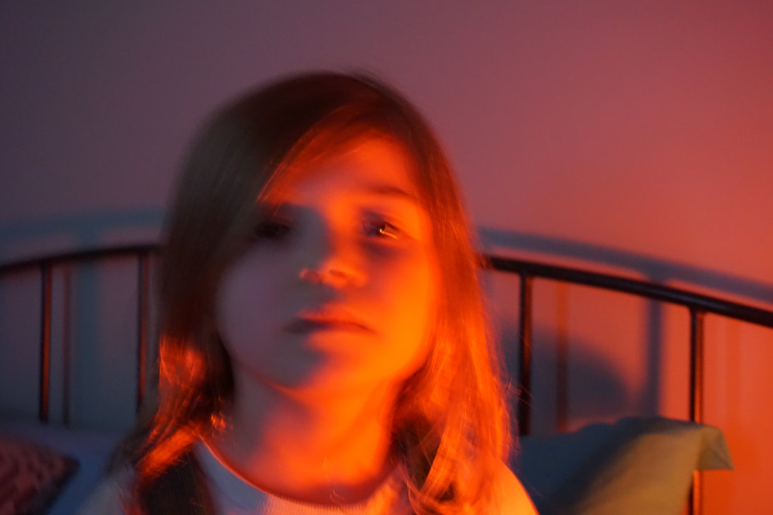
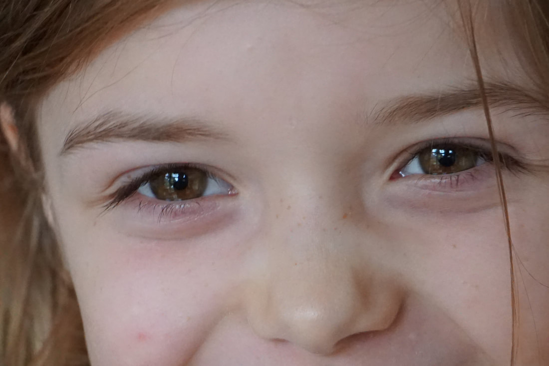
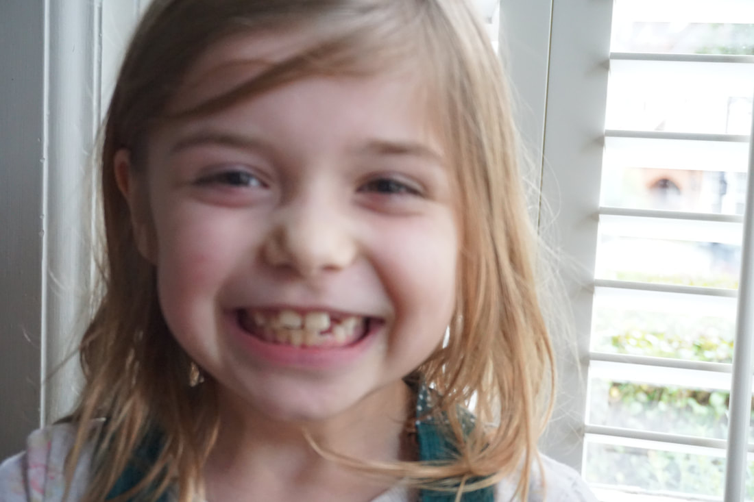
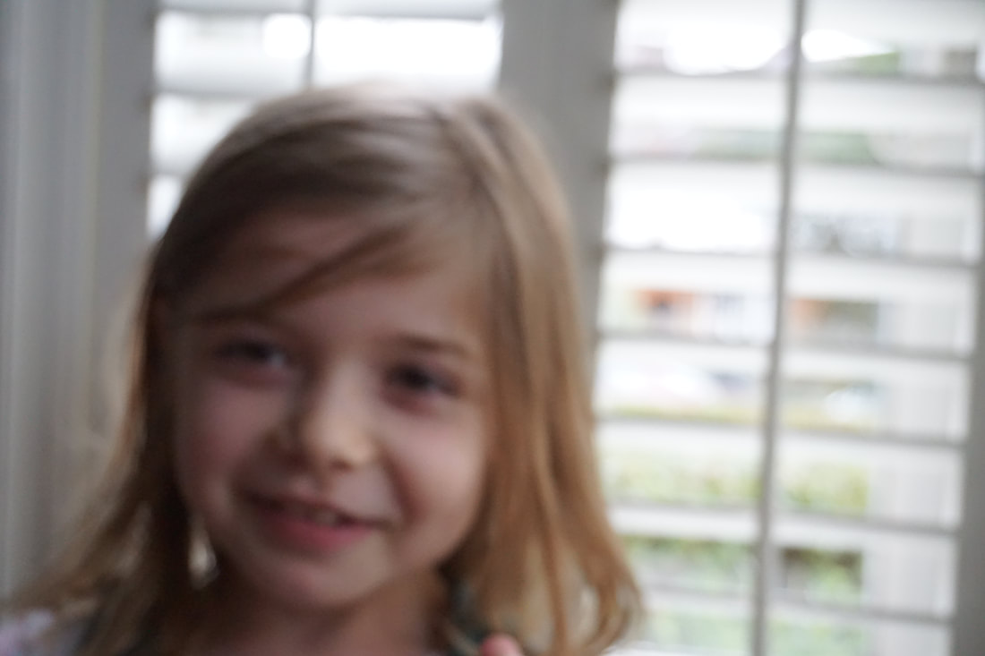
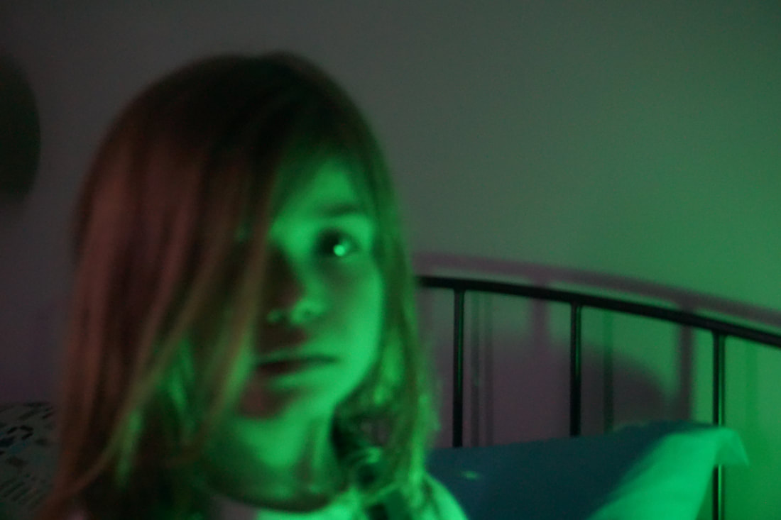
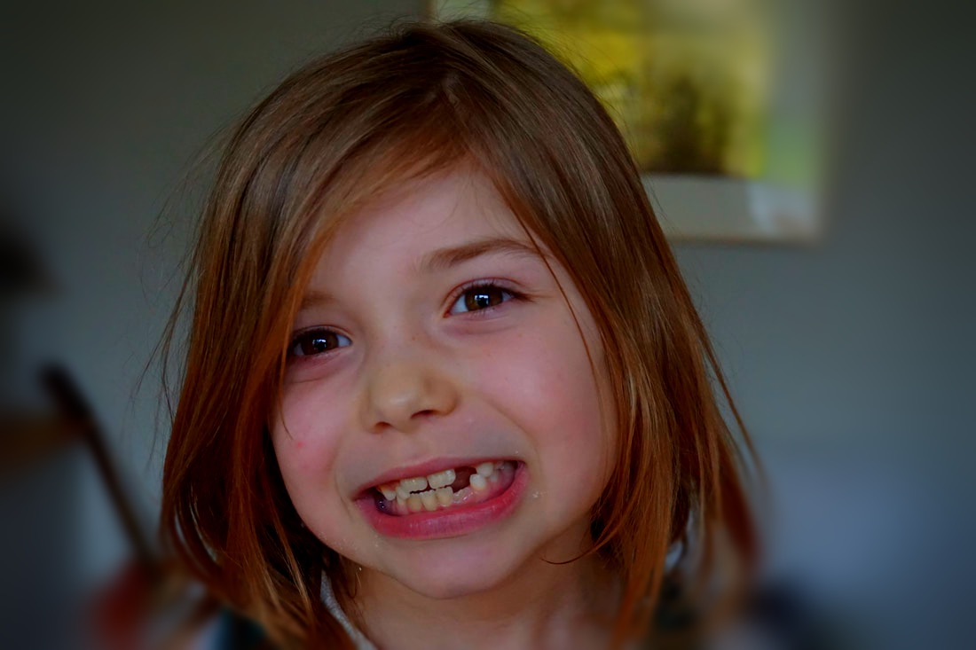
For my final piece I decided to create 3D abstracted images. I took photographs of my sister in different lightings and at different distances to give different perspectives.

|
|
|
|
|
|
|
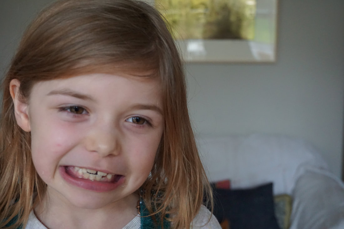
FINAL PIECE:
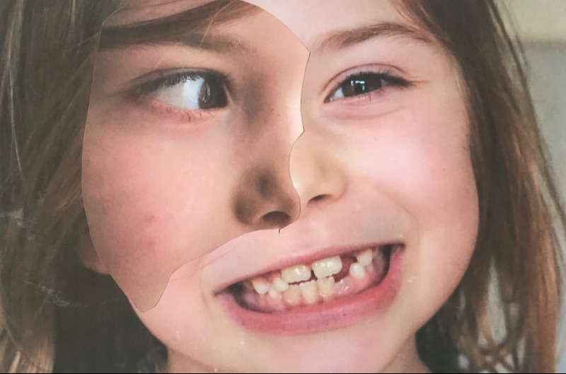
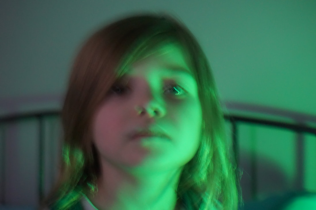
For my final piece I took photographs of my sister creating different faces and in different lighting. I then select two different images for each photograph I created. I then merged them to create an abstract, unrealistic photograph.
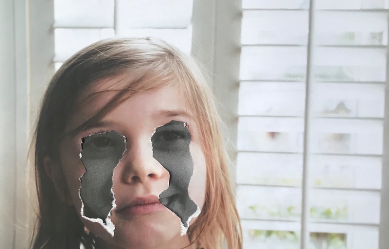
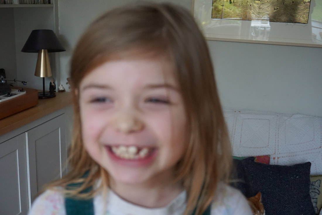
For this piece I decided to rip out the eyes and cheeks of one image leaving the white tear marks from the paper. I then placed it on top of another black and which photograph of my sister smiling. The effect I was left with after was almost haunting. I think this because in the corner of her mouth u can see her smile from underneath.